Multifaceted brand and web presence that lends a strong voice to the Rhineland as a literary location
Project description
Literatur Rheinland
Branding and website
Services:
Branding workshop
Communication strategy
Corporate design
Copywriting
Web design
Frontend programming
Backend programming
In collaboration with Stephanie Butzen, Marie Volmar, Gabriel Richter and awwwesome
literatur-rheinland.de
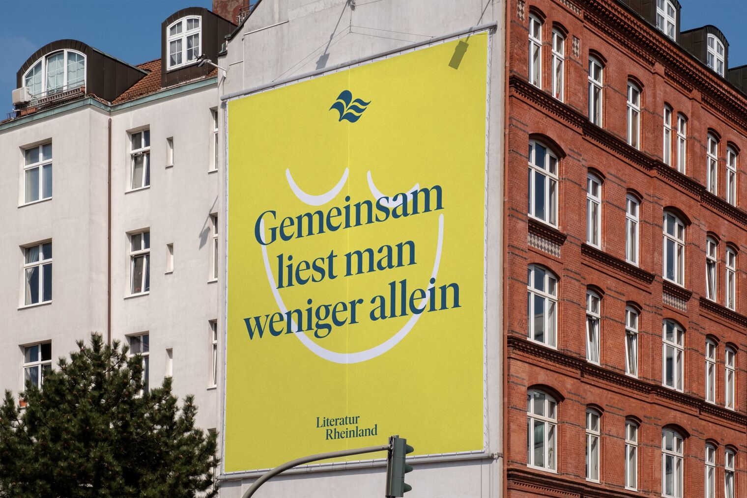
Comfortable reading in the Rhineland
Literatur Rheinland is the regional network for all stakeholders, initiatives and institutions of the literary scene. As a collaborative platform, it comprises everything the local scene has to offer and allows it to speak with one powerful voice. We were responsible for making its potential accessible to a larger – and younger – audience. To this end, we introduced a new brand and web presence that sparks interest and makes it possible to experience the many facets of regional literature. Because reading brings people together – even if they are from Cologne and Düsseldorf.
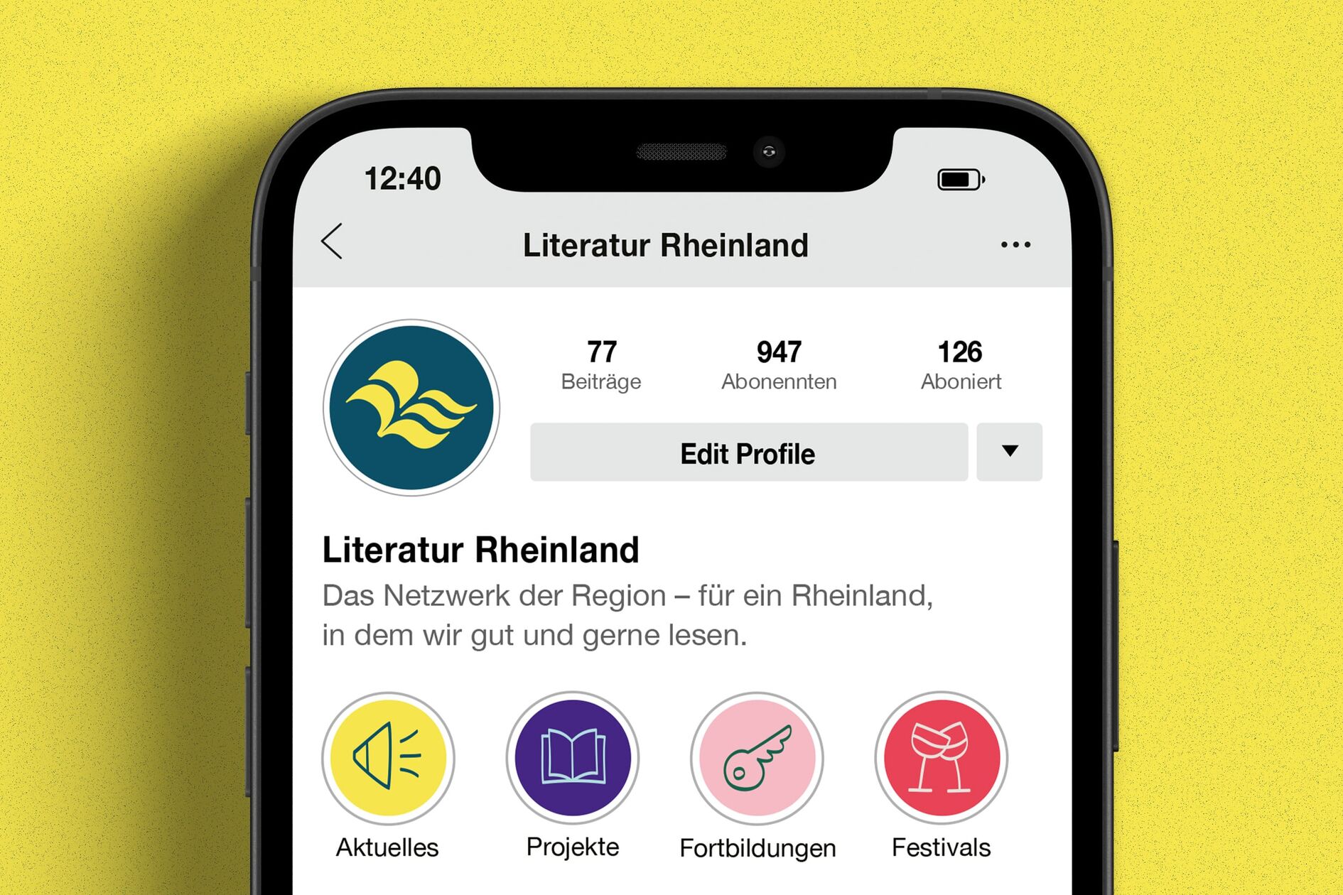
Literature and the Rhine in one clear symbol
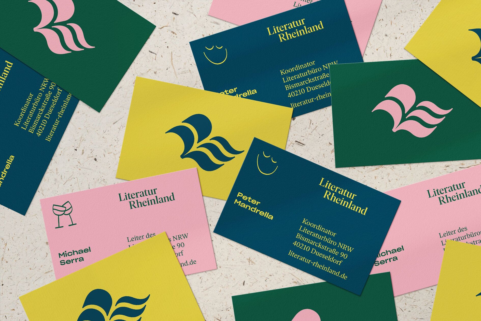
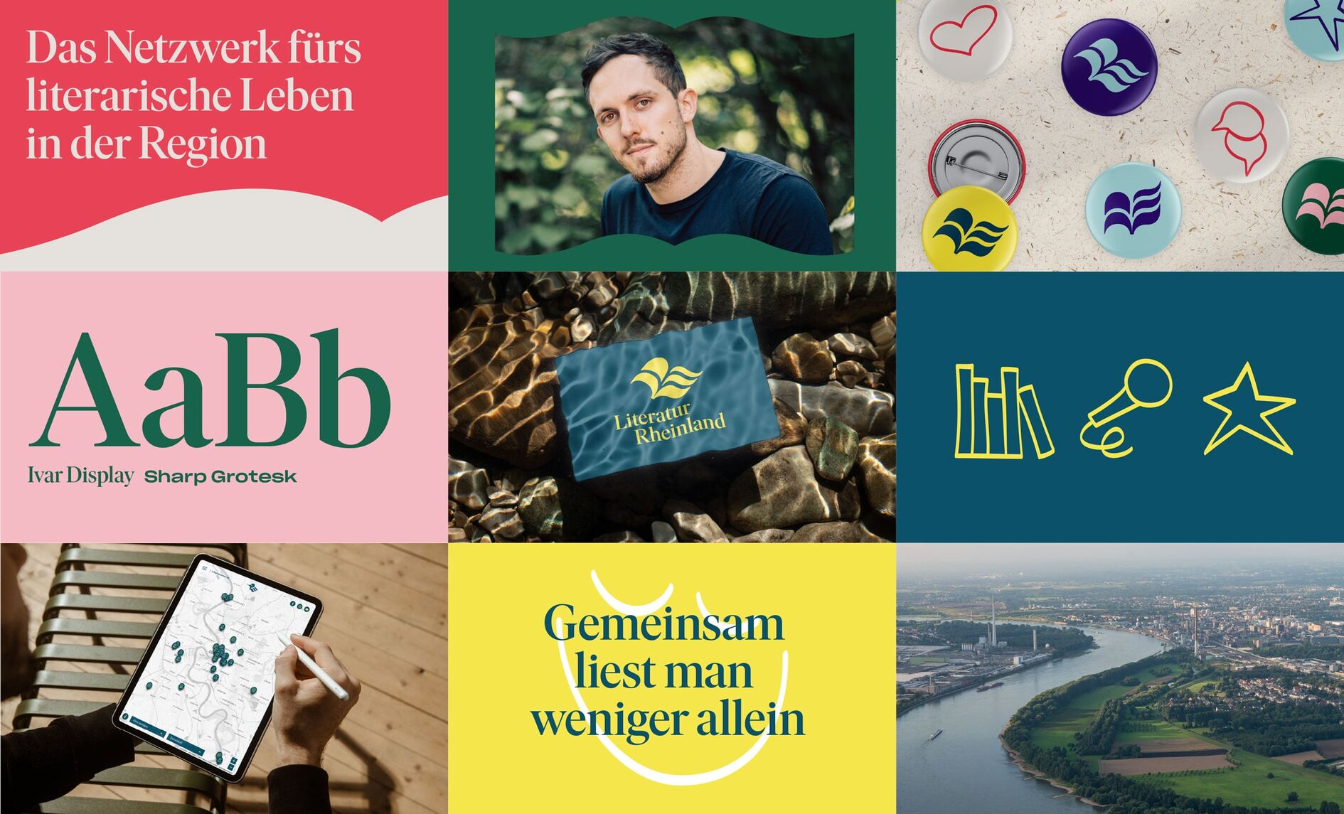
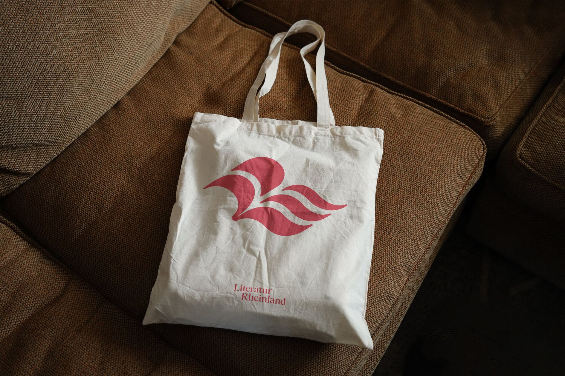
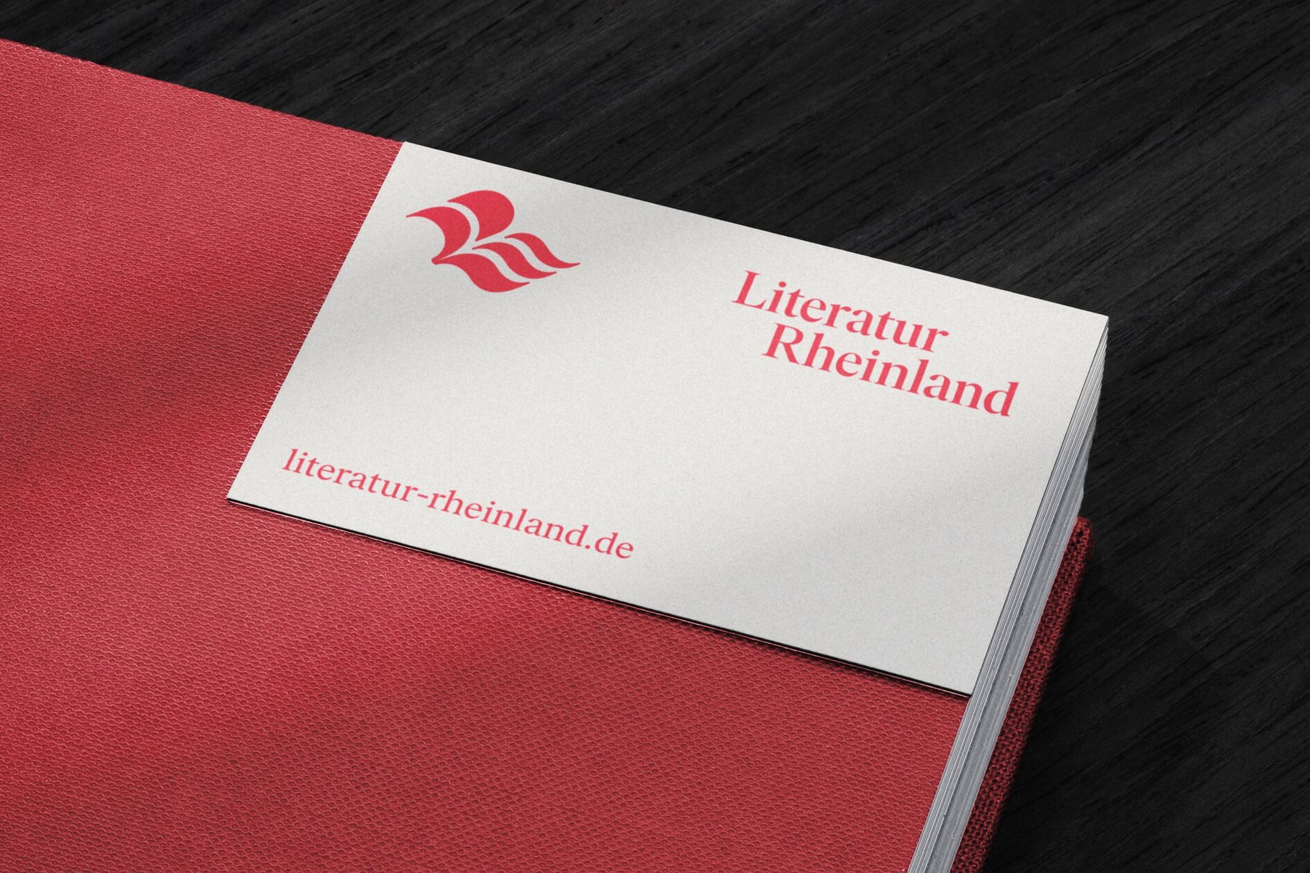
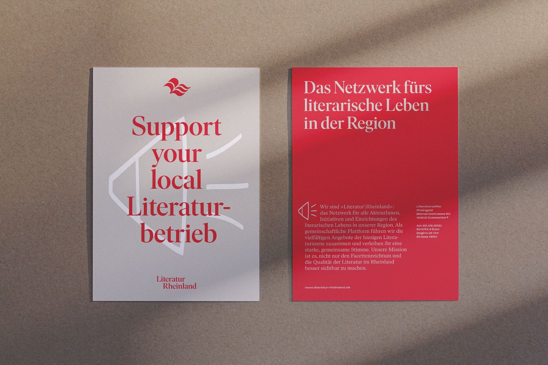
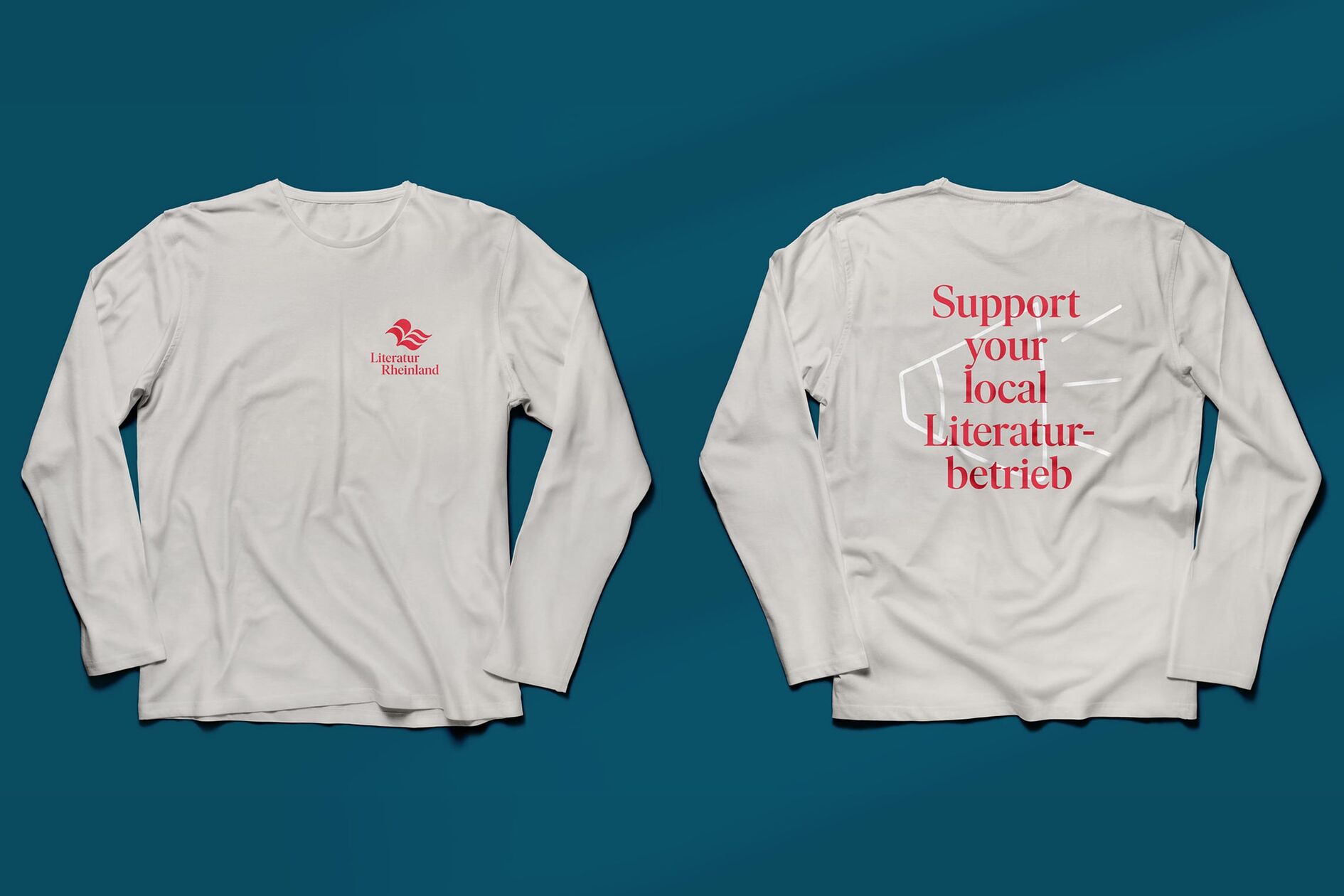
The new logo sends a strong signal on behalf of the regional literary scene. Based on the tilted letter „R“, it combines the impression of an open book with the dynamics of flowing water as a visual reference to the Rhine. A simple, clear symbol with multiple levels of interpretation.
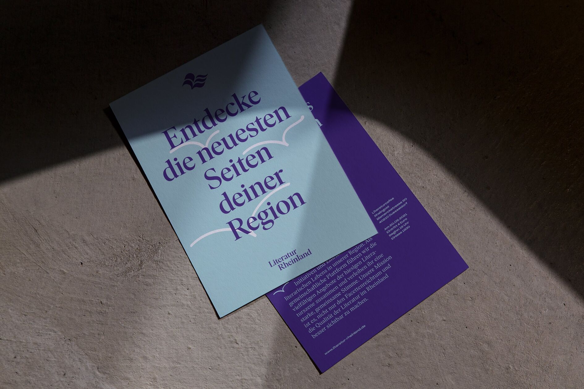
Linguistically pleasing typography
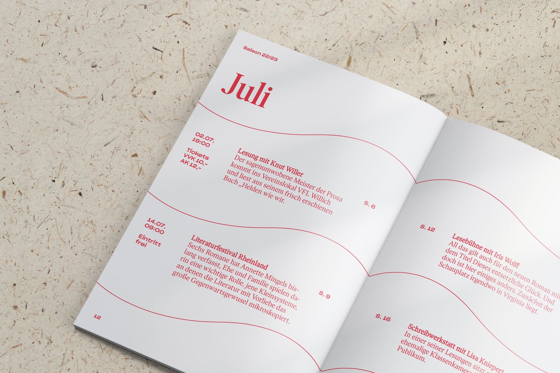
The new corporate font „Ivar“ is an excellent typeface for reading literary texts that also shines in headlines. Together with the nonchalant secondary typeface „Sharp Grotesk“, our typography also covers a broad literary spectrum: from high culture to pop culture.
Book and river - a flowing layout
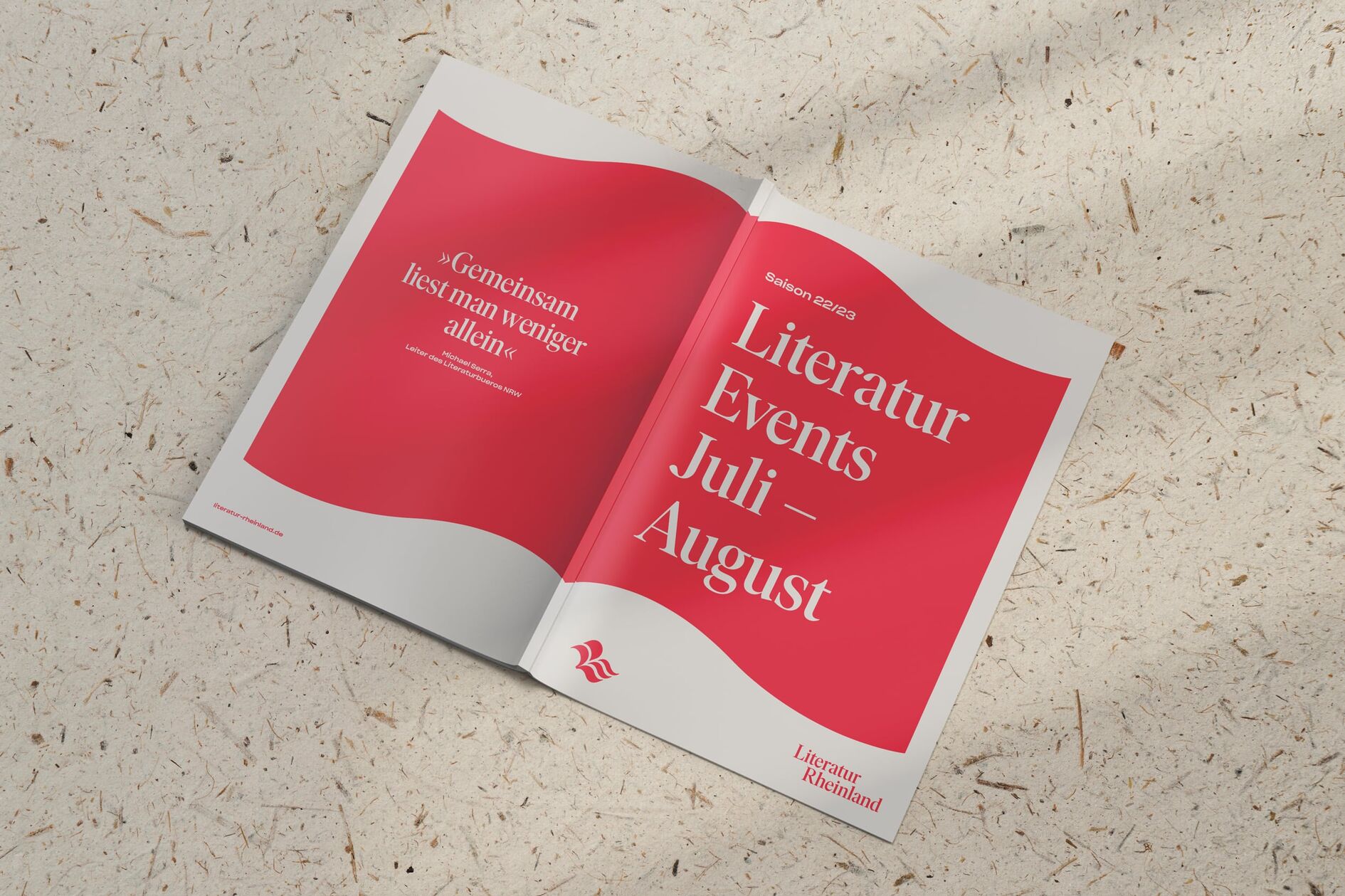
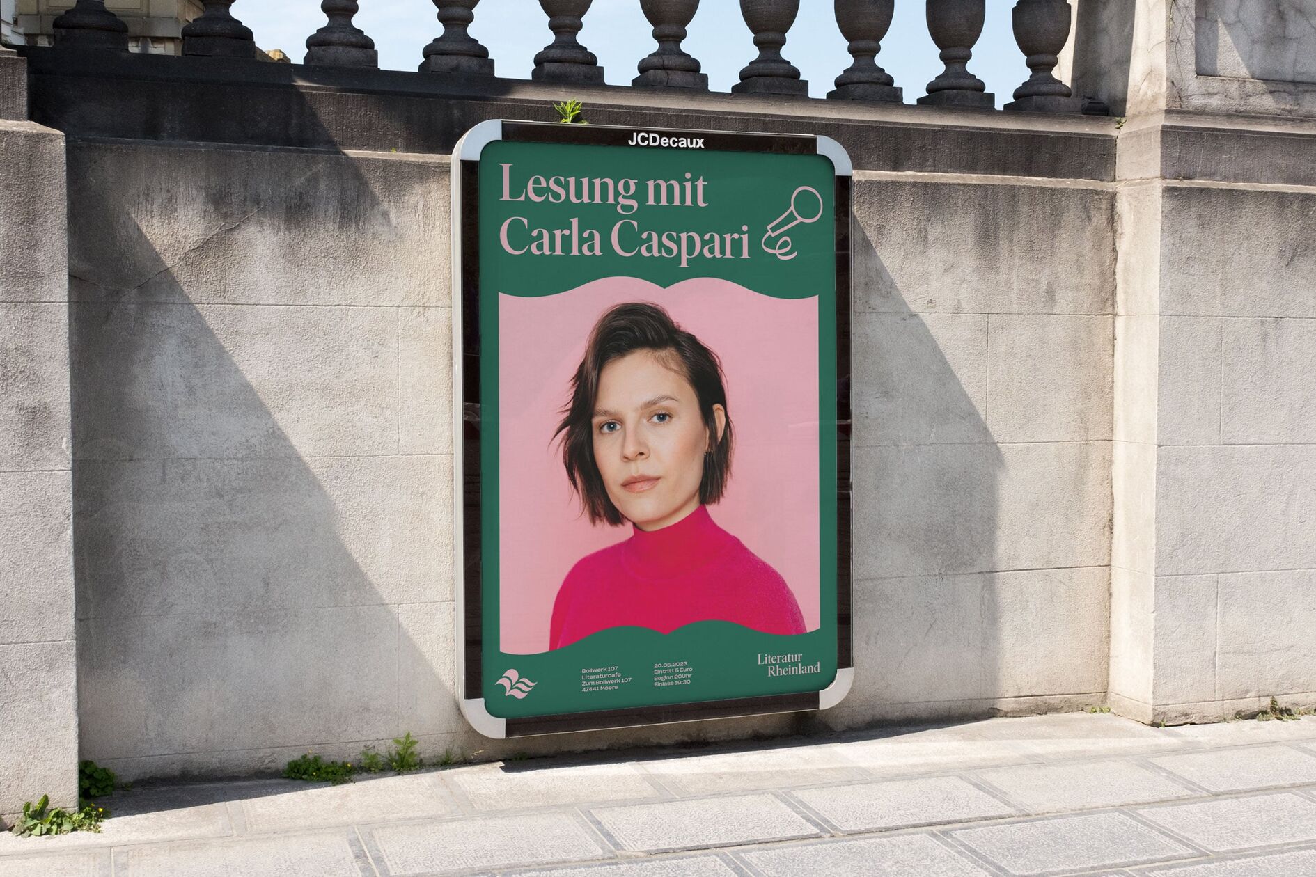
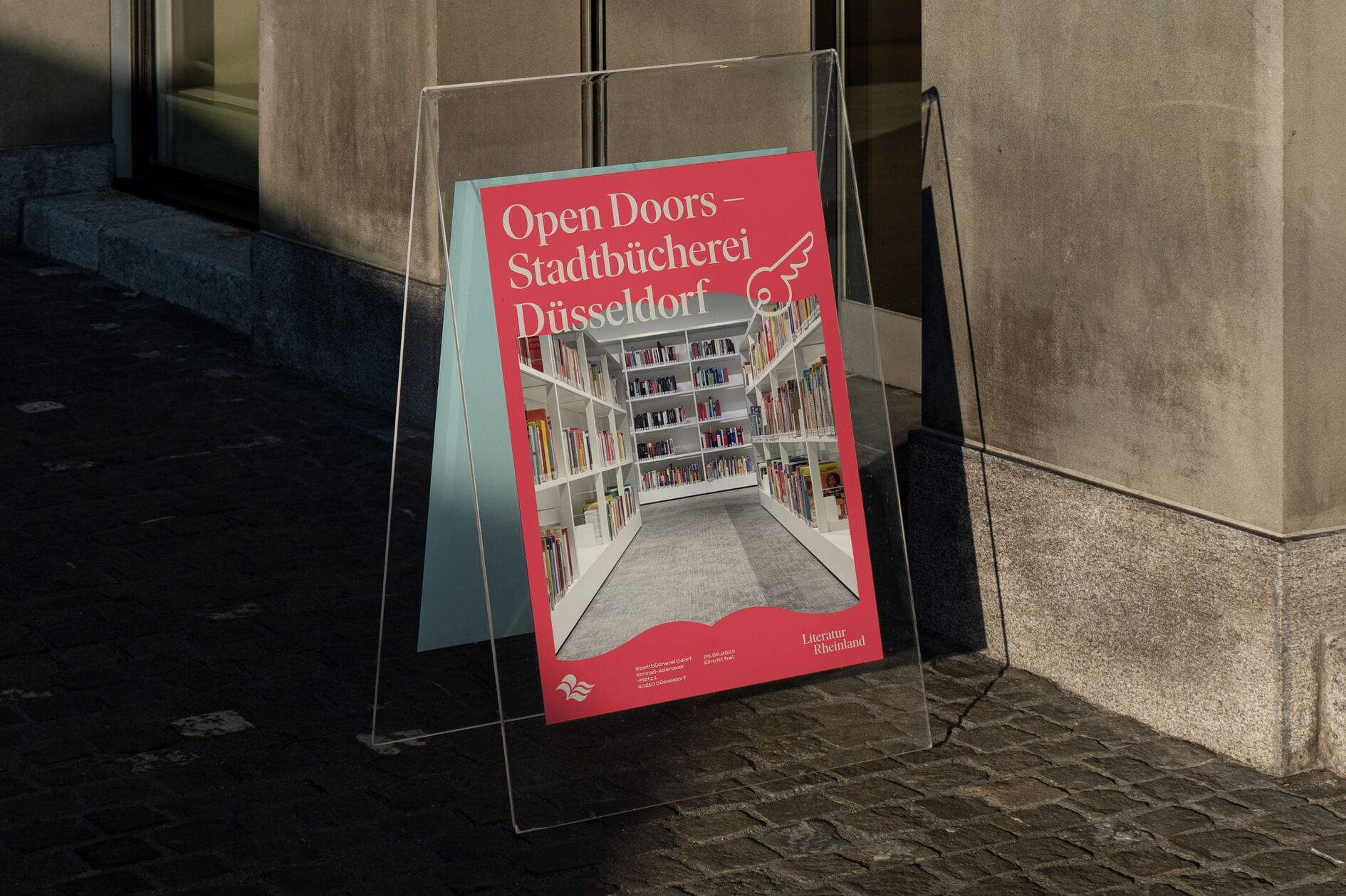
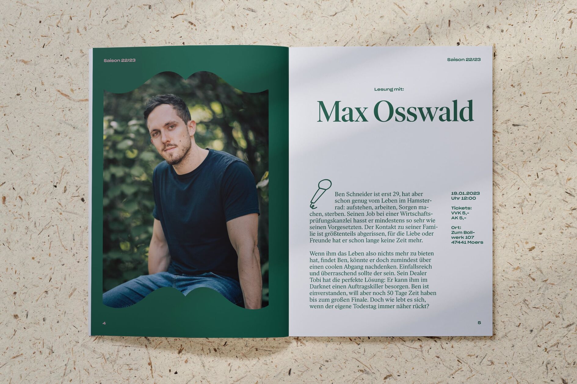
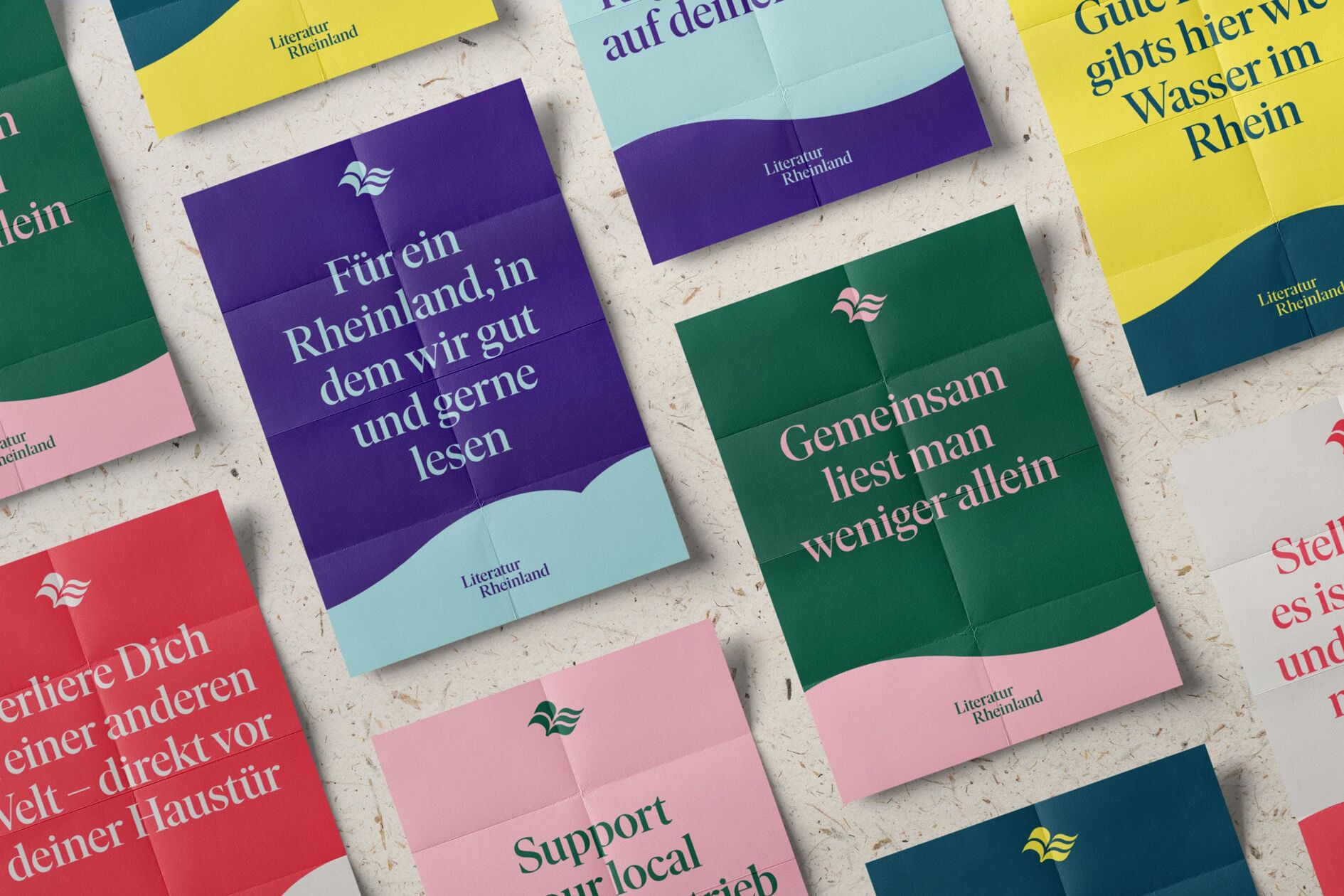
The layout system is derived from the top view of an open book, which, depending on the context, can serve as a graphic frame or image container. Zooming into the image yields exciting sections, which in turn create the impression of flowing water. The result: a concise, flexibly applicable visual toolkit that creates a cross-media identity.
Liveliness through diversity and contrasts
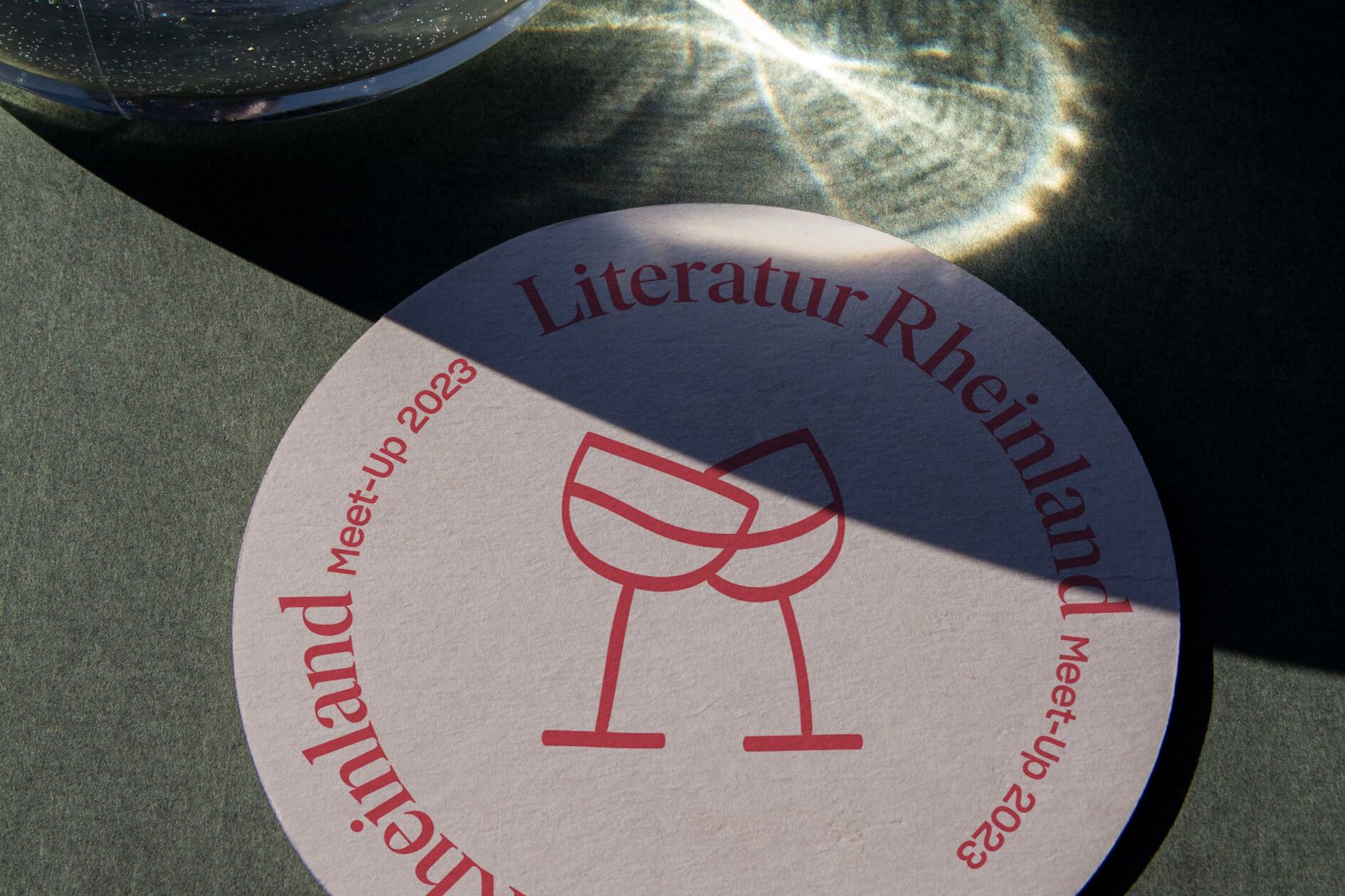
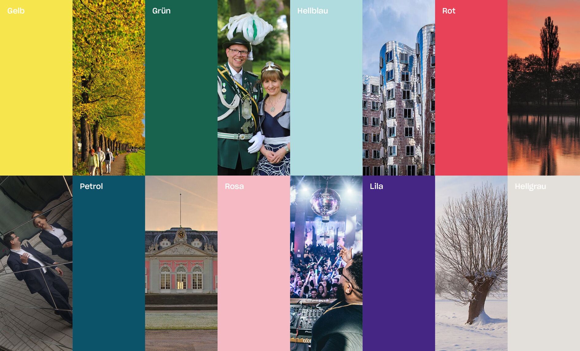
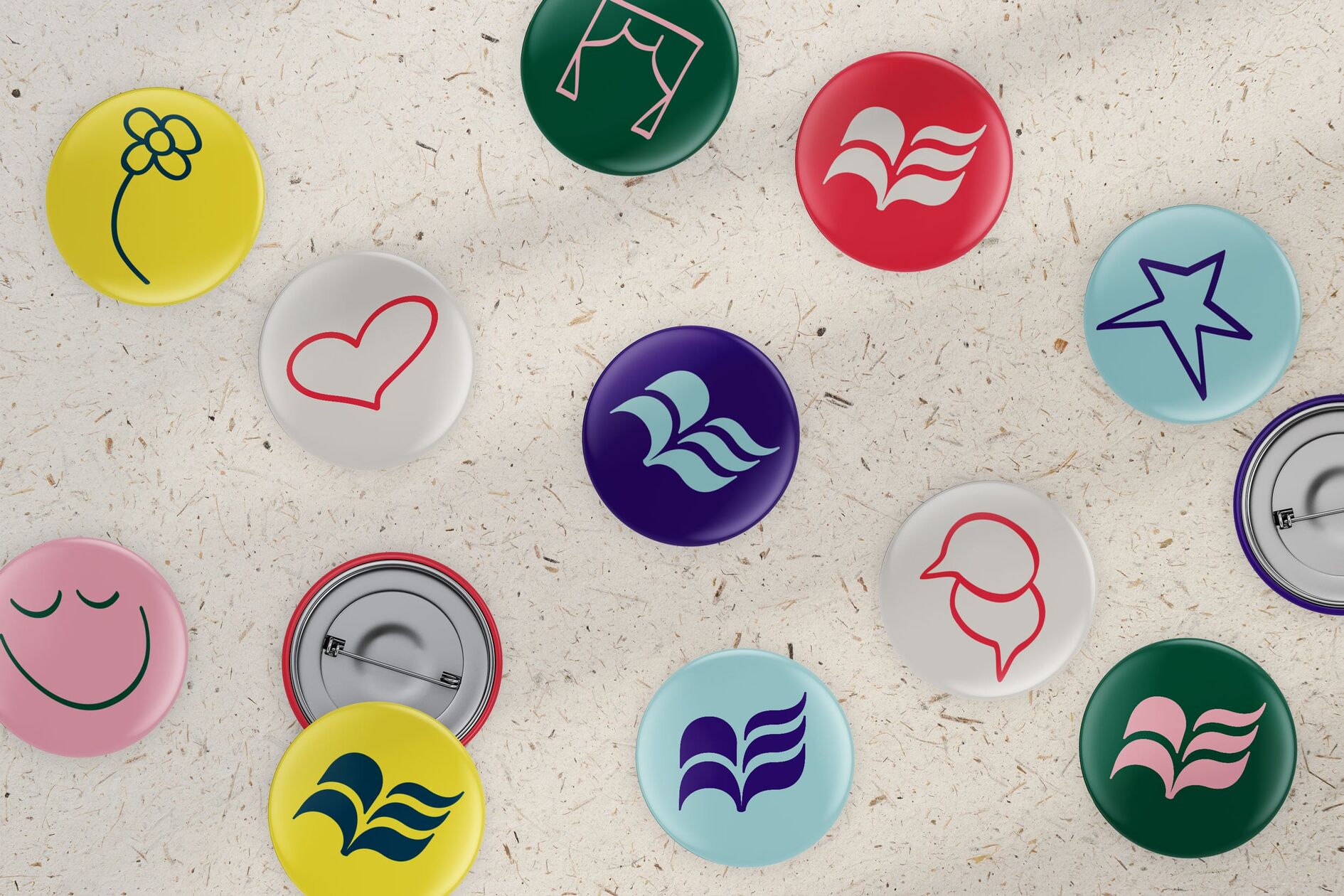
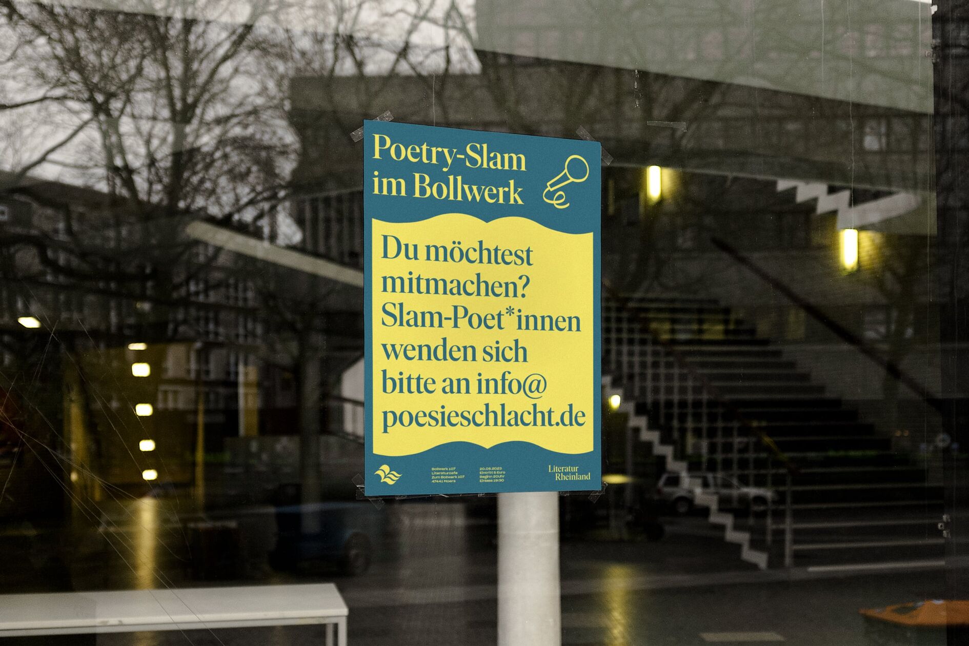
Hand-drawn icons and symbols add levity to the overall image and provide a noticeable contrast to the logo and typography. The brand identity is topped off with a lively color palette, which in its colorfulness also reflects the diversity of the region.
Event platform and more for the regional literary scene
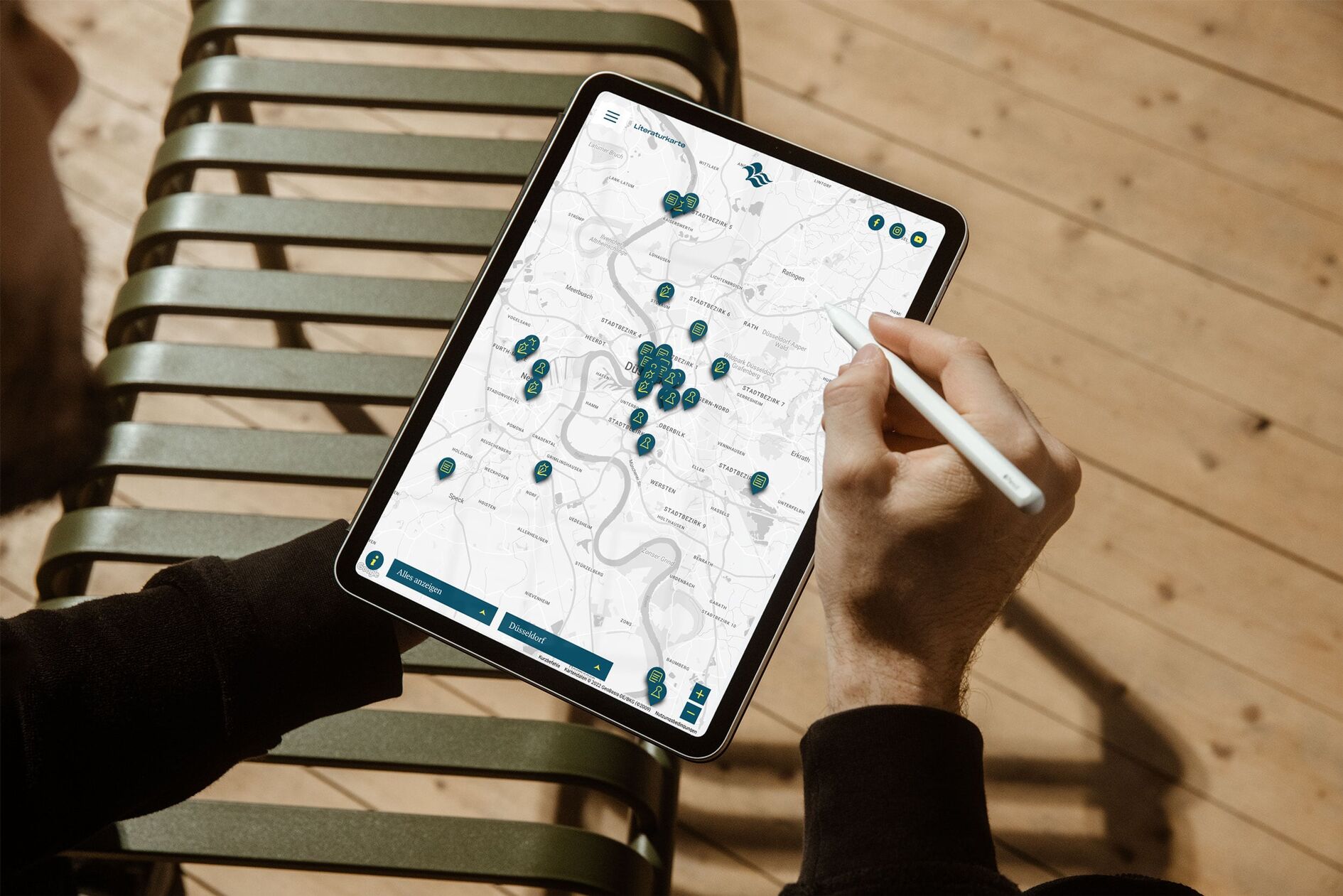
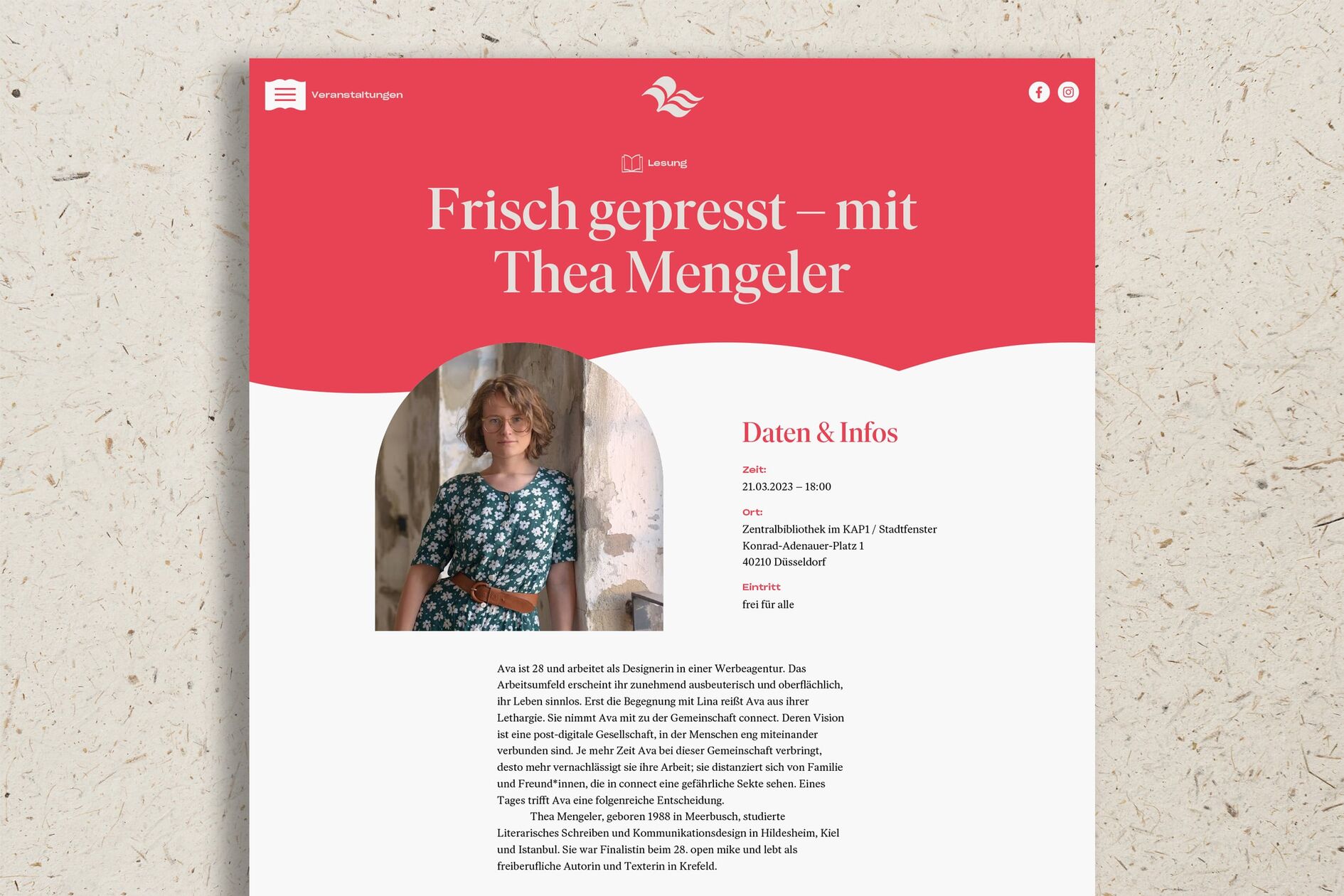
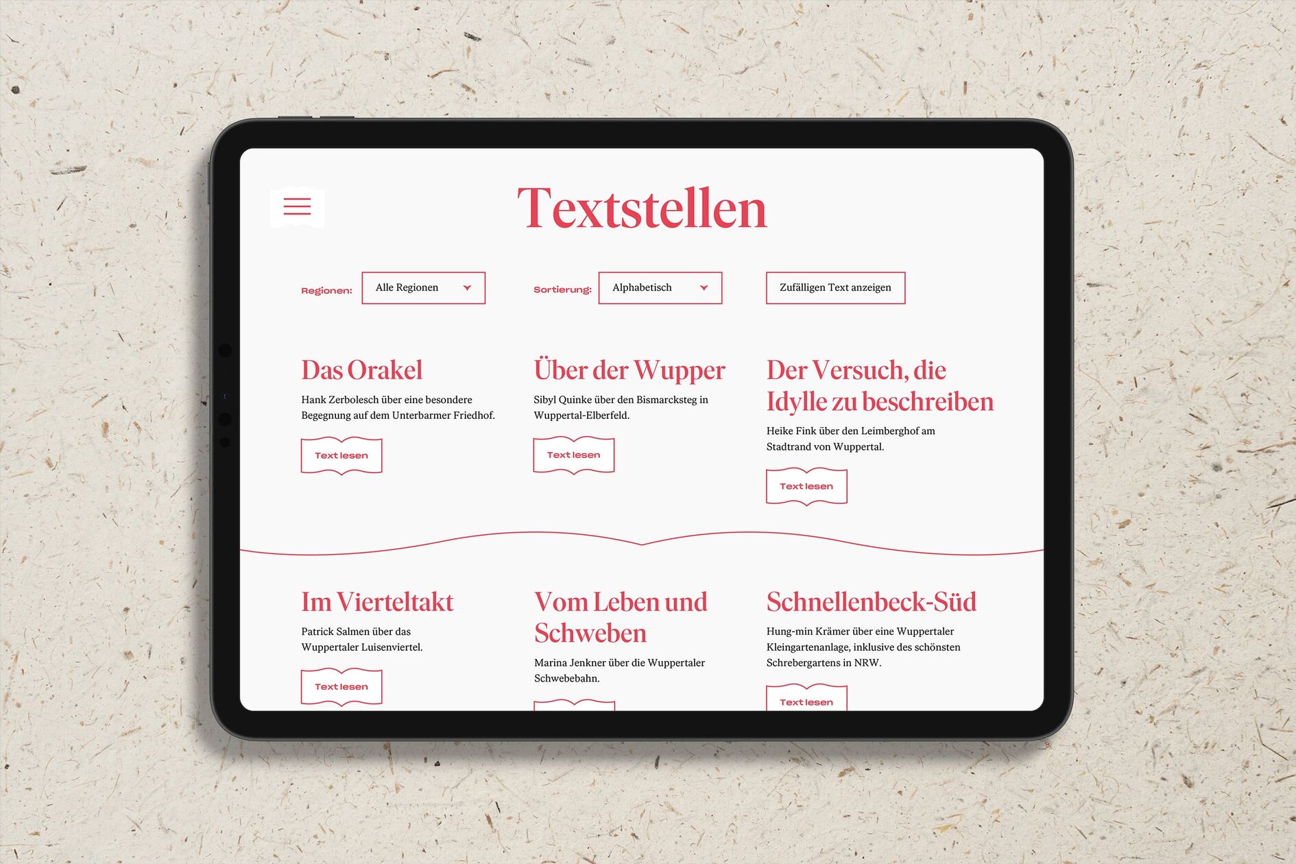
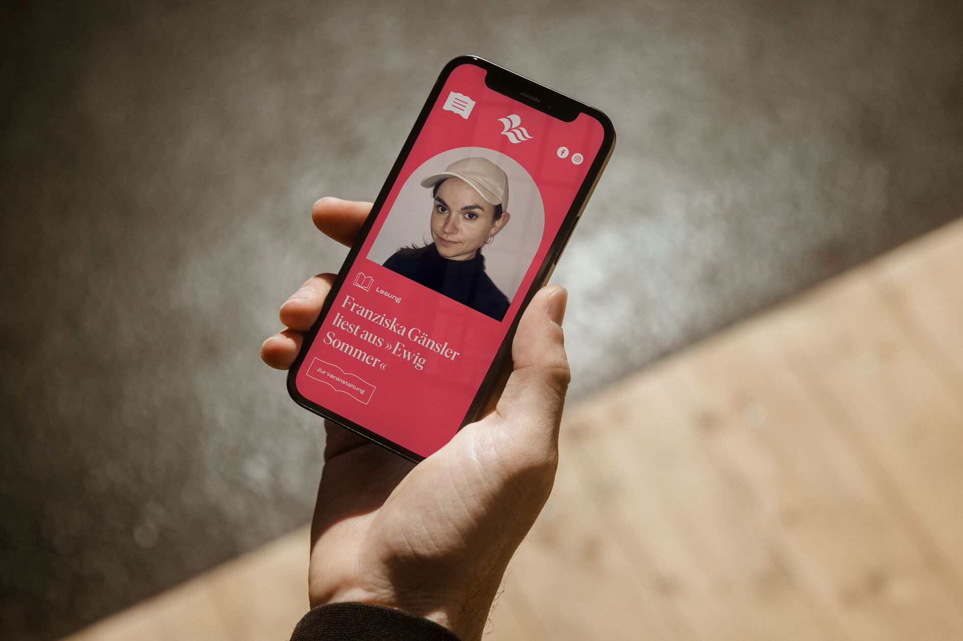
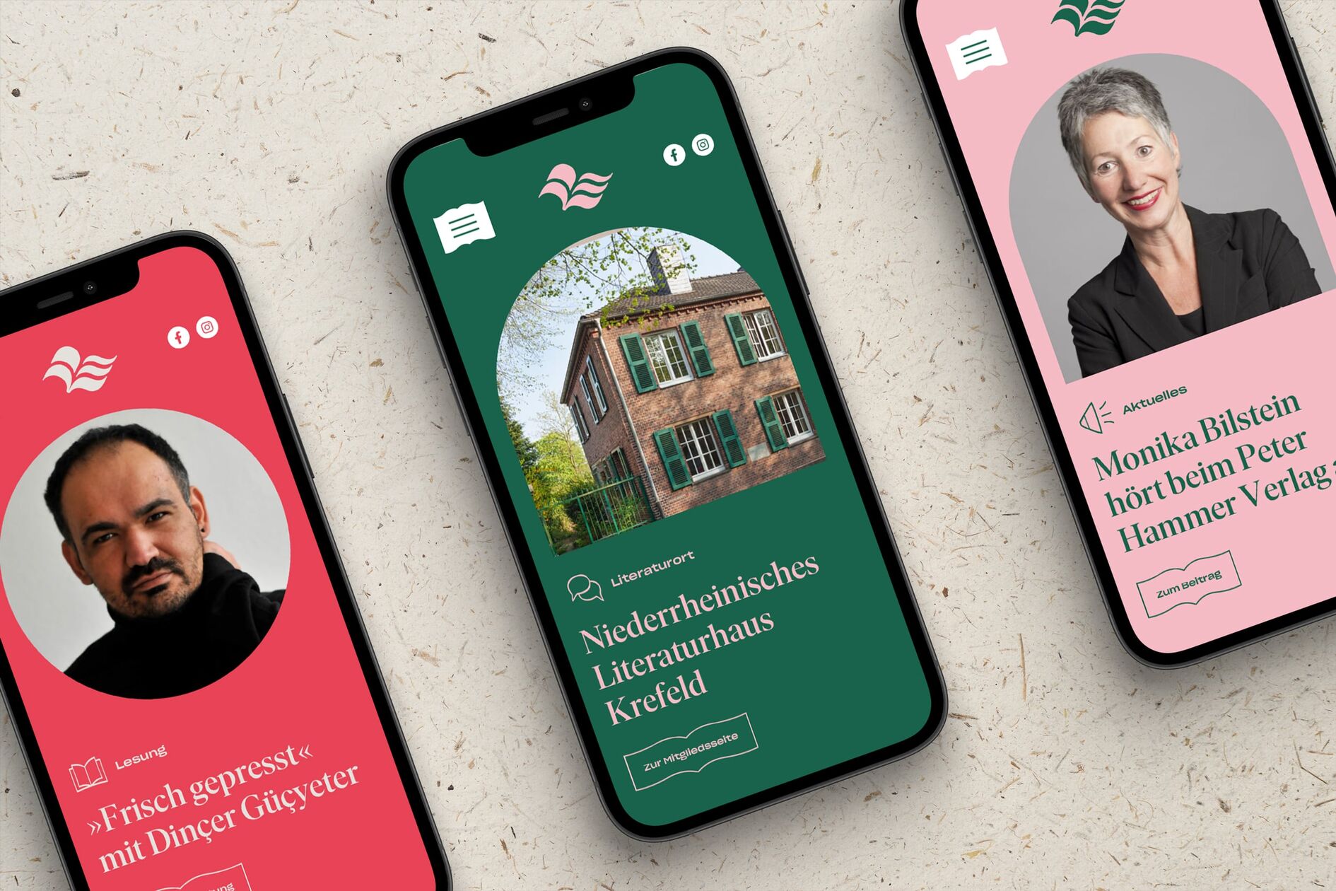
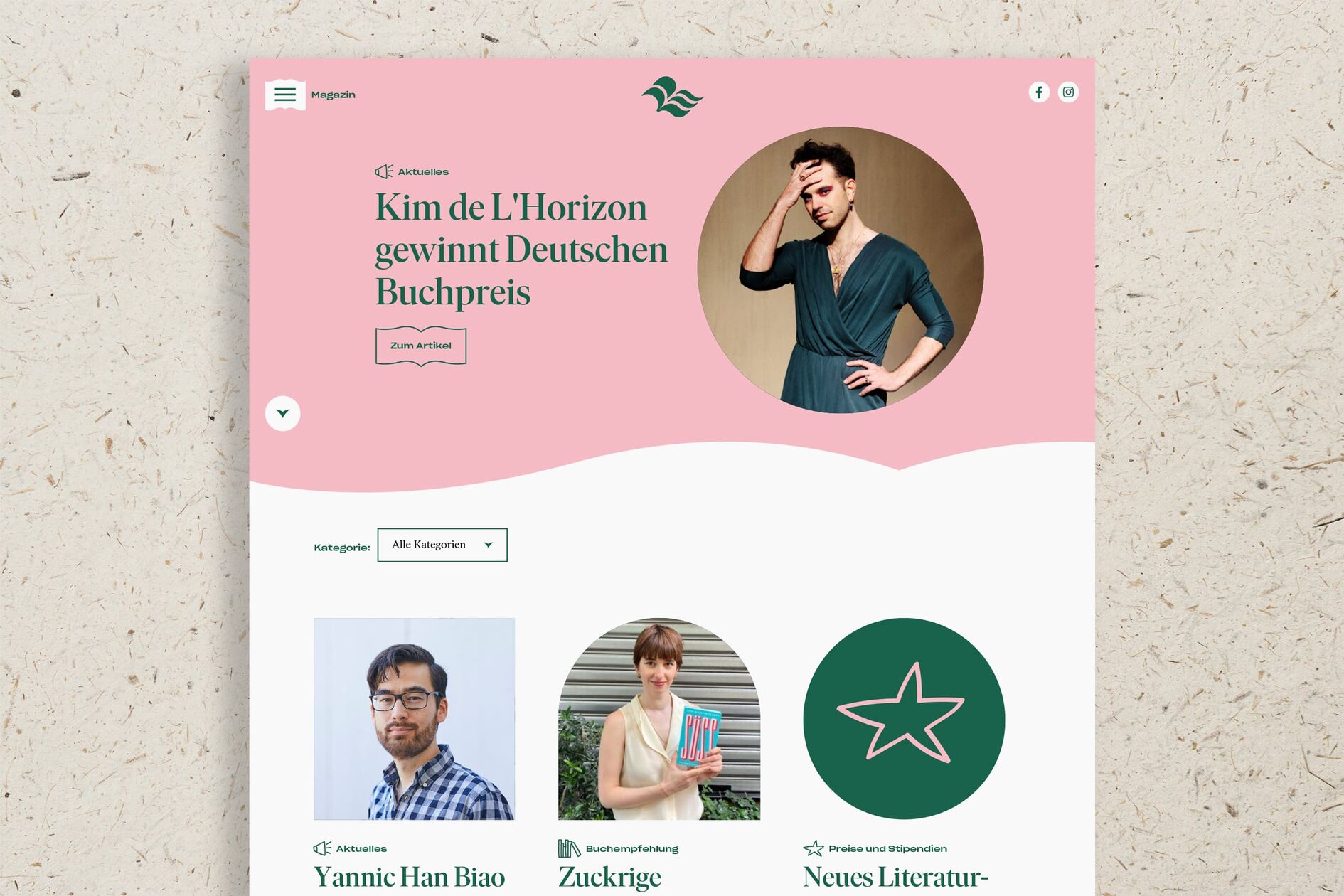
The new website provides an overview of all events in the region and shows what literature in the Rhineland can do. An interactive literary map, a dedicated magazine, and portraits of all members of the network make the diversity and quality of literature in the Rhineland visible and tangible even in the digital space.
Regional literature on a map
One highlight of the website is an interactive literary map that allows users to explore the Rhineland vis-à-vis its literature by providing easy and intuitive access to descriptions of places by Rhenish writers, portraits of authors who have lived and worked here, and institutions and initiatives that enrich literary life.
