Fresh new branding for a regional apple orchard and farm store
Project description
Raadts
Branding
Services:
Corporate Website
Corporate Design
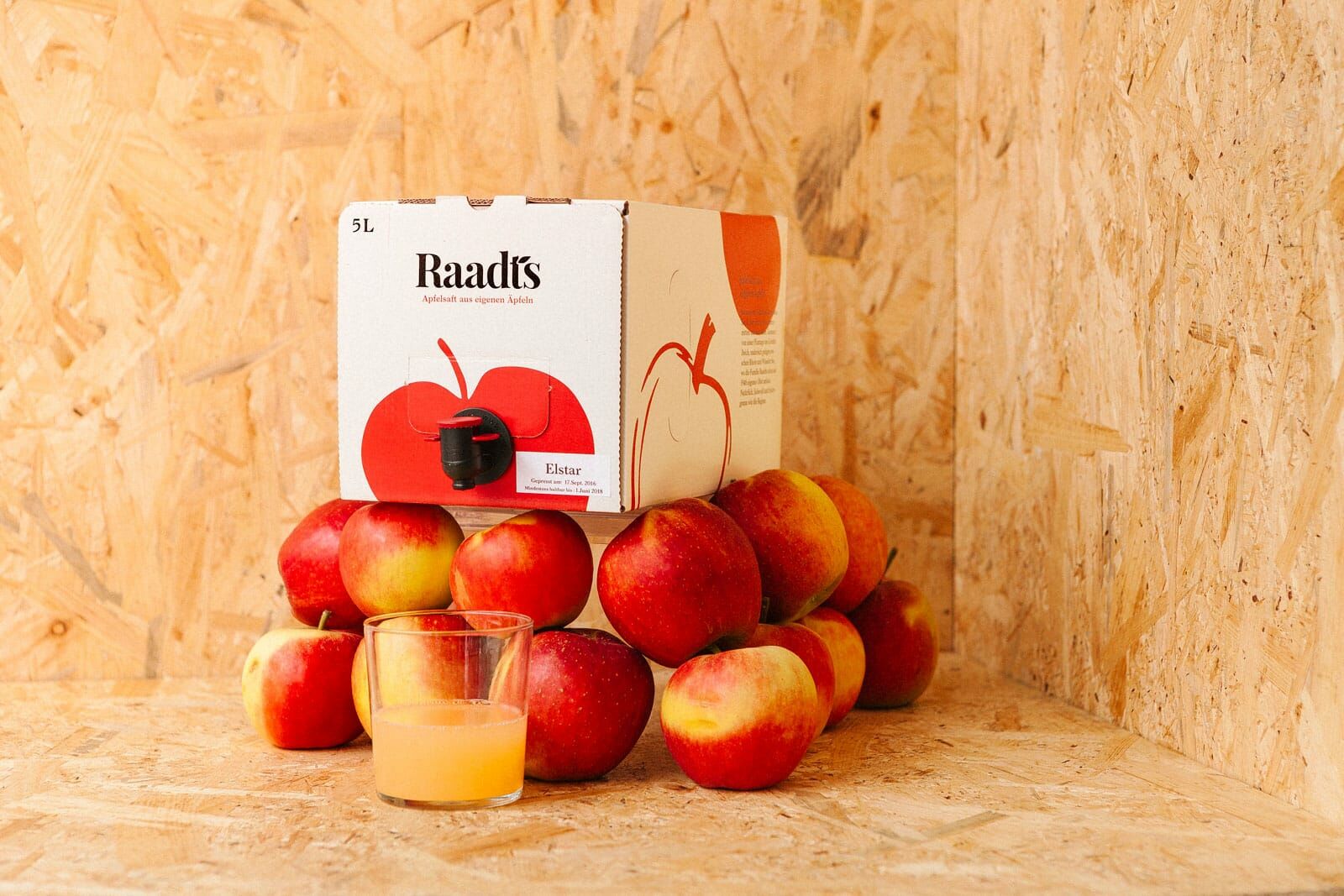
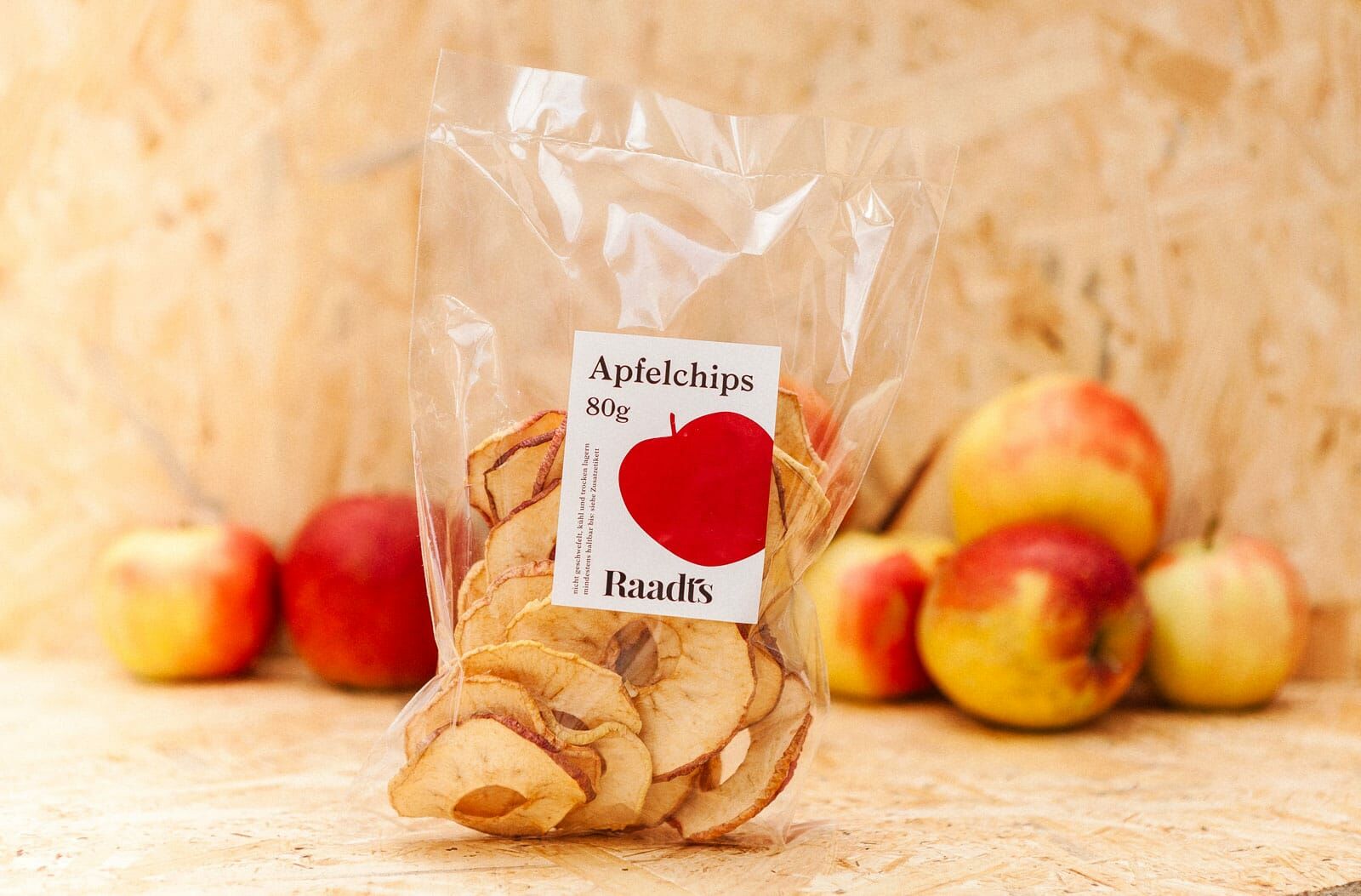
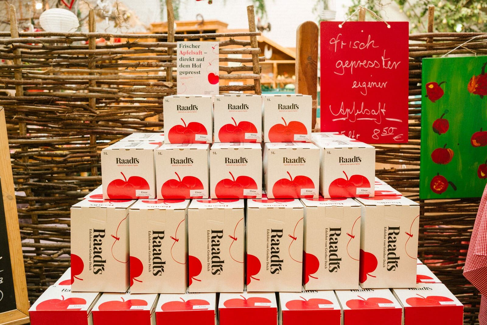
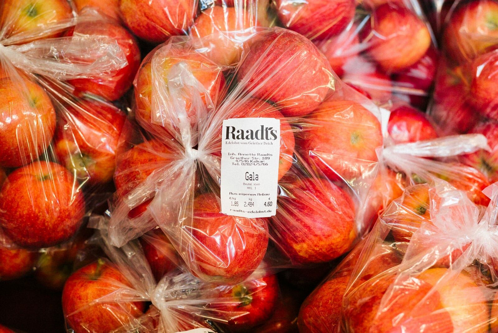
Packaging Design
Claim Development
Communication Strategy
Copywriting
In collaboration with Anna Fitzon
Website:
edelobst-raadts.de
Holistic Redesign
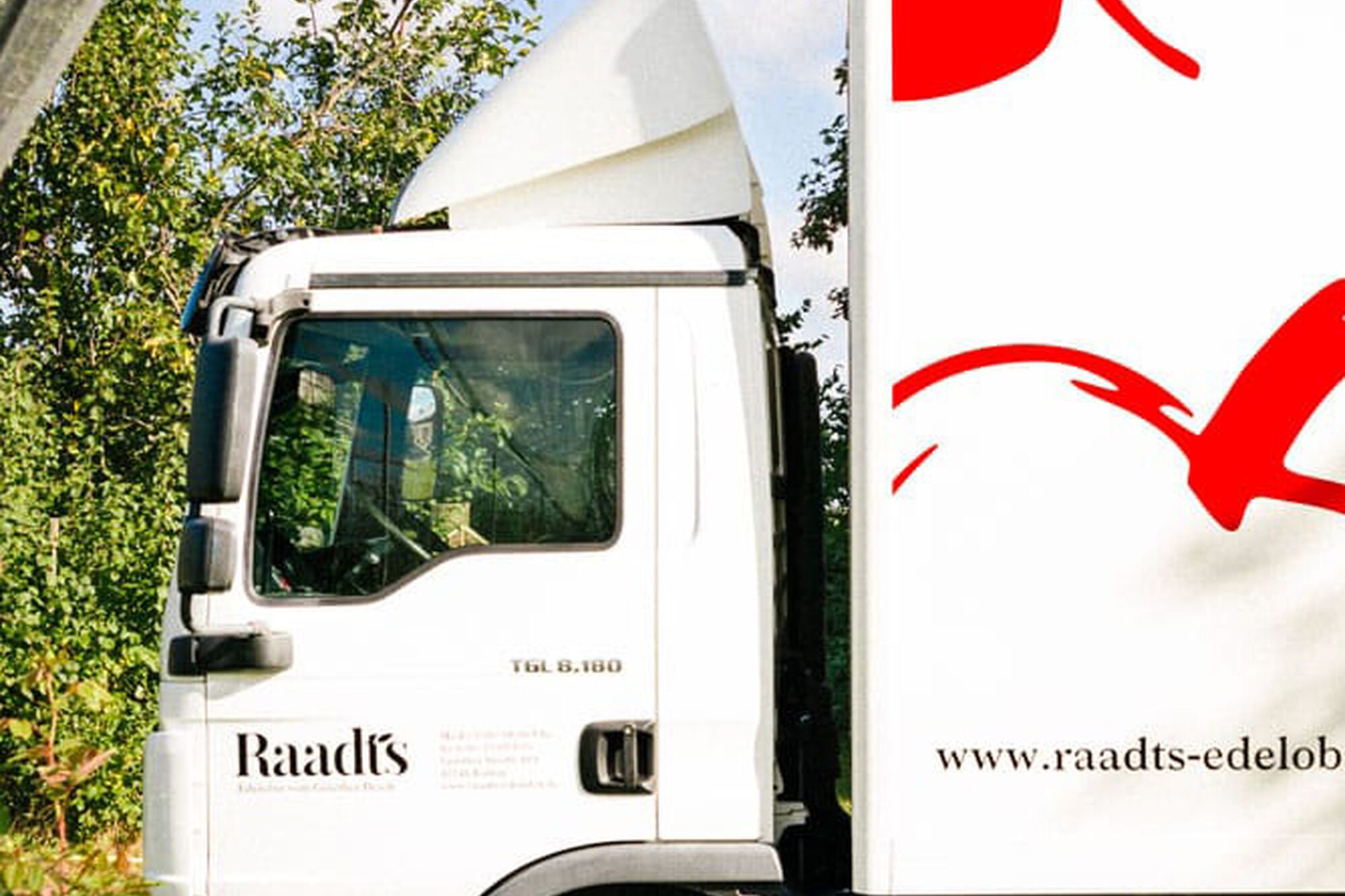
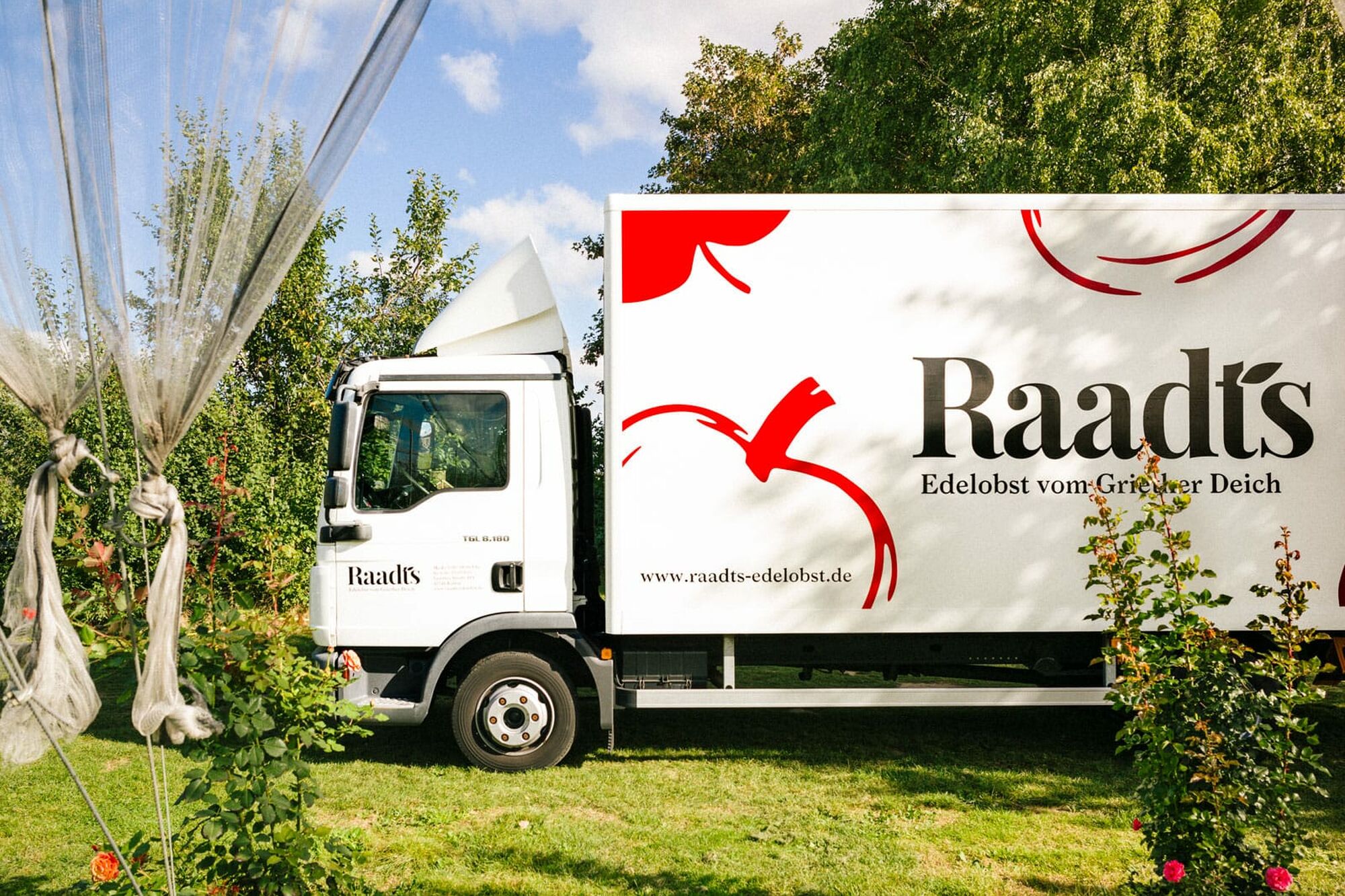
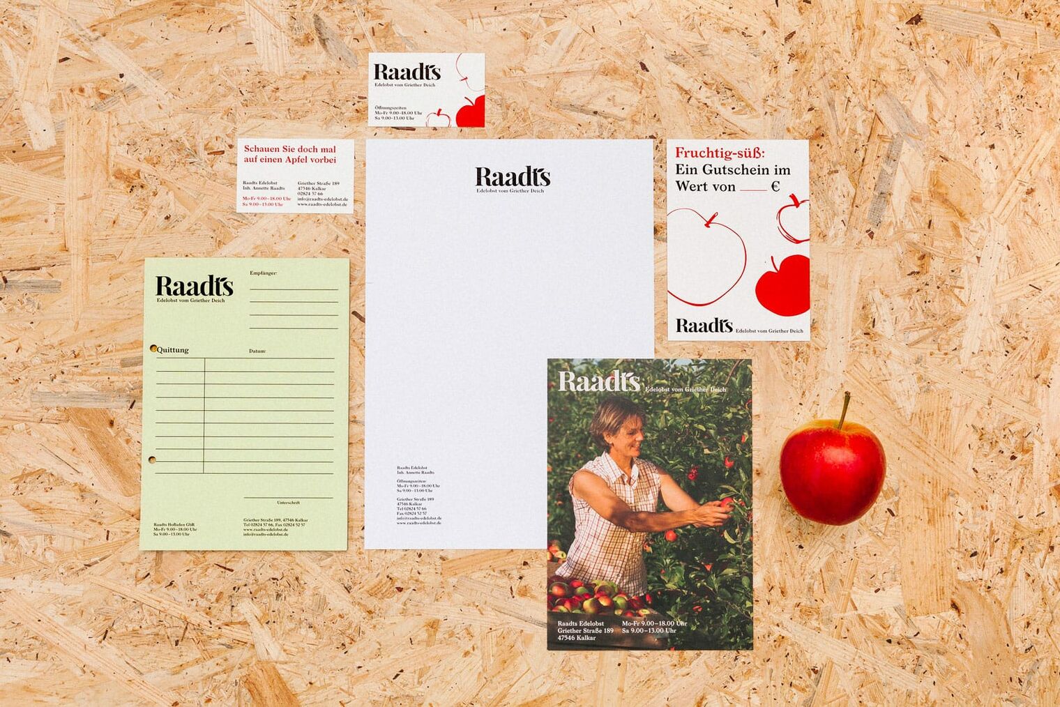
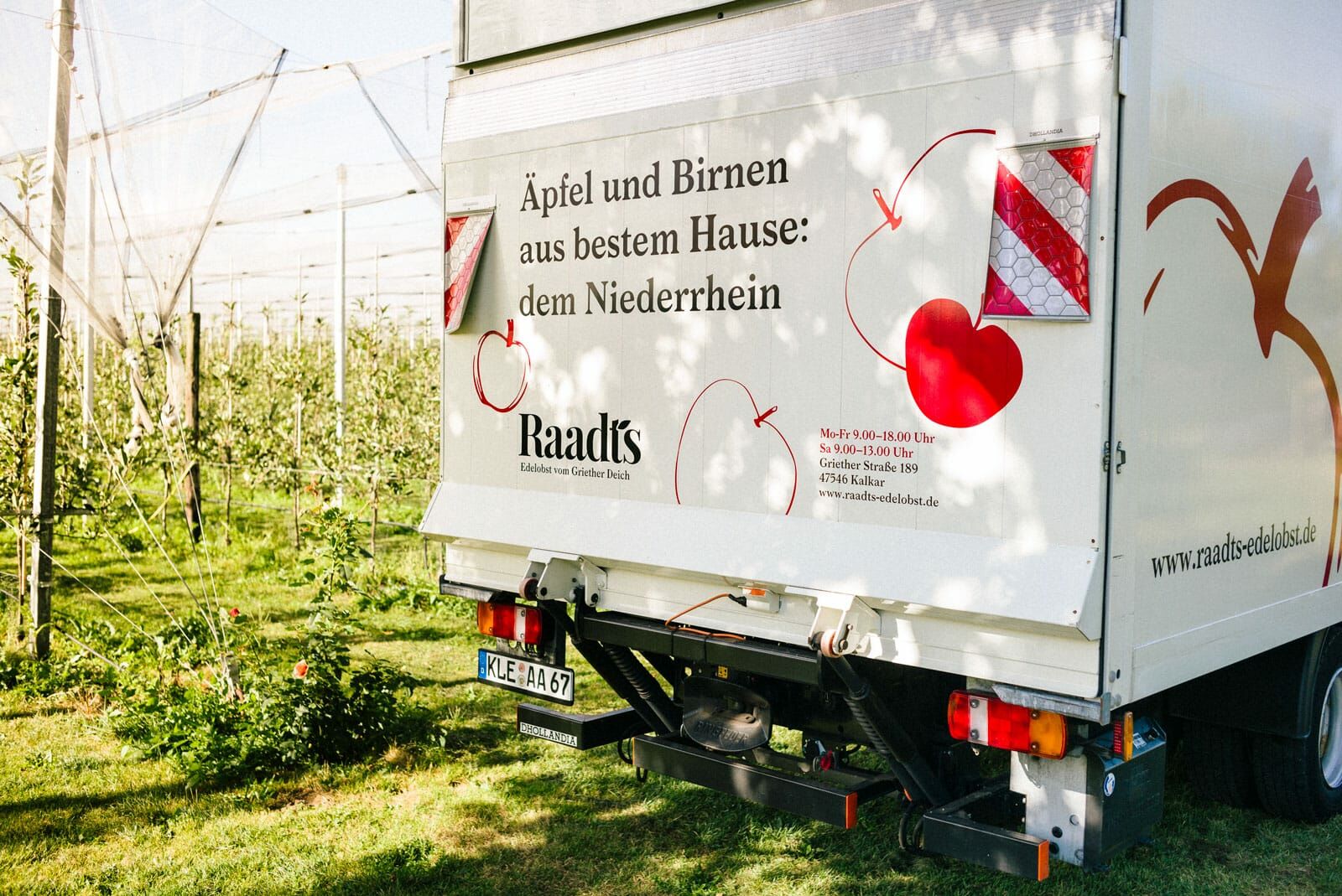
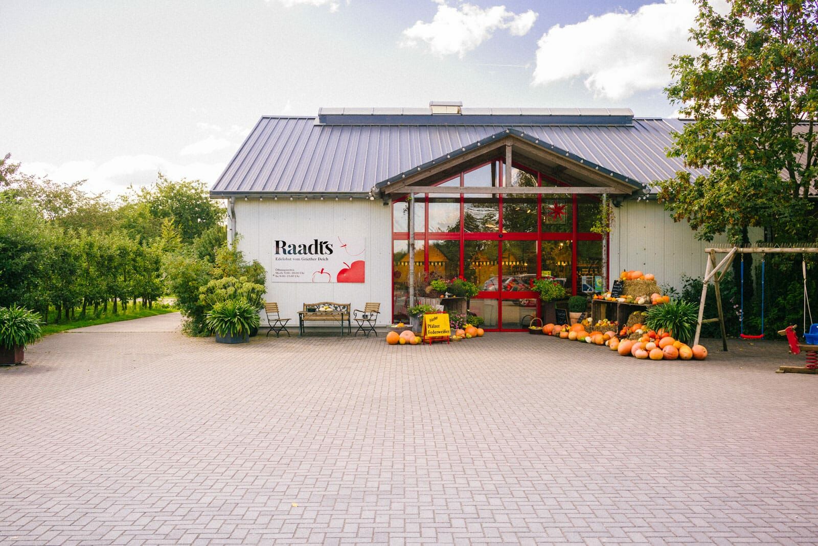
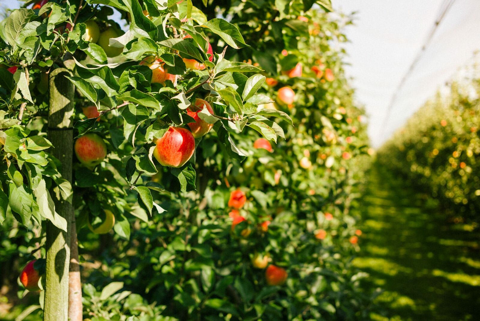
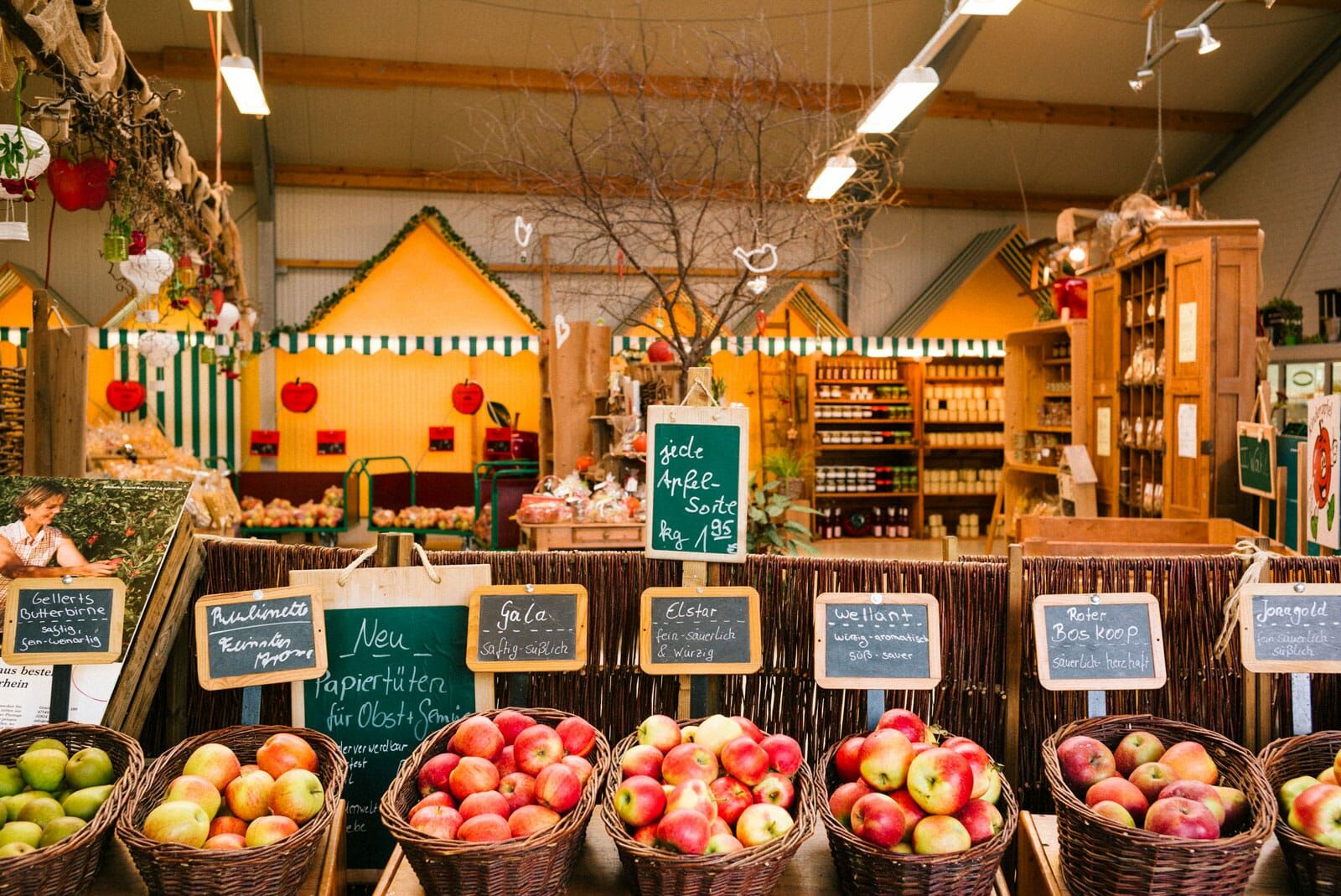
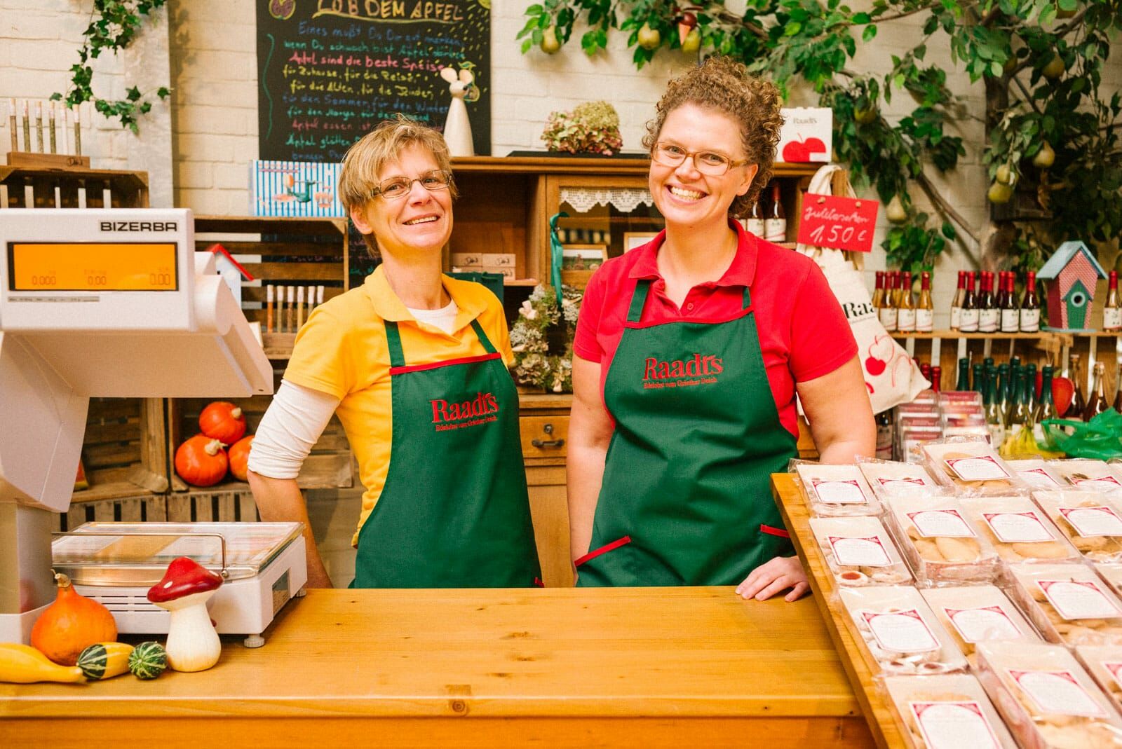
We developed a modern yet timeless look for this third generation family business. The combination of a concise wordmark with a lively visual system makes you want to enjoy their locally produced natural products.
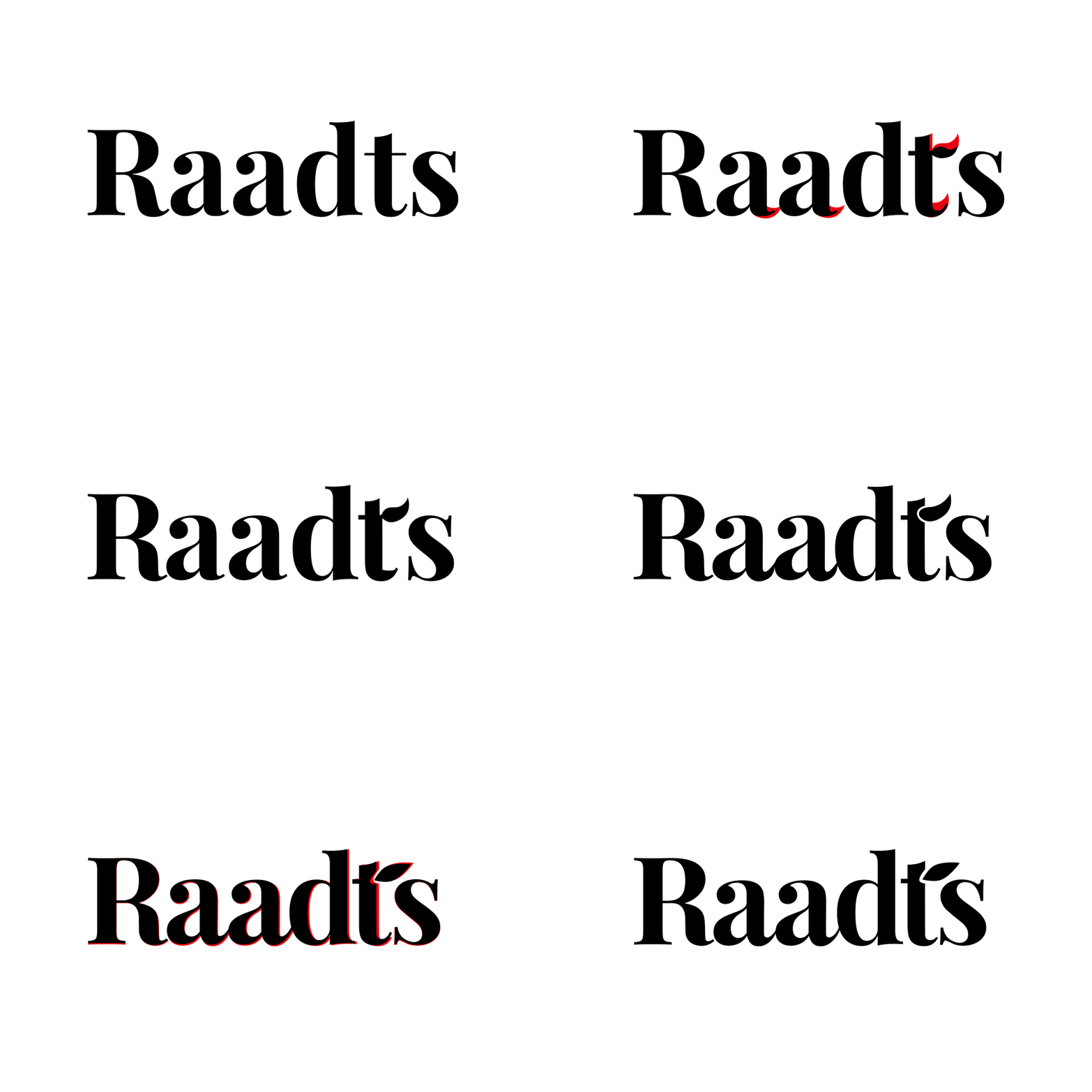
A Curvaceous Logo as a Visual Anchor
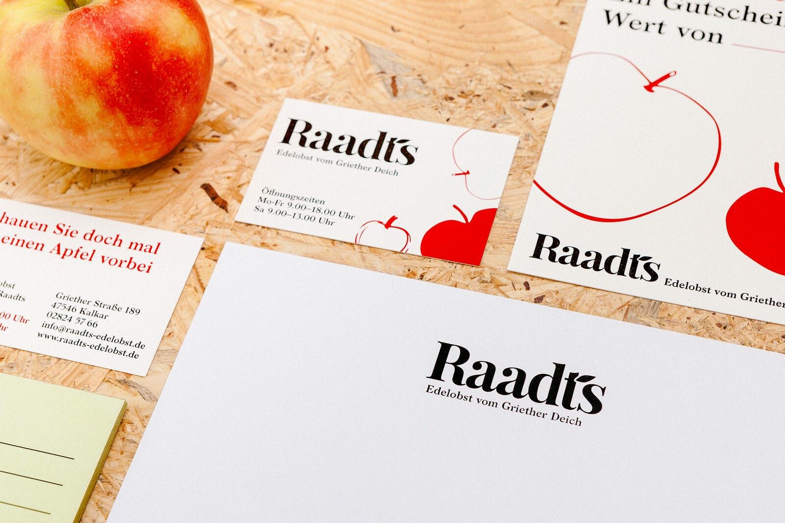
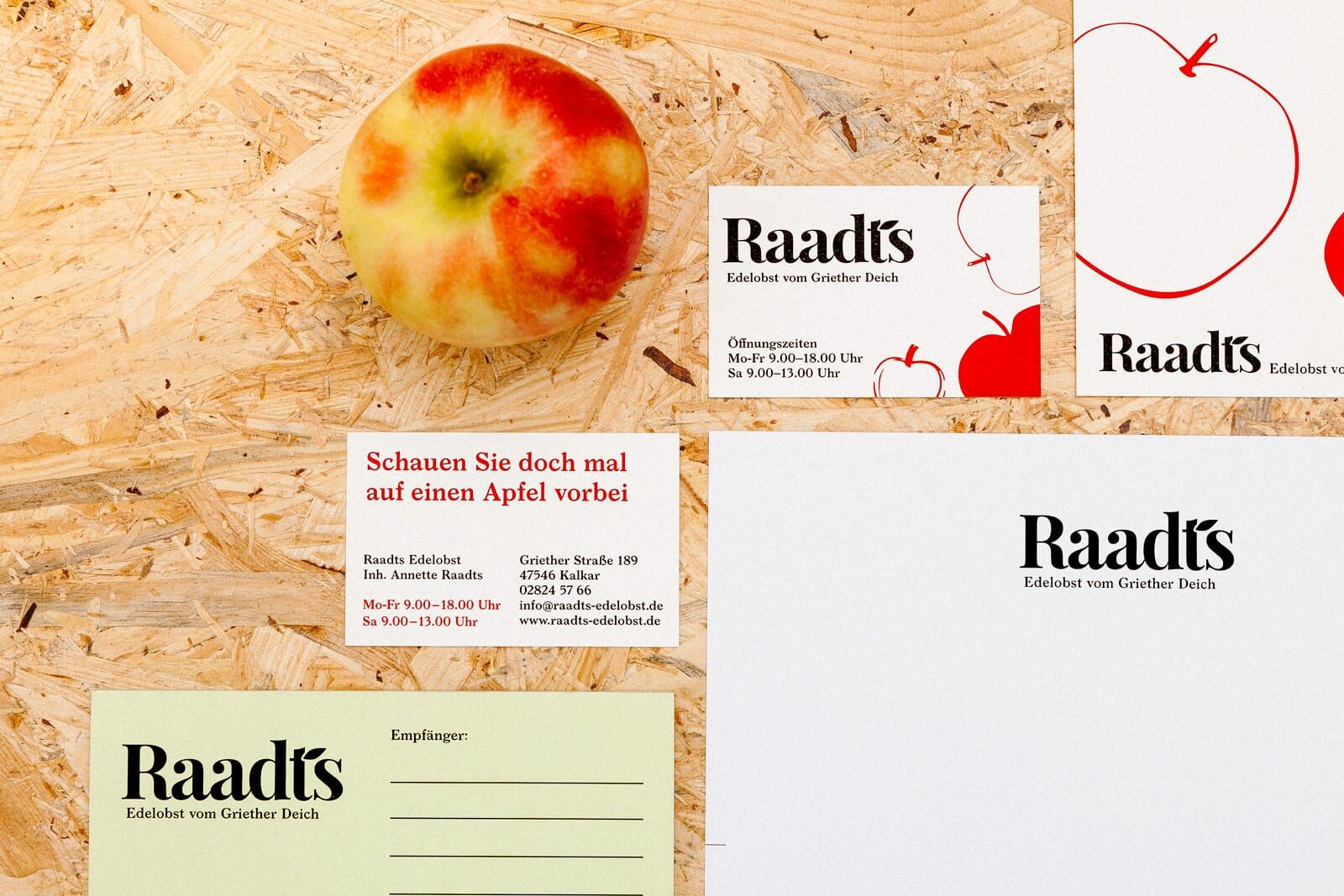
We translated the aesthetic form of an apple into a concise typographical logo. The apple leaf integrated into the letter »t« creates a visual reference to the physical environment on the orchard.
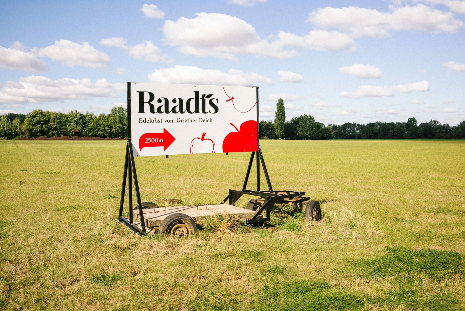
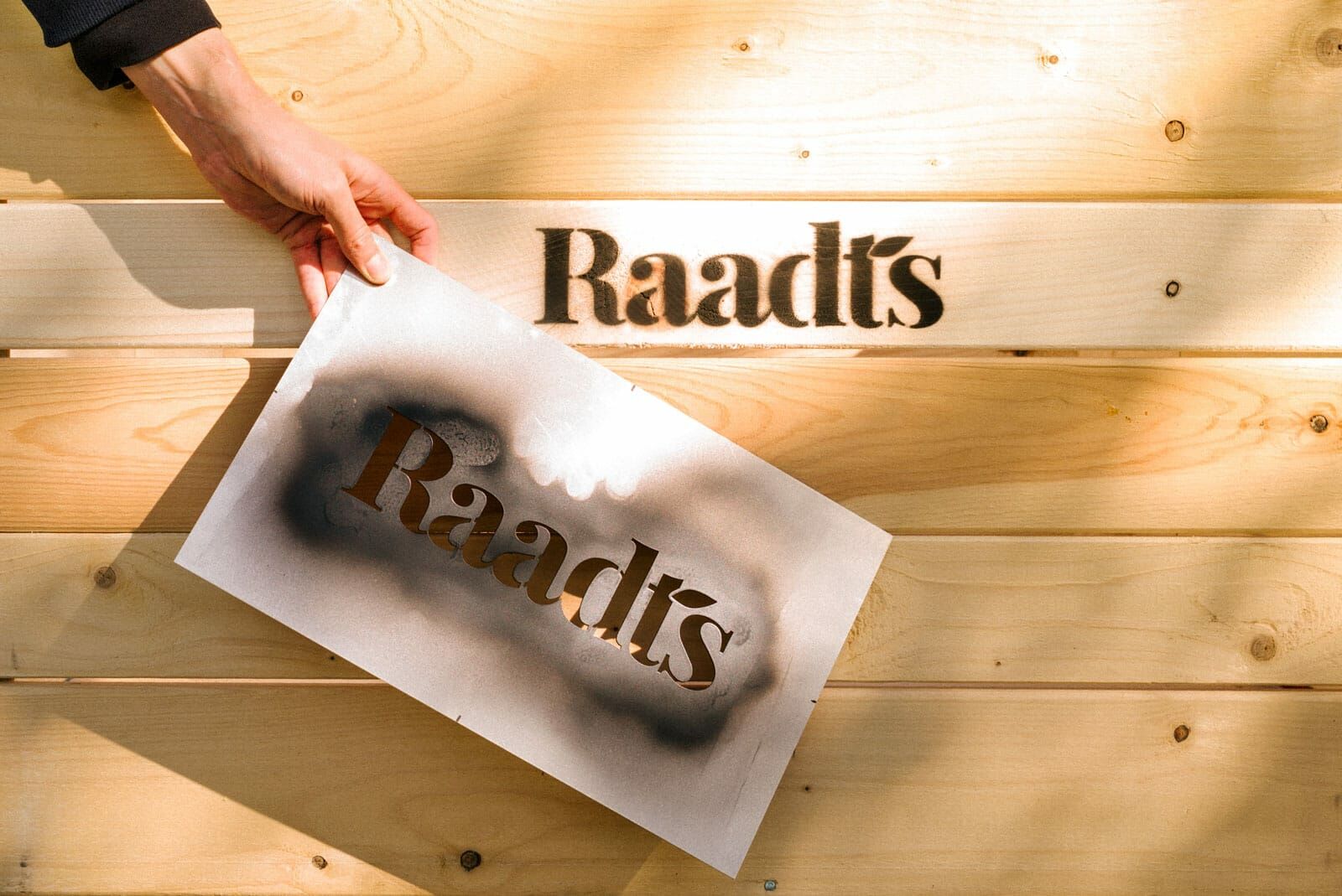
Hand Picked and Hand Drawn
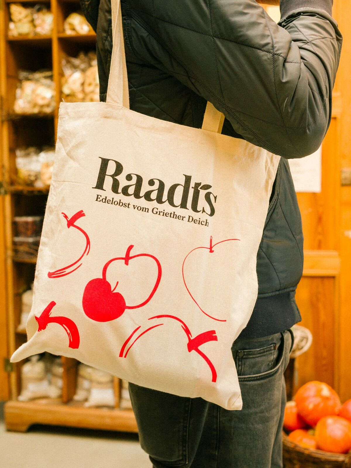
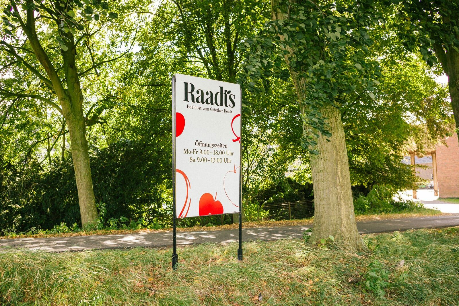
In addition to the word mark, we have developed an easy to use visual system based on hand drawn apples. Each apple is drawn in a different style – just as they appear in nature; no two apples are identical.
Digital View into an Idyllic Apple Orchard
A compact website showcases the apple orchard and farm shop, as well as the philosophy and production of the family business.
