New brand world for a marine start-up that develops sustainable solutions for global plastic pollution
Project description
everwave
Branding
Services:
Branding workshop
Communication strategy
Name finding
Corporate Design
Icon-Set
Copywriting
Art Direction Website
In collaboration with Thanh-Thao Tran, Anna Fitzon, Stephanie Butzen, Gabriel Richter and Marie Volmar
everwave.de
(Execution and Development by friendventure)
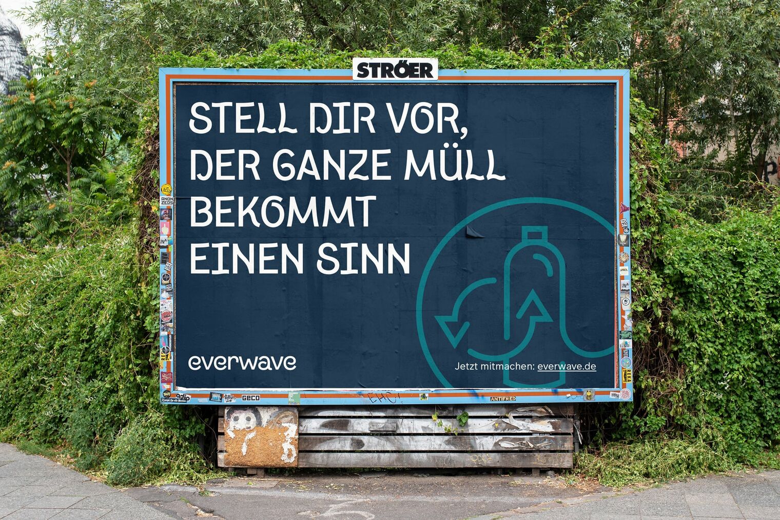
A collective problem that requires collective solutions
When the everwave team approached us, their name was „Pacific Garbage Screening“. The old name was based on CEO Marcella Hansch’s master’s thesis at RWTH Aachen University that developed a platform that filters plastic in the Pacific Ocean. In the meantime, her organization grew considerably and expanded beyond the physical screening of plastic in the Pacific Ocean to holistic approaches that target the entire (vicious) circle of marine pollution. These approaches range from education and awareness campaigns to innovative “Clean-up” products. To do justice to the ambitious new direction the organization has taken, we joined forces to develop a new brand world to inspire people around the world to support everwave’s mission to save the oceans.
A new name to reflect a new focus on recycling management
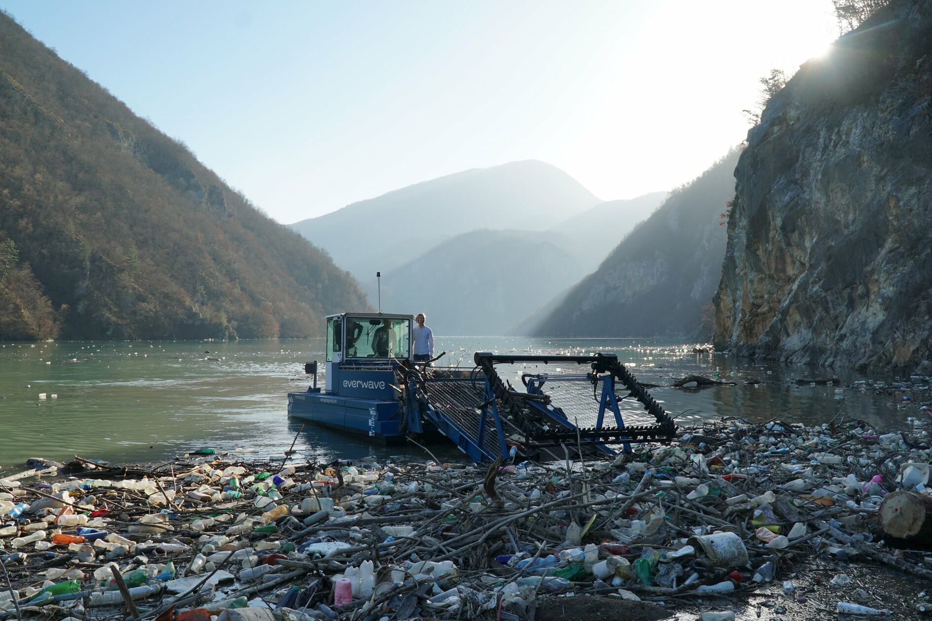
In addition to a strong commitment to environmental education, everwave is developing boats and platforms that trap plastic in rivers to eliminate them from flowing into the sea. The skimmed-off waste is then biotechnologically recycled and begins a new life as a part of the sustainable recycling economy instead of being incinerated or buried at a garbage dump. The organization’s new name is not only memorable and accessible but also refers to the holistic approach to combating marine pollution that goes beyond engineering solutions.
A strong symbol that is easily drawn in the sand
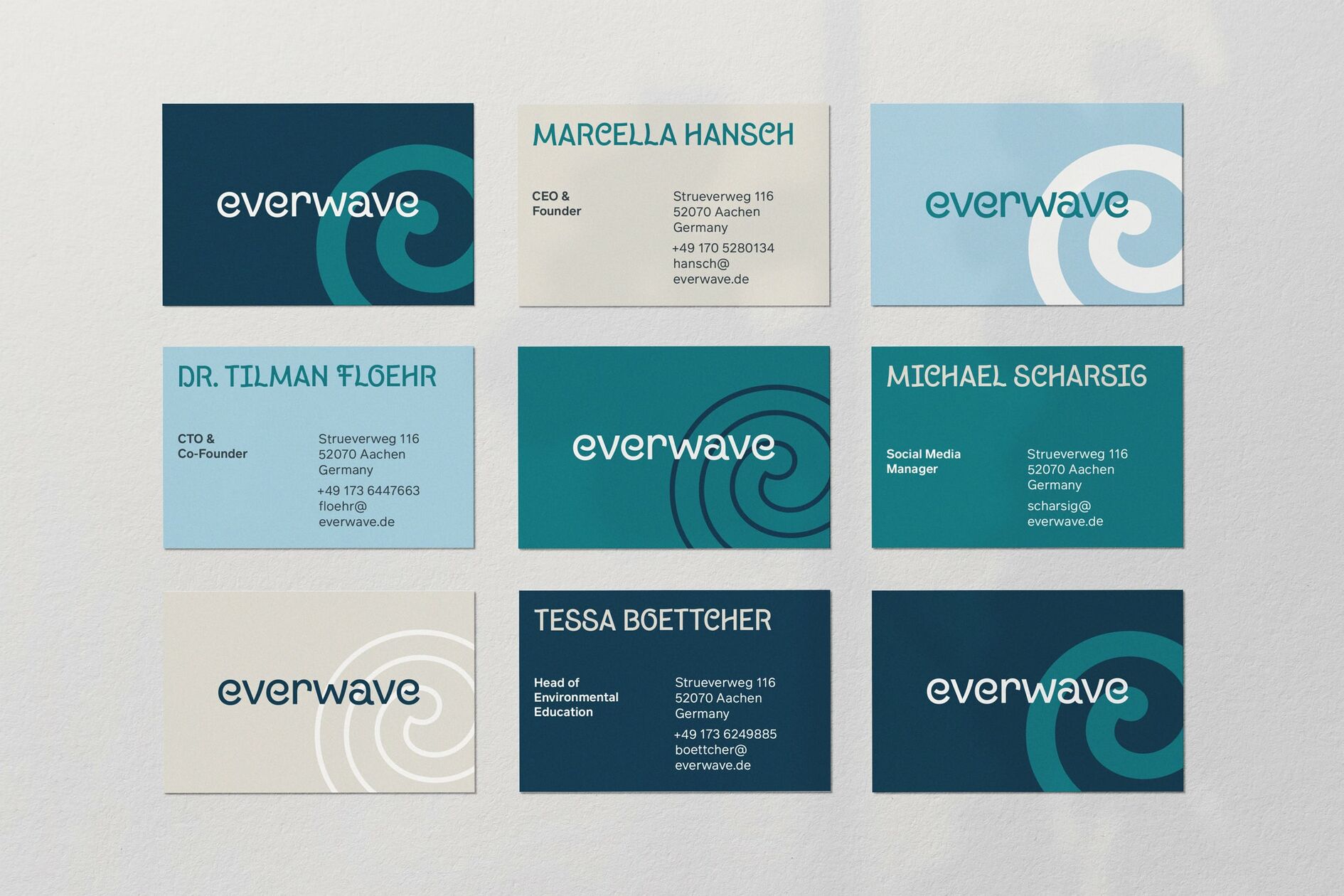
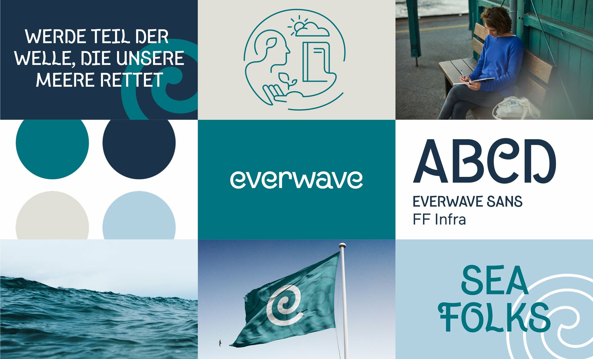
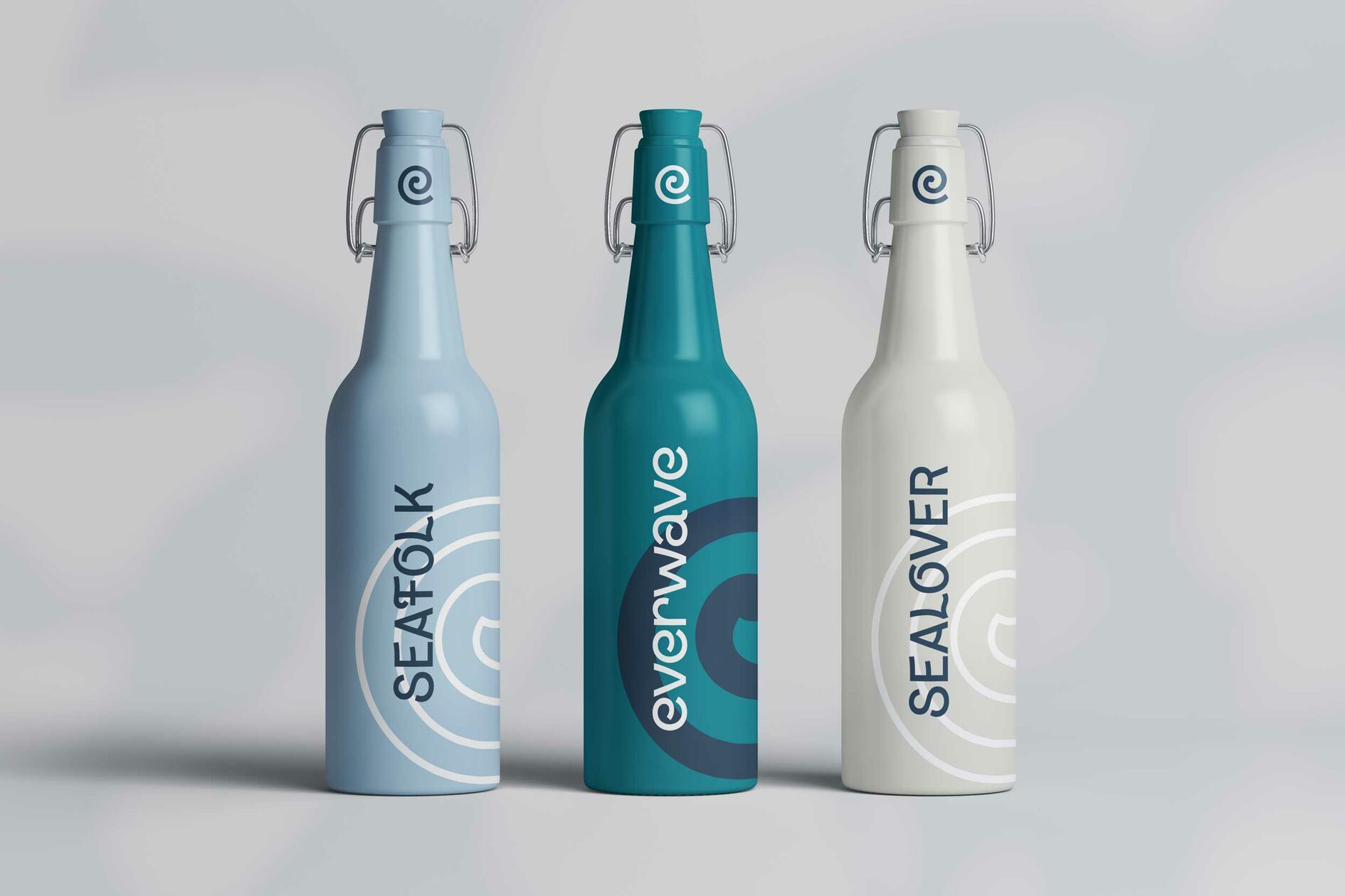
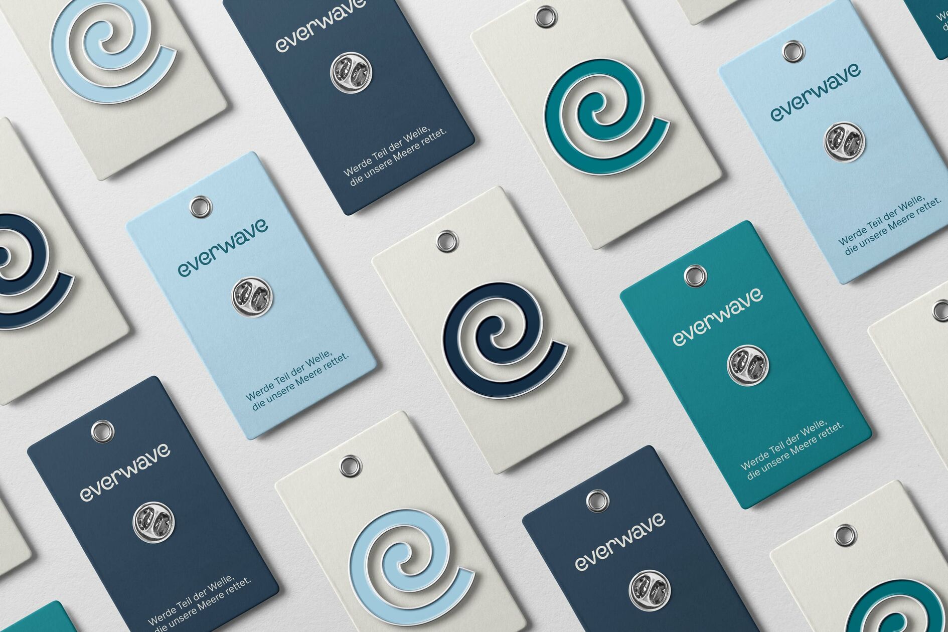
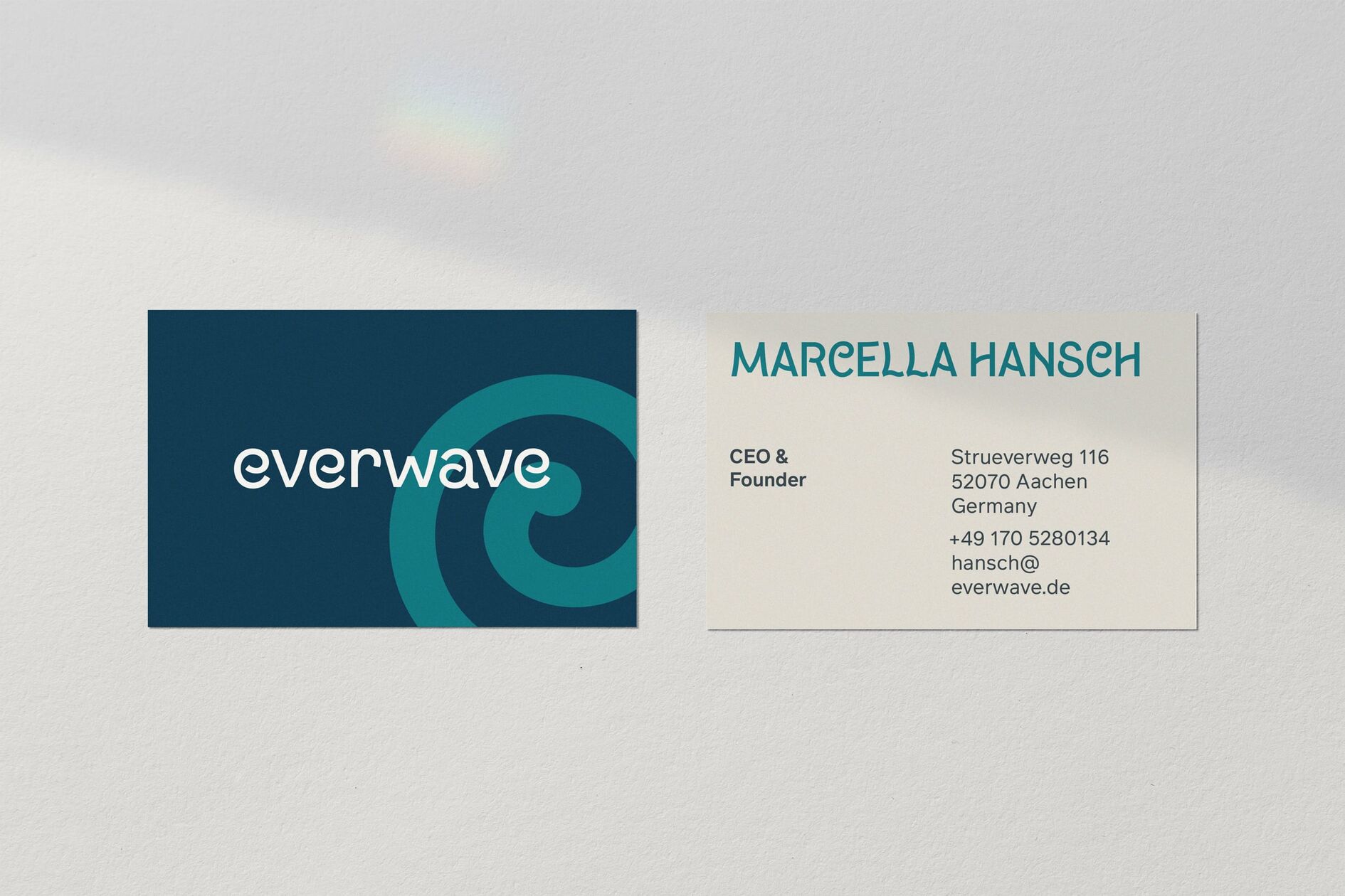
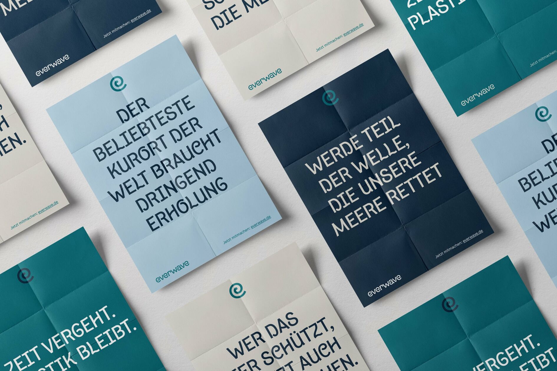
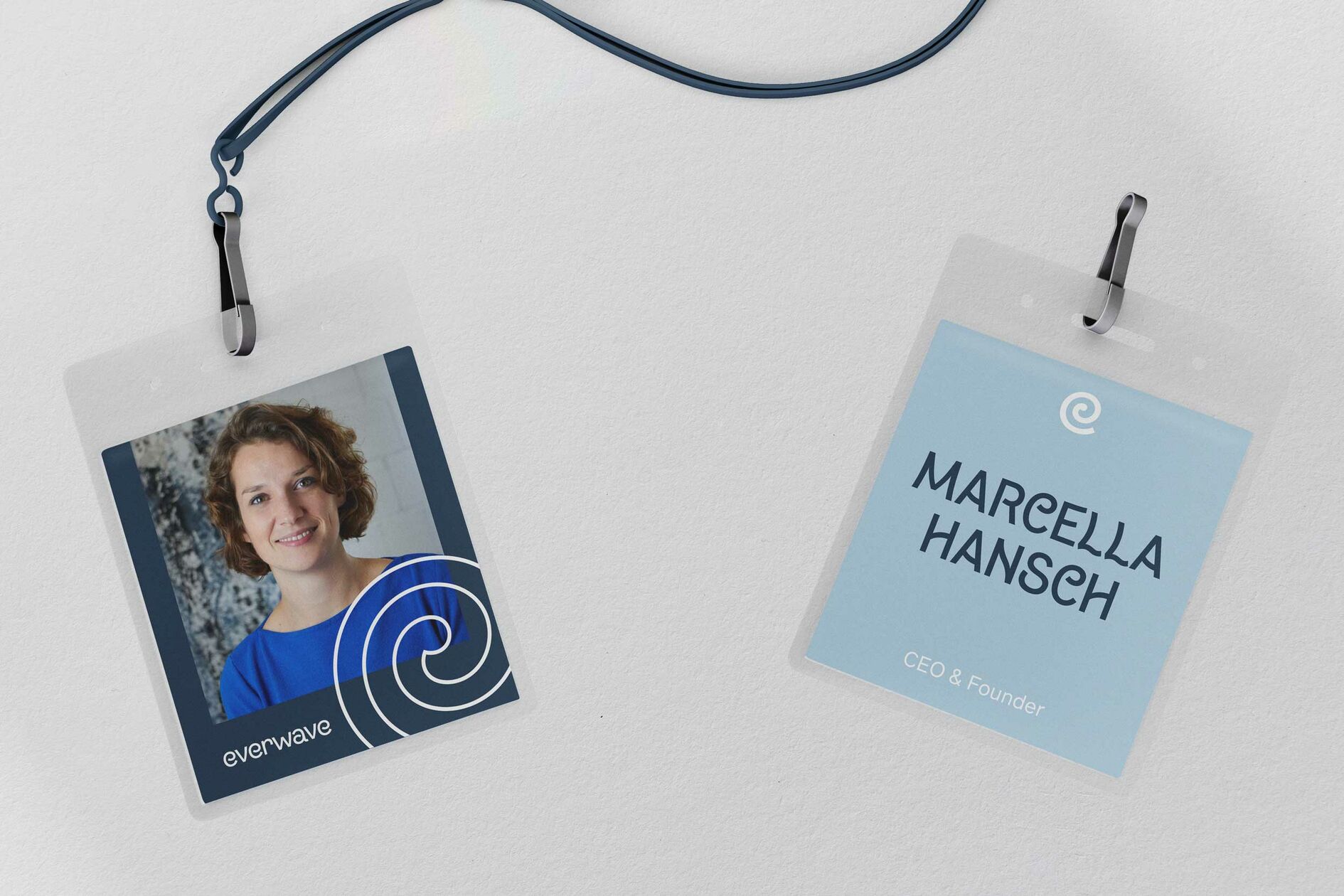
The new everwave logo is radically minimalist, yet reflects the most important facets of the brand personality. The „e“, formally adapted to the new headline font, reveals a stylized, breaking wave in the negative space that refers to the ideals of a sustainable recycling economy.
An independent, typographic voice for our seas
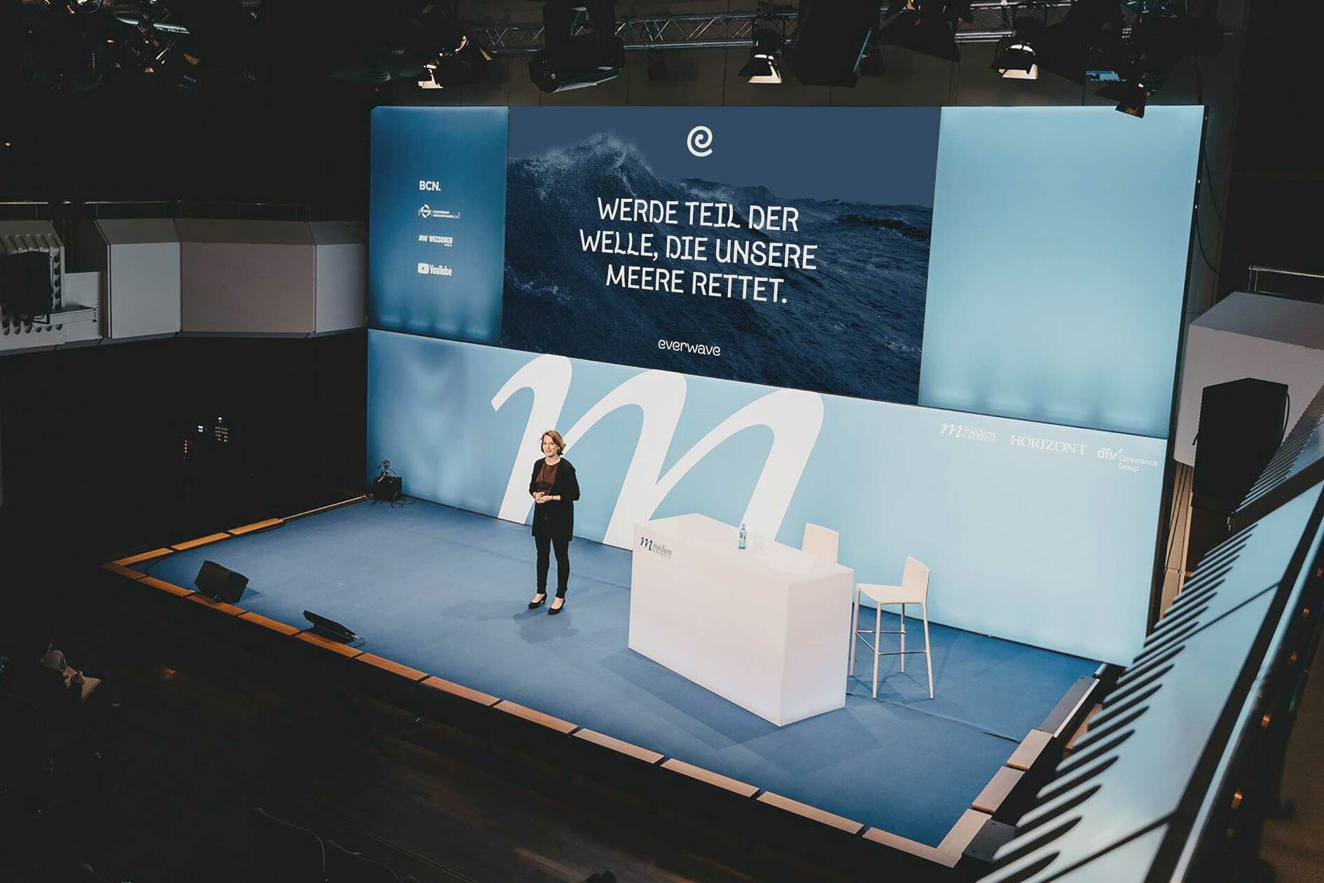
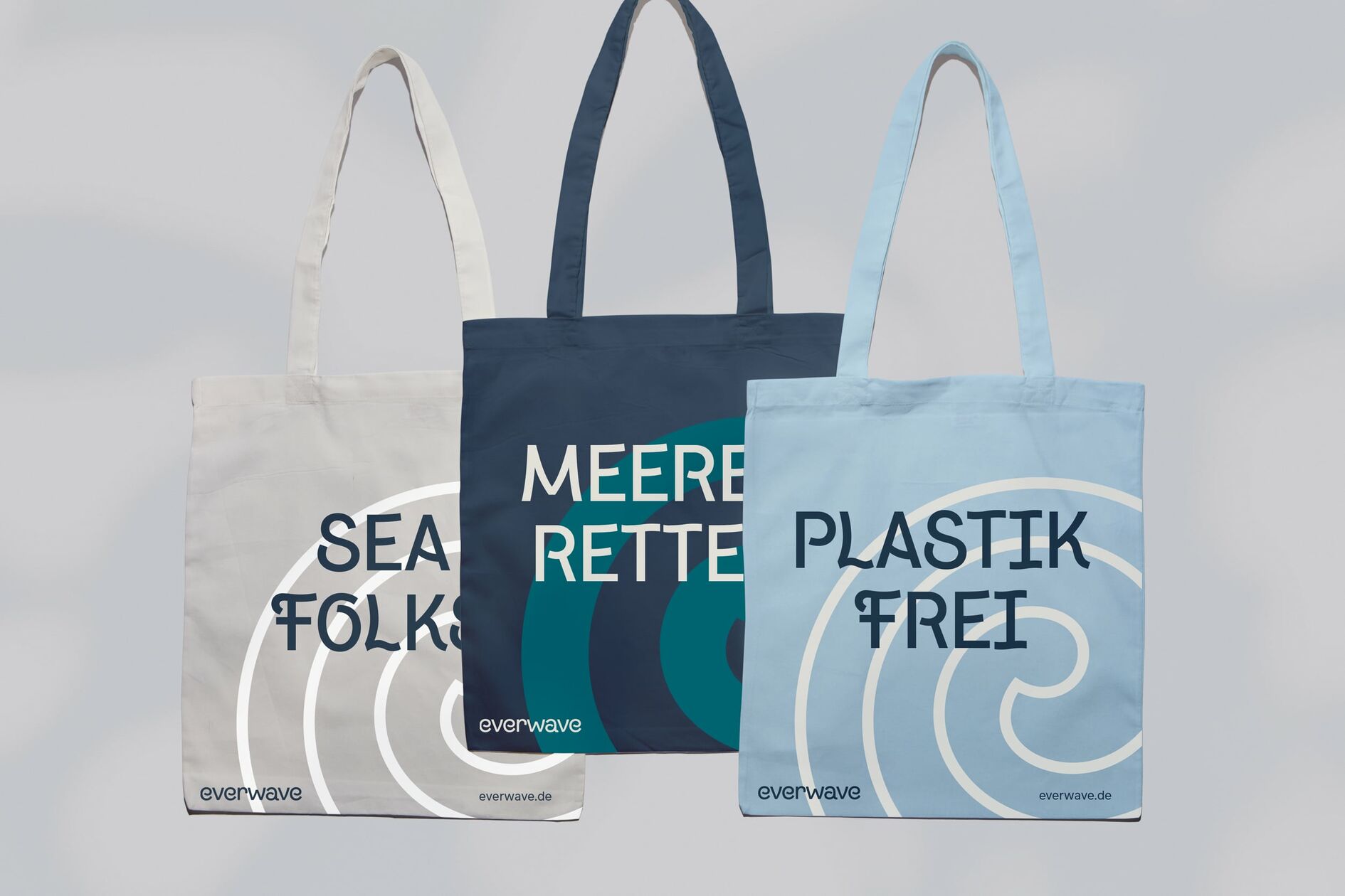
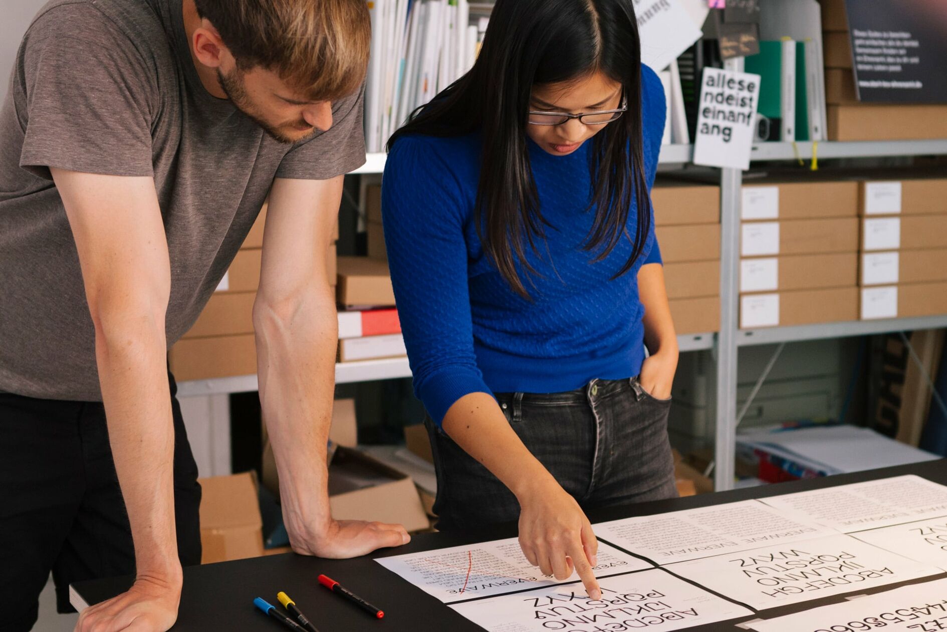
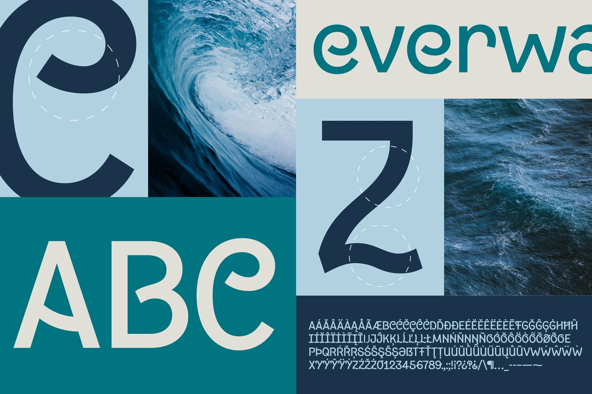
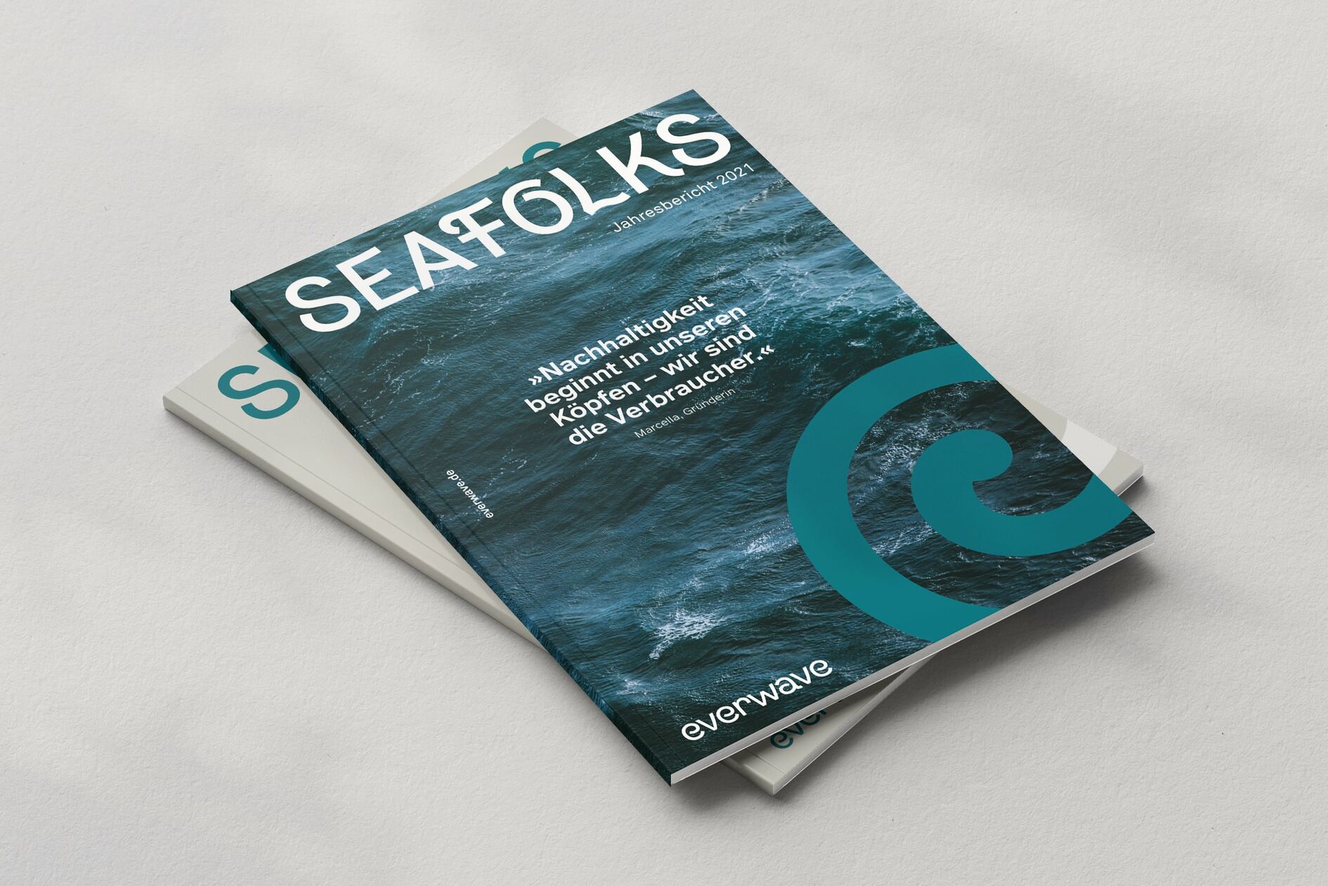
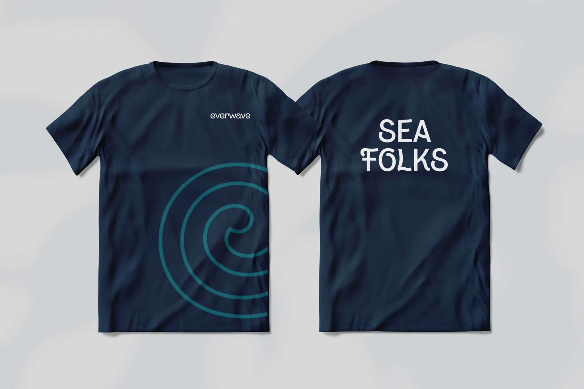
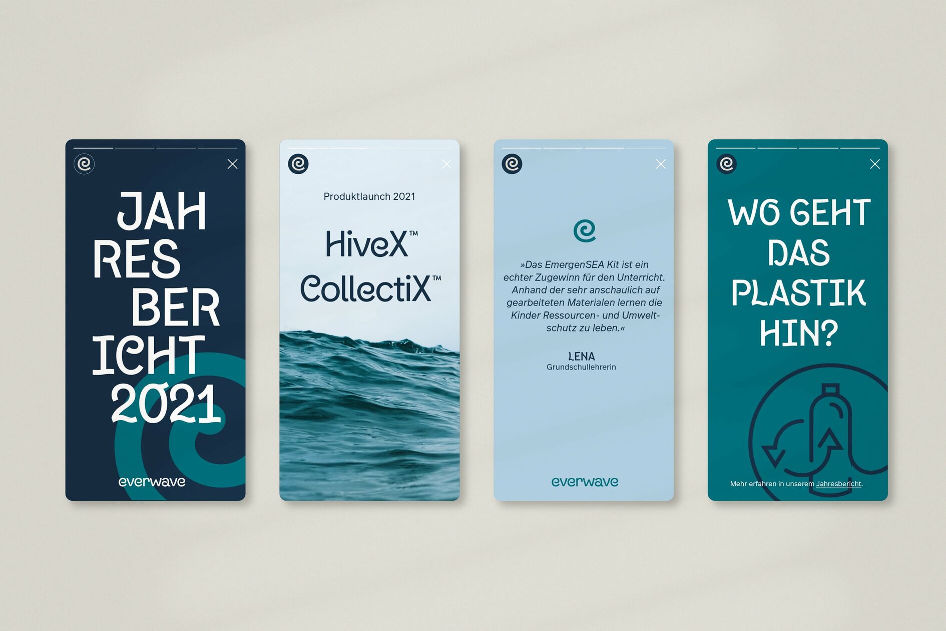
We designed a new headline font exclusively for everwave, in cooperation with type designer Gabriel Richter, to give its mission a distinctive voice. Subtle, typographic references to water and waves create a typeface with a strong character that is friendly and engaging. We round off the typographic system with a functional grotesque typeface that serves as an objective counterpart to the new headline font.
A color world derived from the different colors of the sea
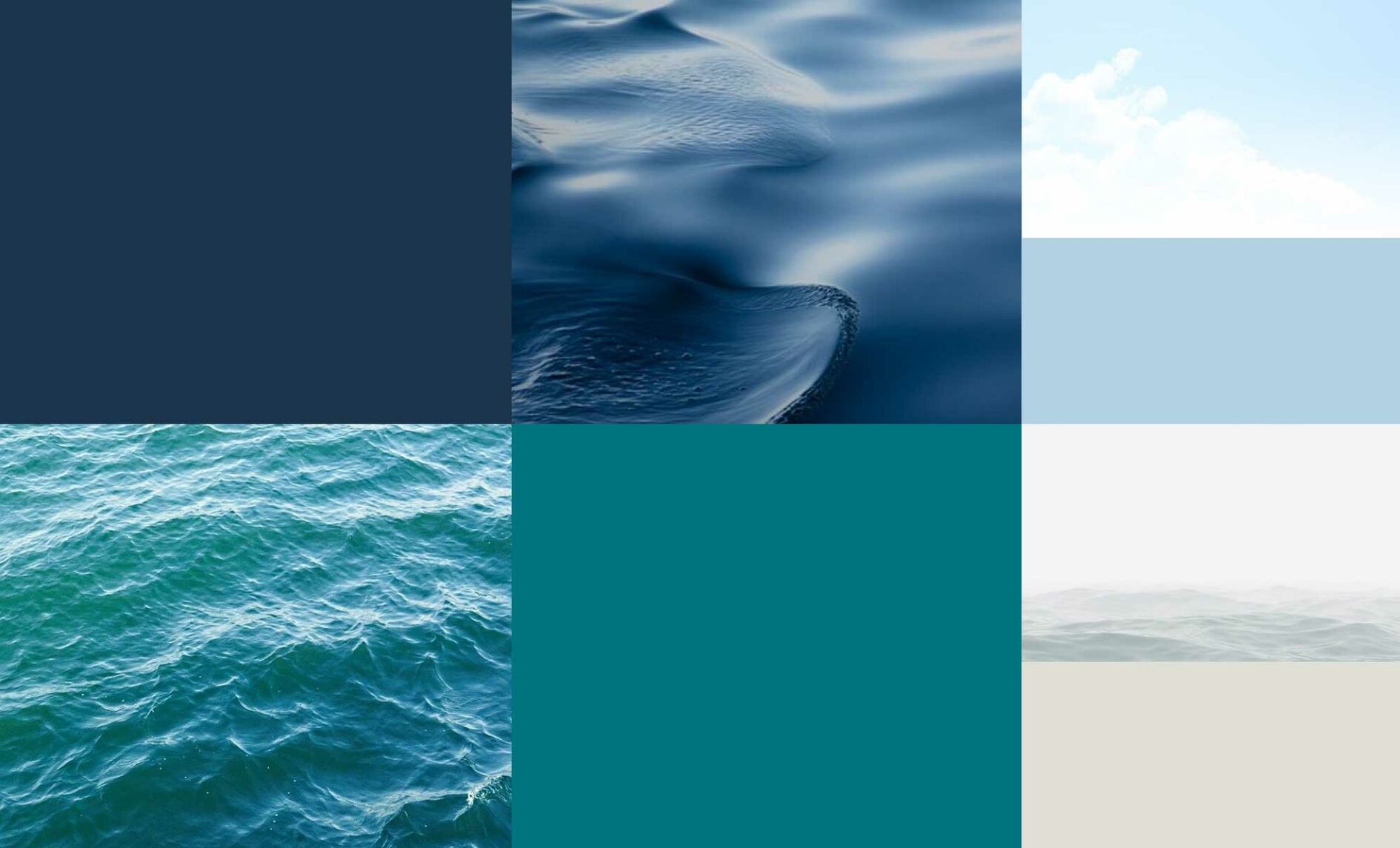
The overriding goal of everwave’s brand identity is to make the value and beauty of the world’s oceans tangible. In addition to oceanic references built into the typography, we extracted colors directly from the many shades of the ocean.
Icons visualize different facets of the organization’s holistic approach
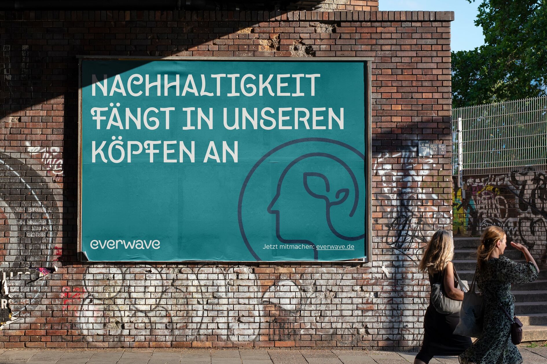
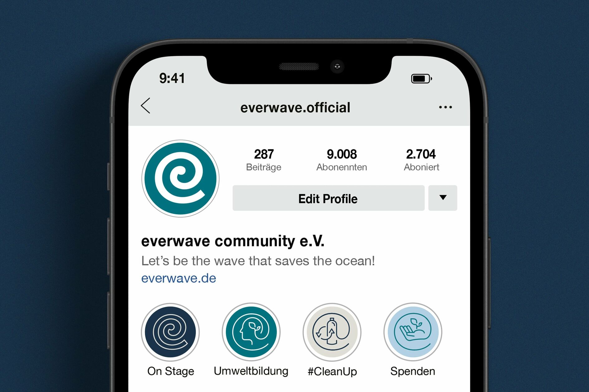
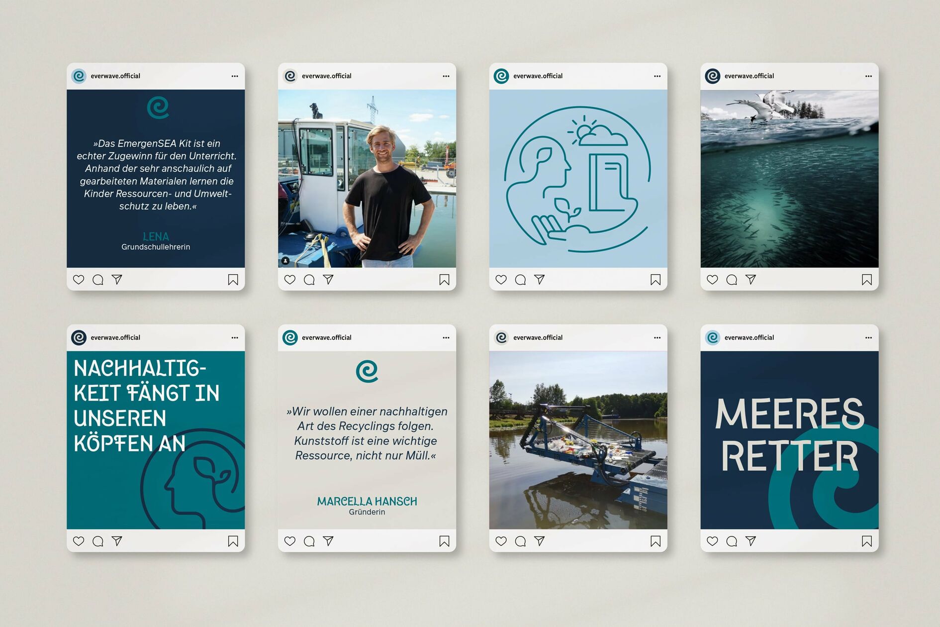
By combining technological innovation with ecological inspiration, everwave makes a measurable contribution to a sustainable future. Two key visuals composed of individual icons represent the two core activities that make up the bulk of the organizations’ work.
Sustainability begins in our minds
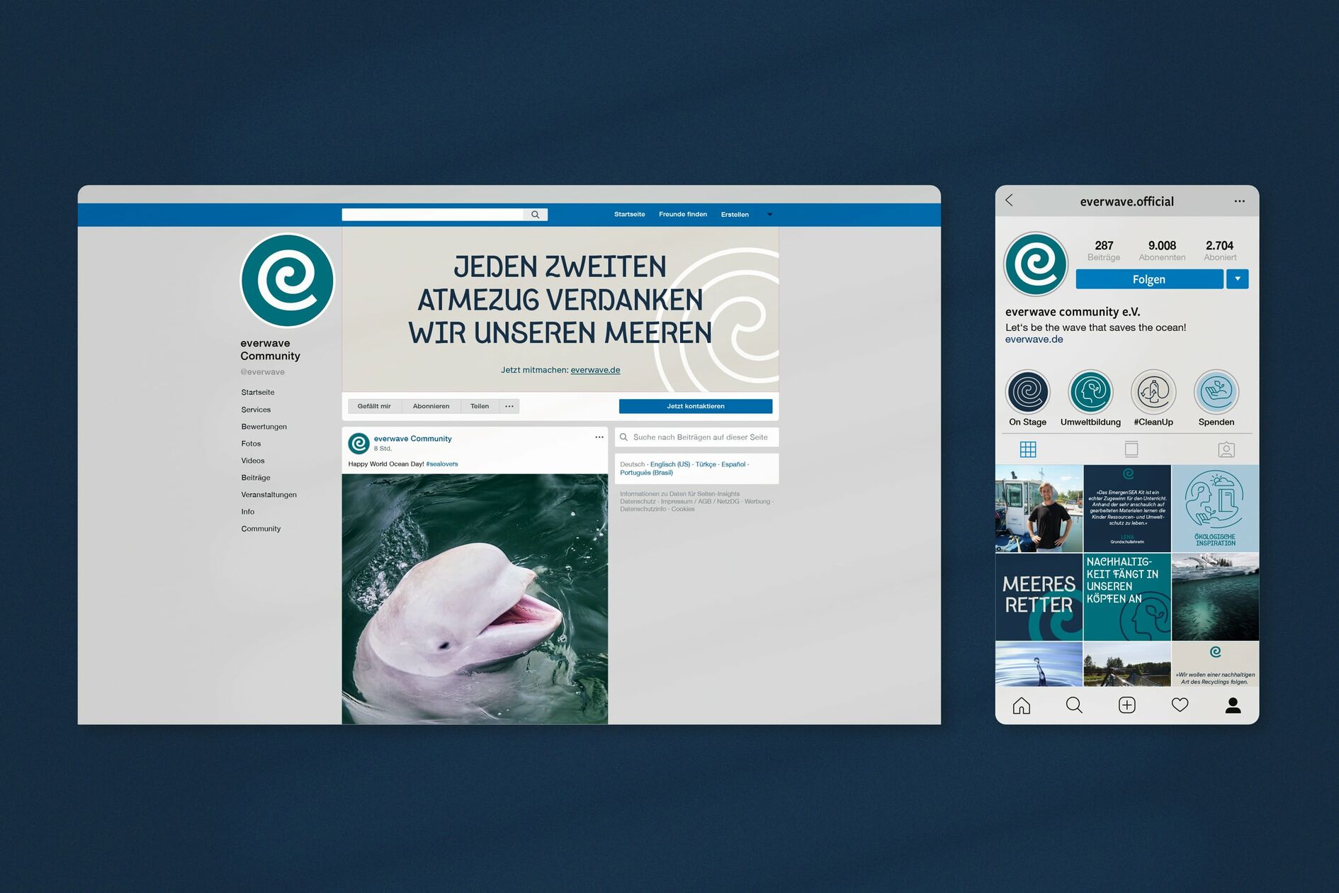
everwave’s new brand identity creates a spirit of optimism and addresses many stakeholders including the general public, investors, as well as scientific and political partners. After all, we are all in the same boat - global marine pollution can only be solved by working together. We are proud to be able to contribute to this ambitious goal with our work.
