Branding and website design for an interdisciplinary research group opening new horizons in understanding the human brain
Project description
Julich Brain Atlas
Branding and website
Services:
Branding workshop
Communication strategy
Corporate design
Art direction
Editorial design
Copywriting and editing
Web design
Frontend programming
Backend programming
In cooperation with Thanh-Thao Tran and awwwesome
Photography: Mareen Fischinger

New ways to communicate science
Since the dawn of time, we humans have explored and mapped the world around us. On the other hand, our brains are largely uncharted territory. To change that, a team of neuroscientists and AI, and supercomputing experts from the Jülich Research Centre (Forschungszentrum Jülich) and Heinrich-Heine-University Düsseldorf, are developing a three-dimensional atlas that combines all facets of what we know about the human brain in an open-source interface. This atlas serves as a navigation system, similar to google maps, for researchers and physicians to better understand the intricacies of the human brain. Our task was to develop a succinct brand identity for the research project within the Human Brain Project that adequately conveys genuine fascination for the human brain and makes their findings accessible to the general public.
Making different levels of brain research visible
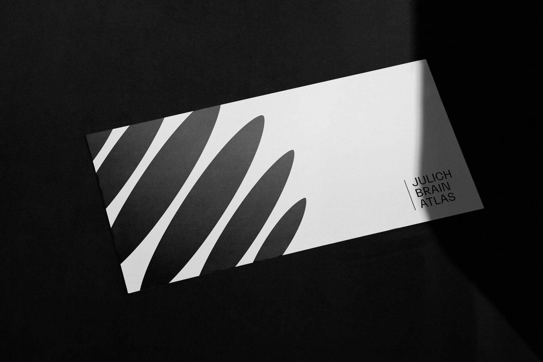
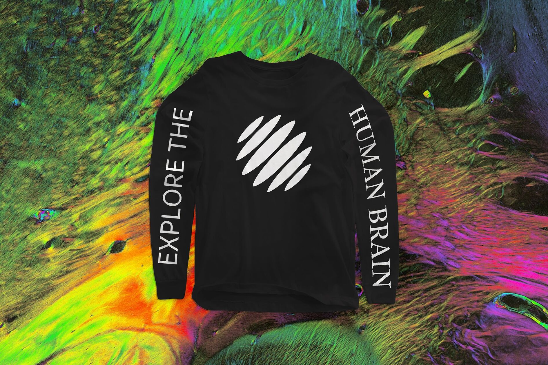
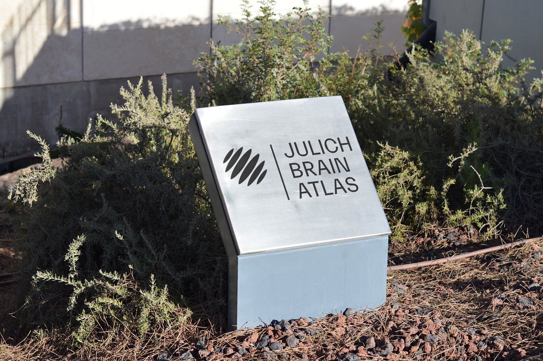
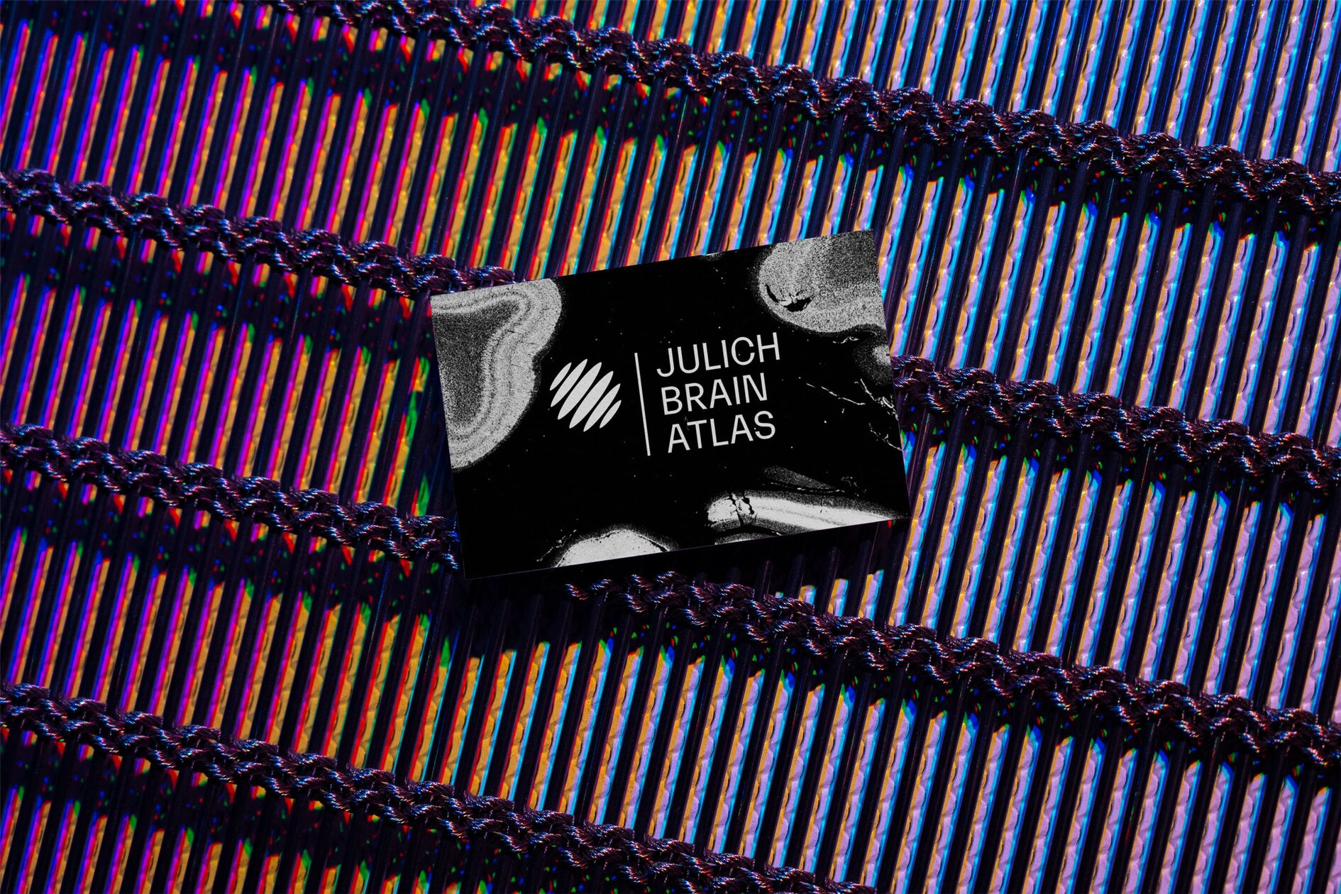
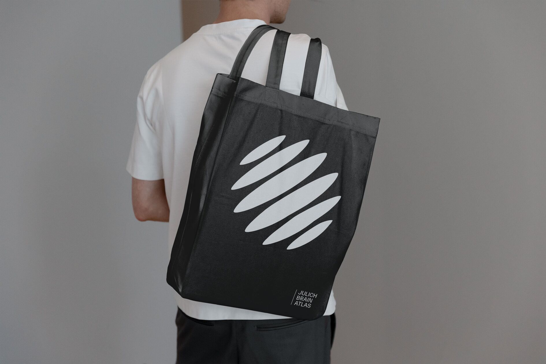
The central organizing theme behind the Julich Brain Atlas project is to implement an interdisciplinary approach to brain research. Generating, communicating, and linking knowledge about the human brain at different levels of analysis all play key parts in the project. Even the atlas itself functions at varying levels of resolution - from the global view down to the cellular level of neurotransmitter receptors. The new logo juxtaposes the image of a brain with a globe, organized by layered planes, referring to the project’s goal to link all disciplines of brain research together.
Technical objectivity meets humanistic expression
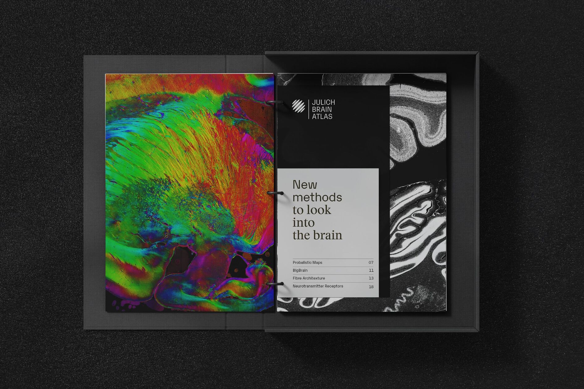
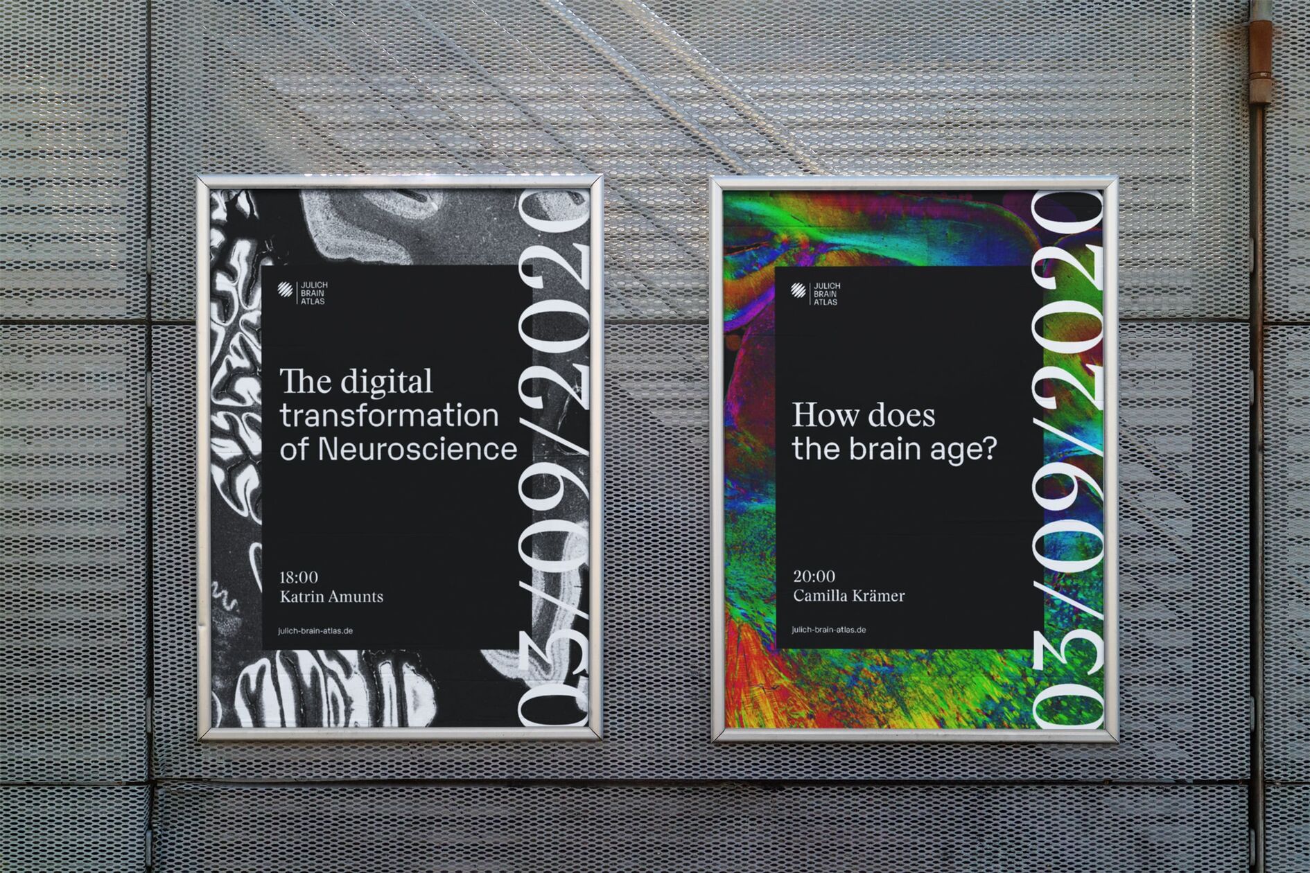
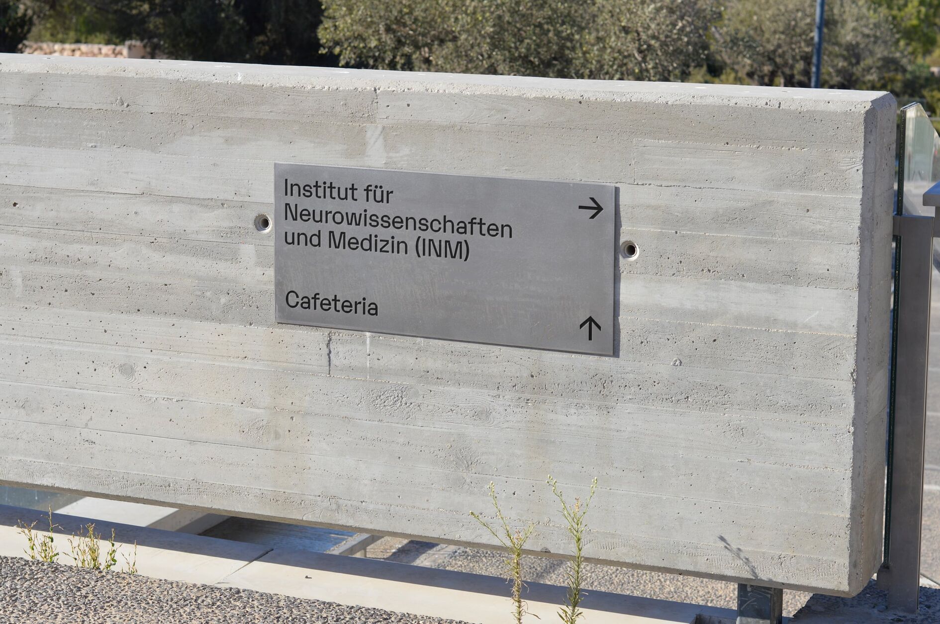
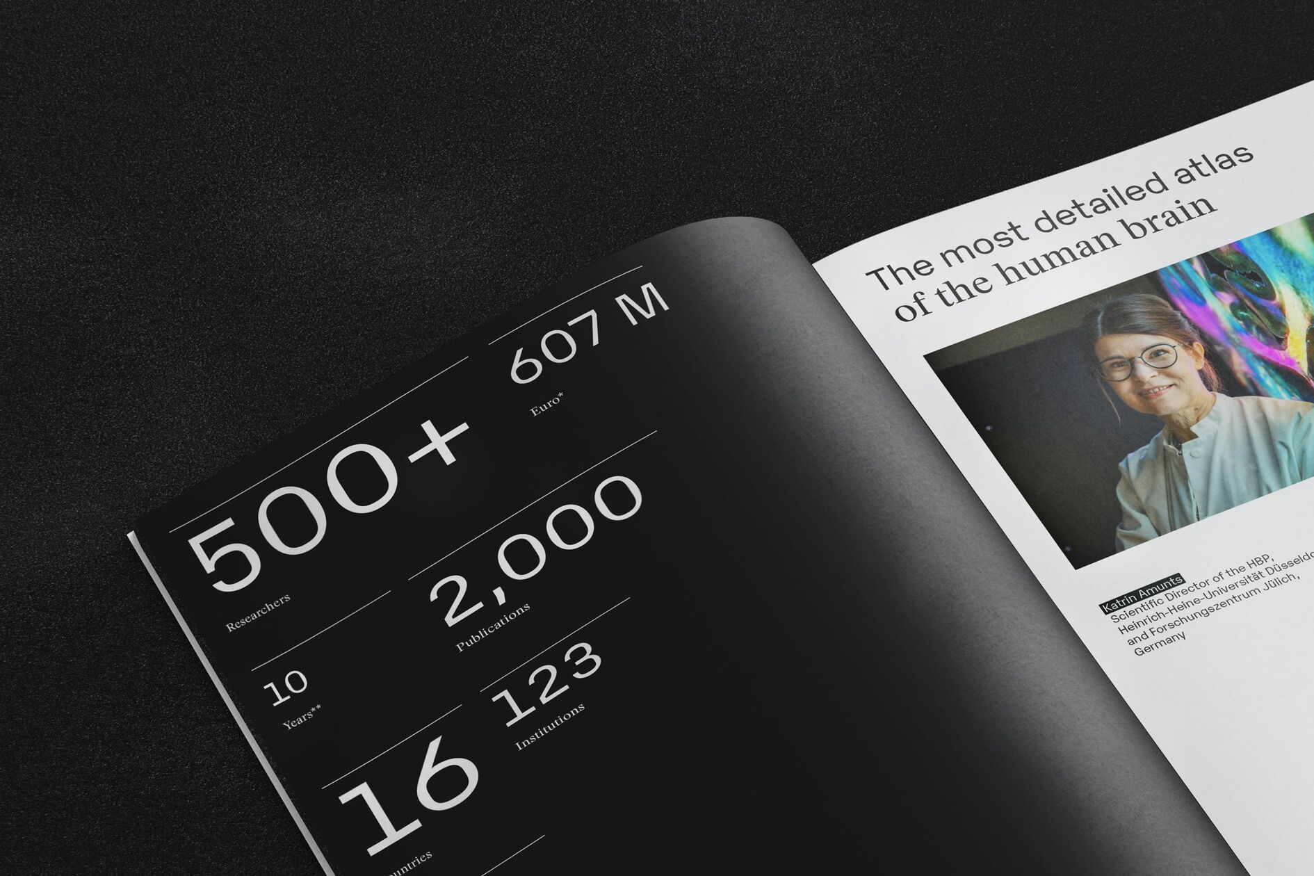
We combined the mechanistic font „Karelia“ with the nostalgic font „Stanley“, which was developed by Swiss type designer Ludovic Balland, to visually represent the project’s multidisciplinary nature. We also create additional visual tension throughout the entire design system by superimposing text onto images to present information at different levels of analysis.
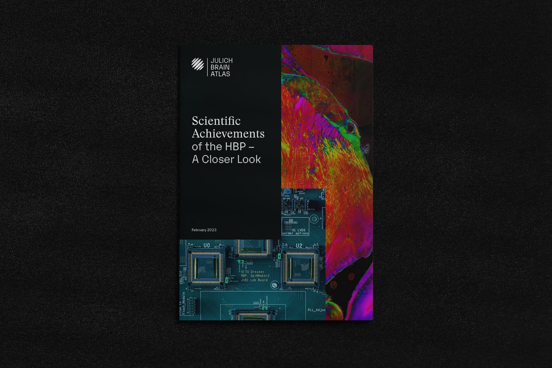
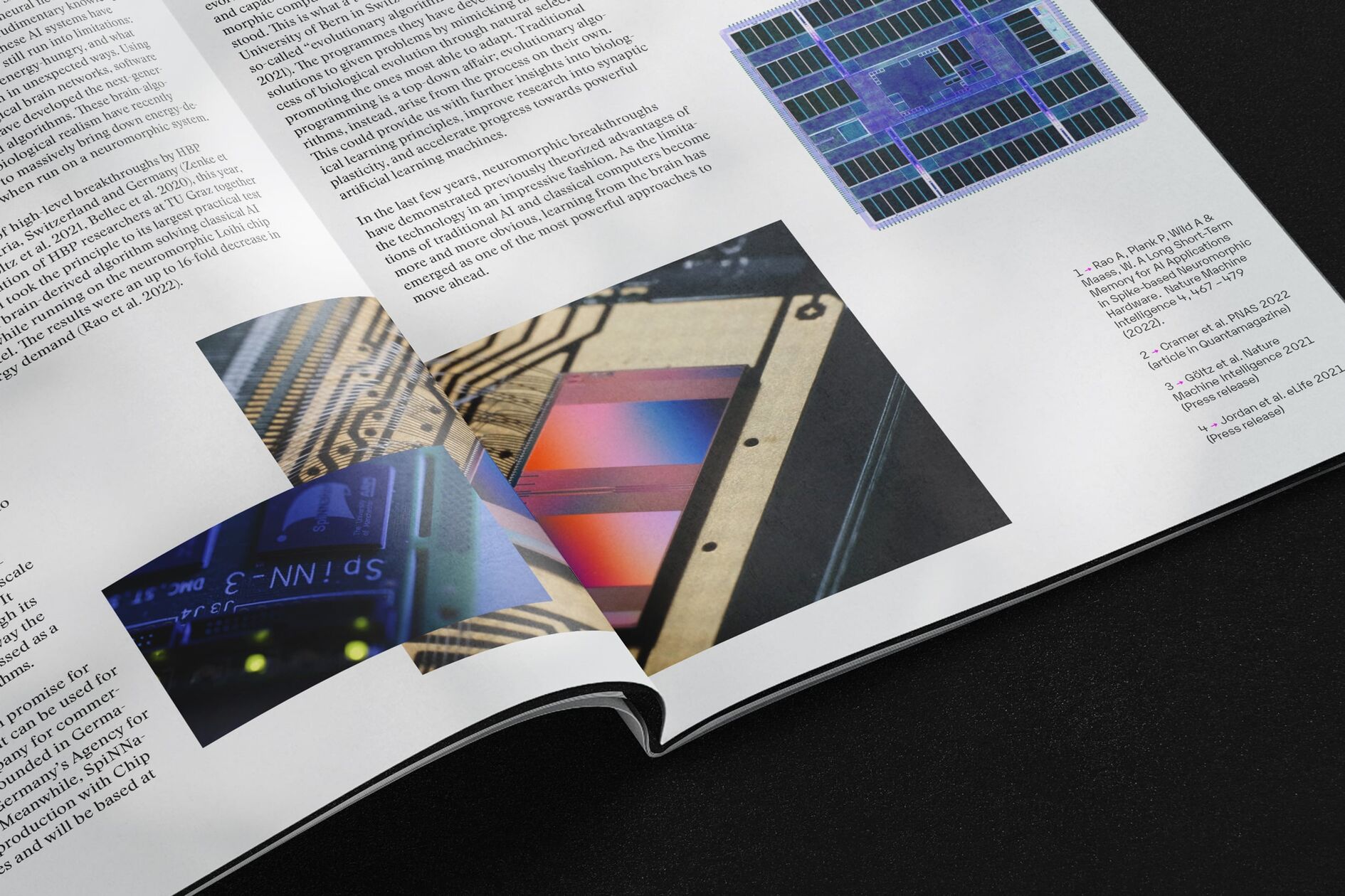

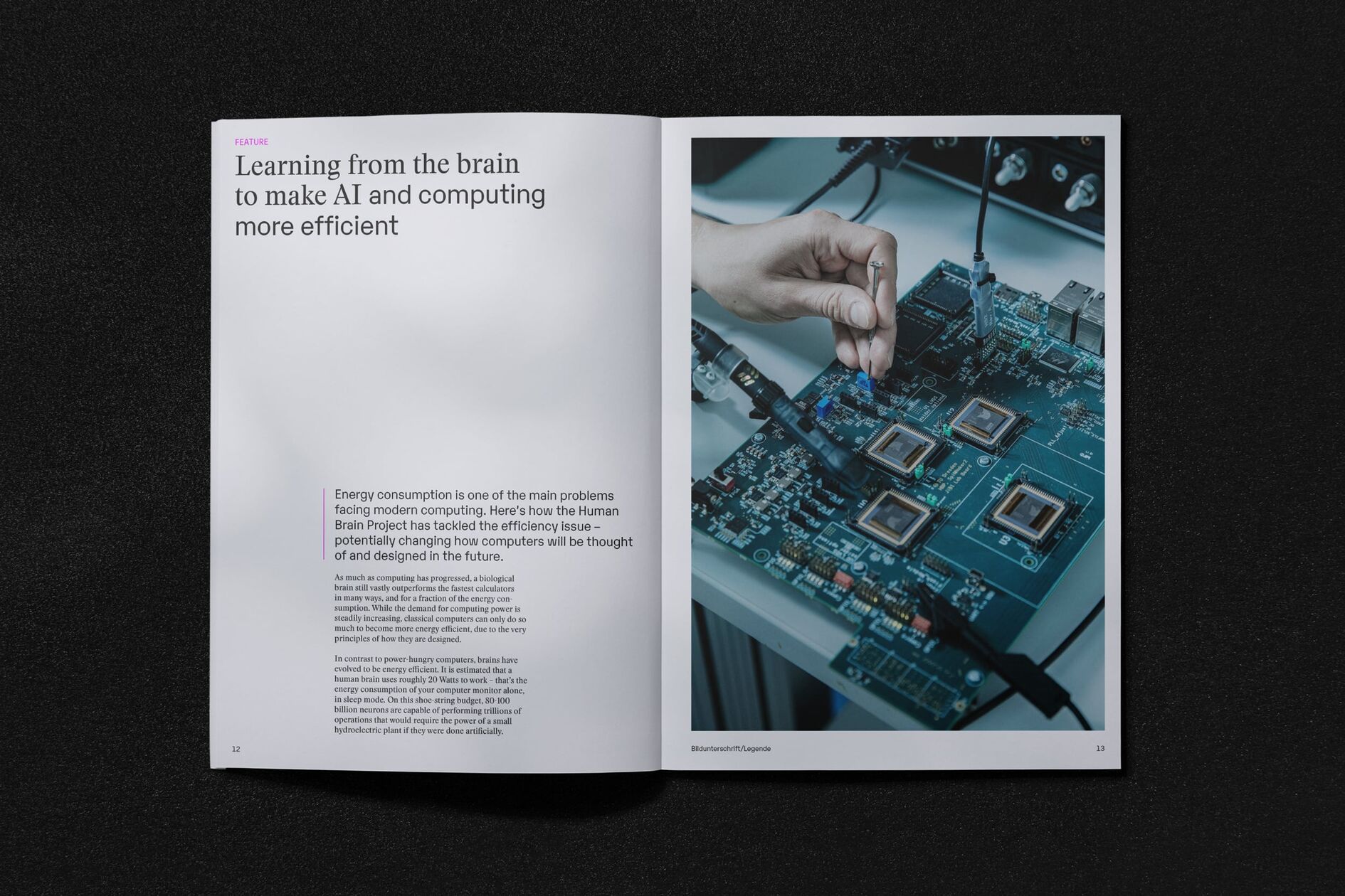
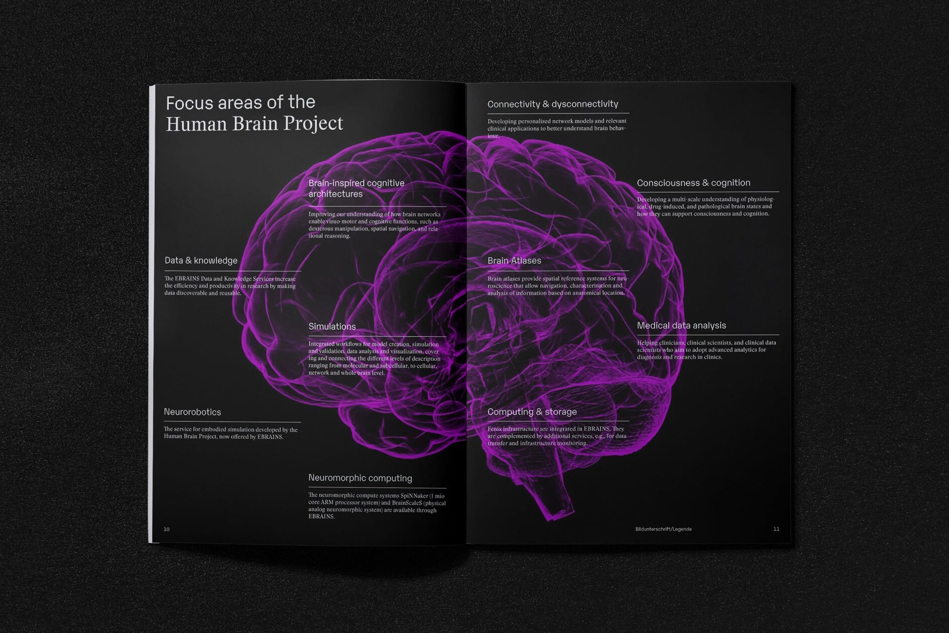
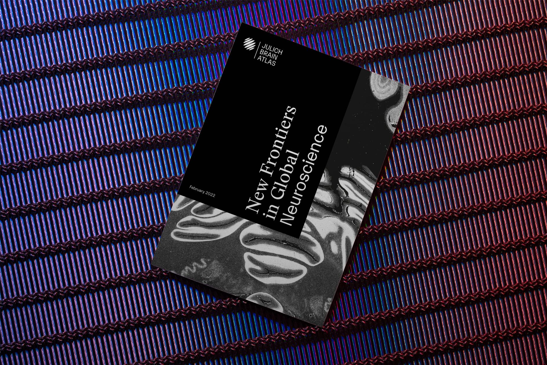
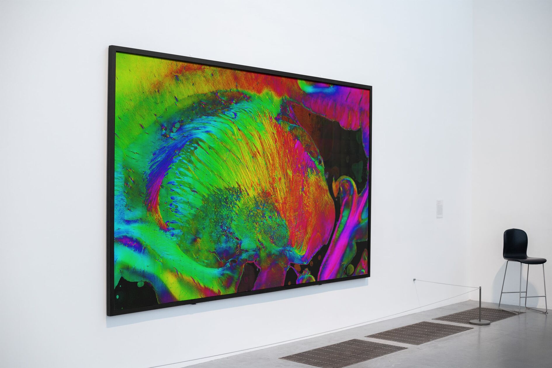
Gray matter - razor-sharp and in color
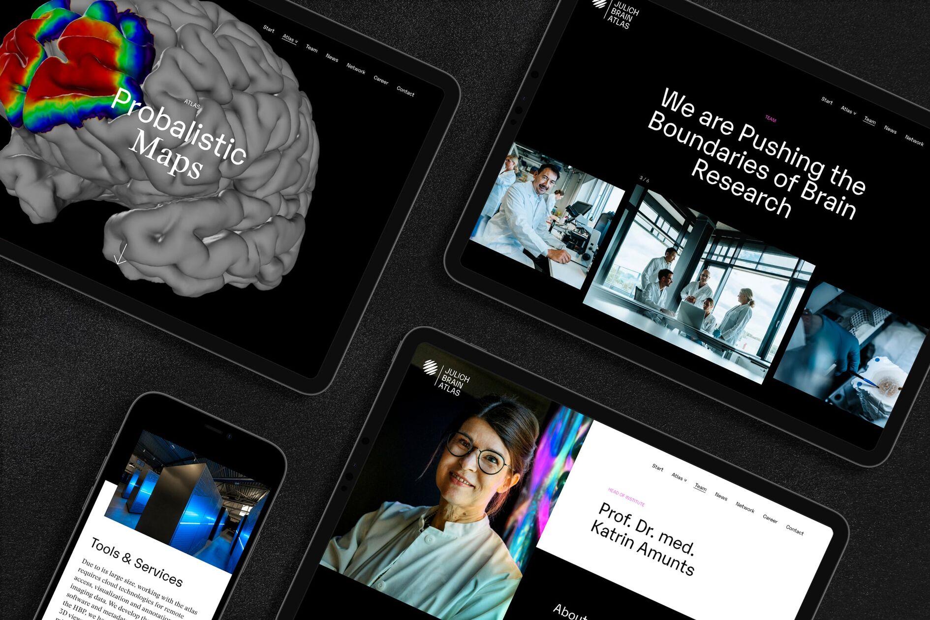
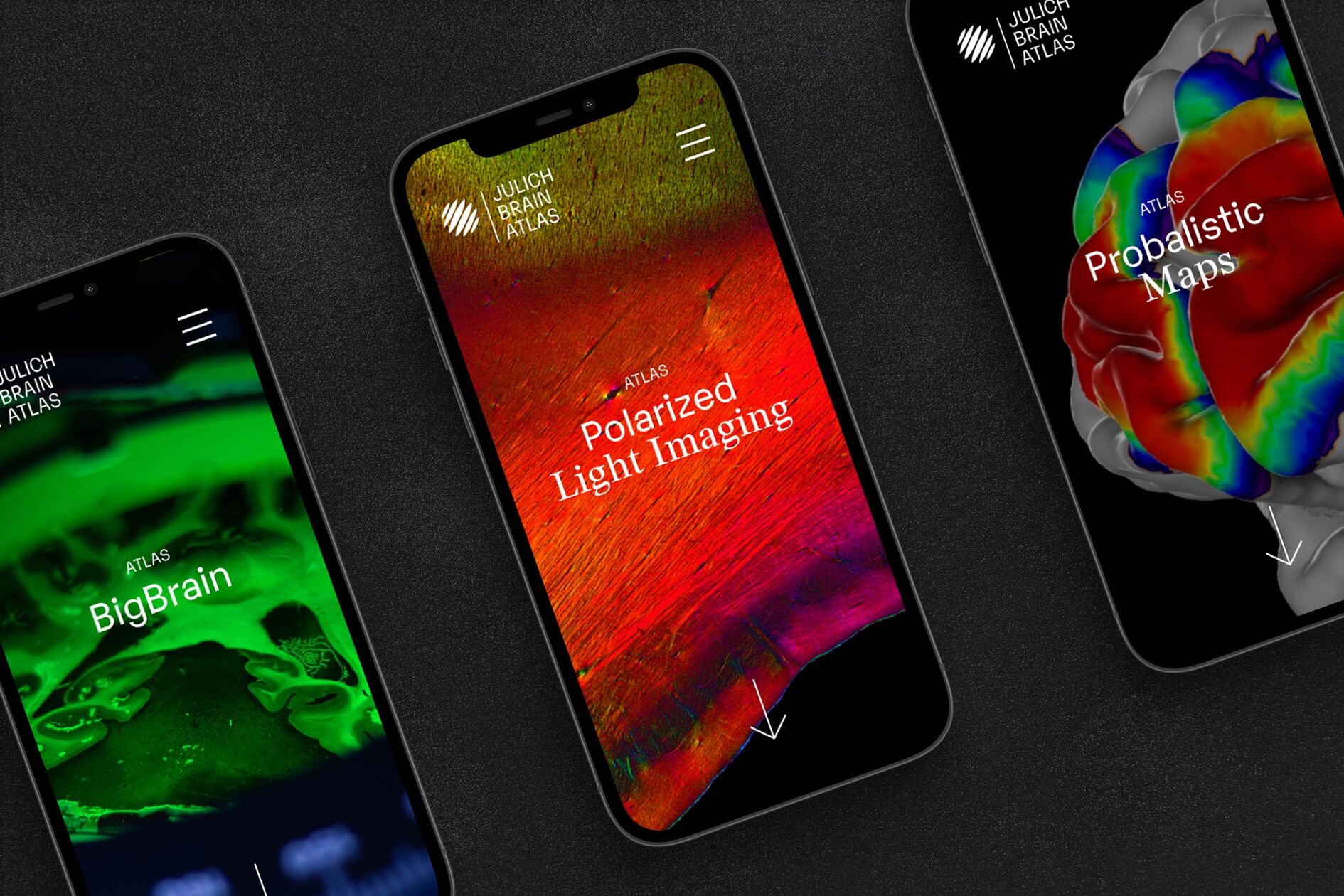
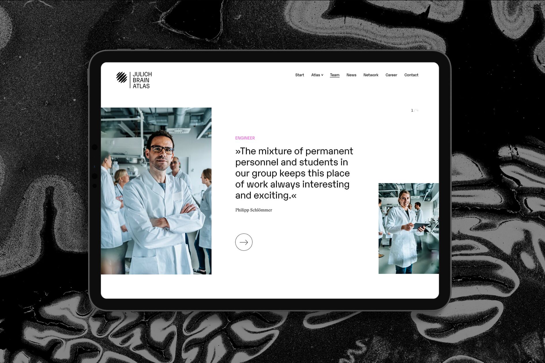
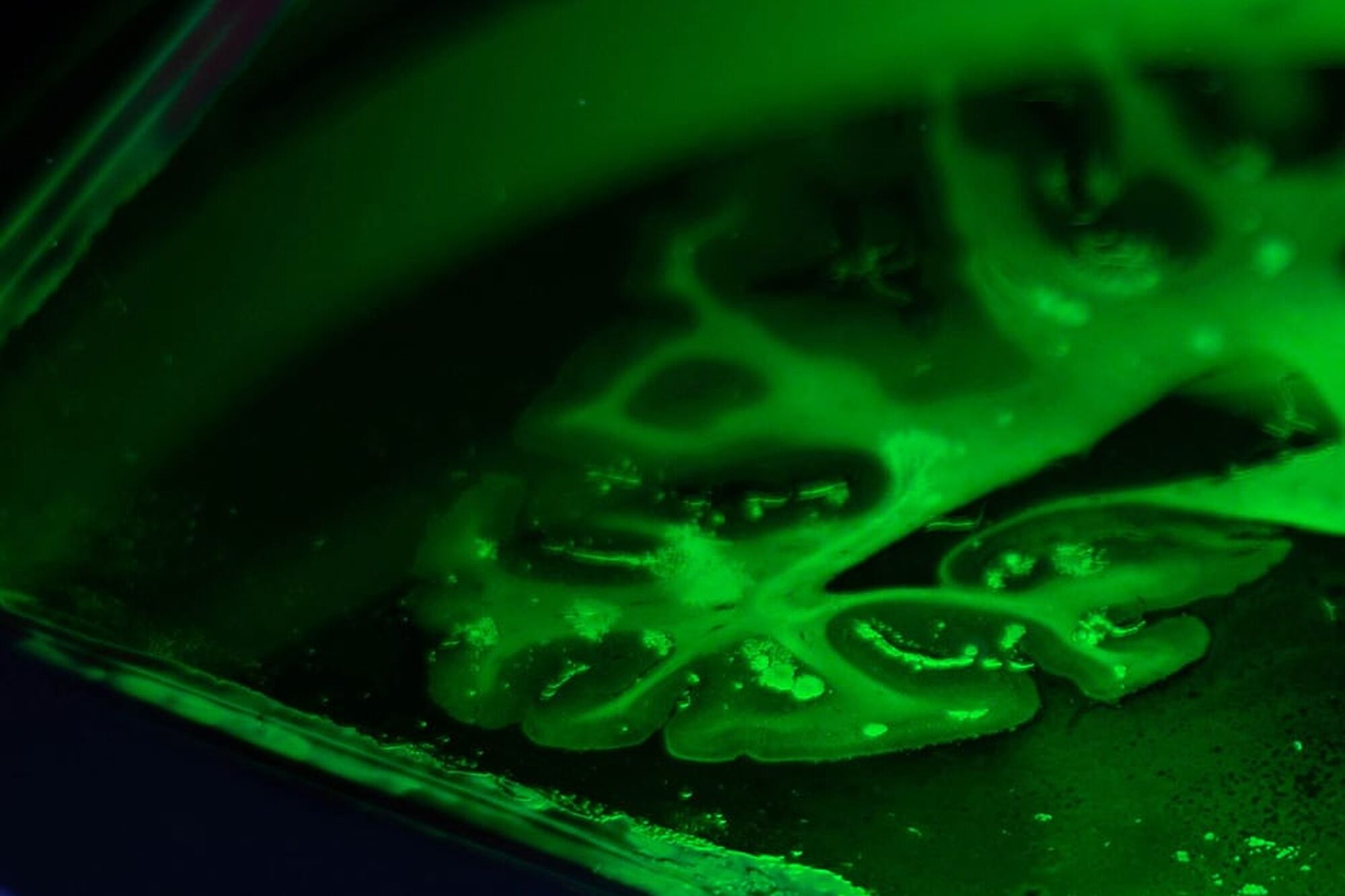
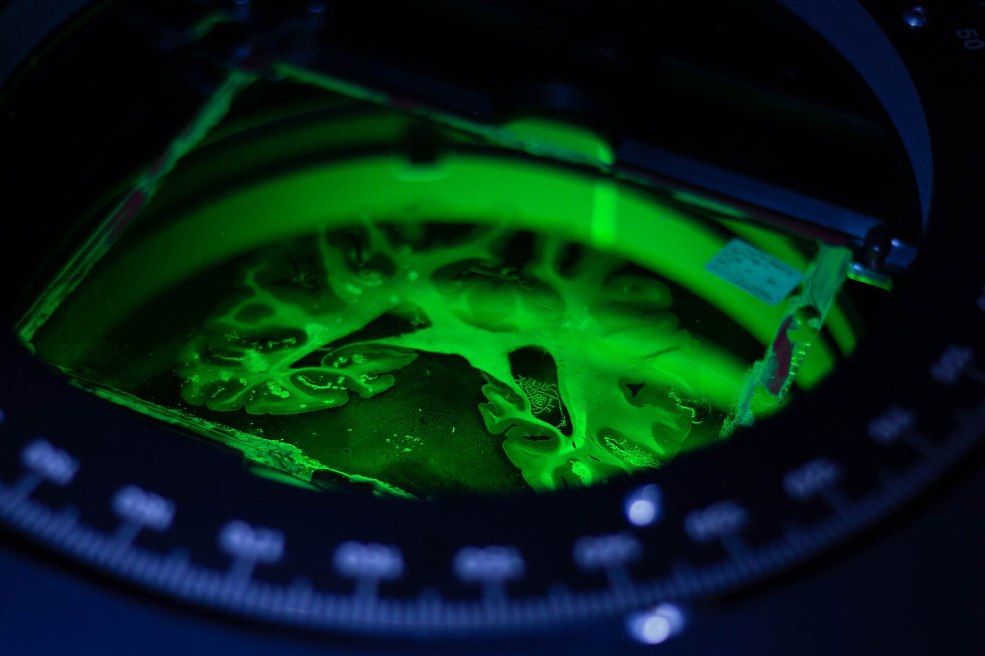
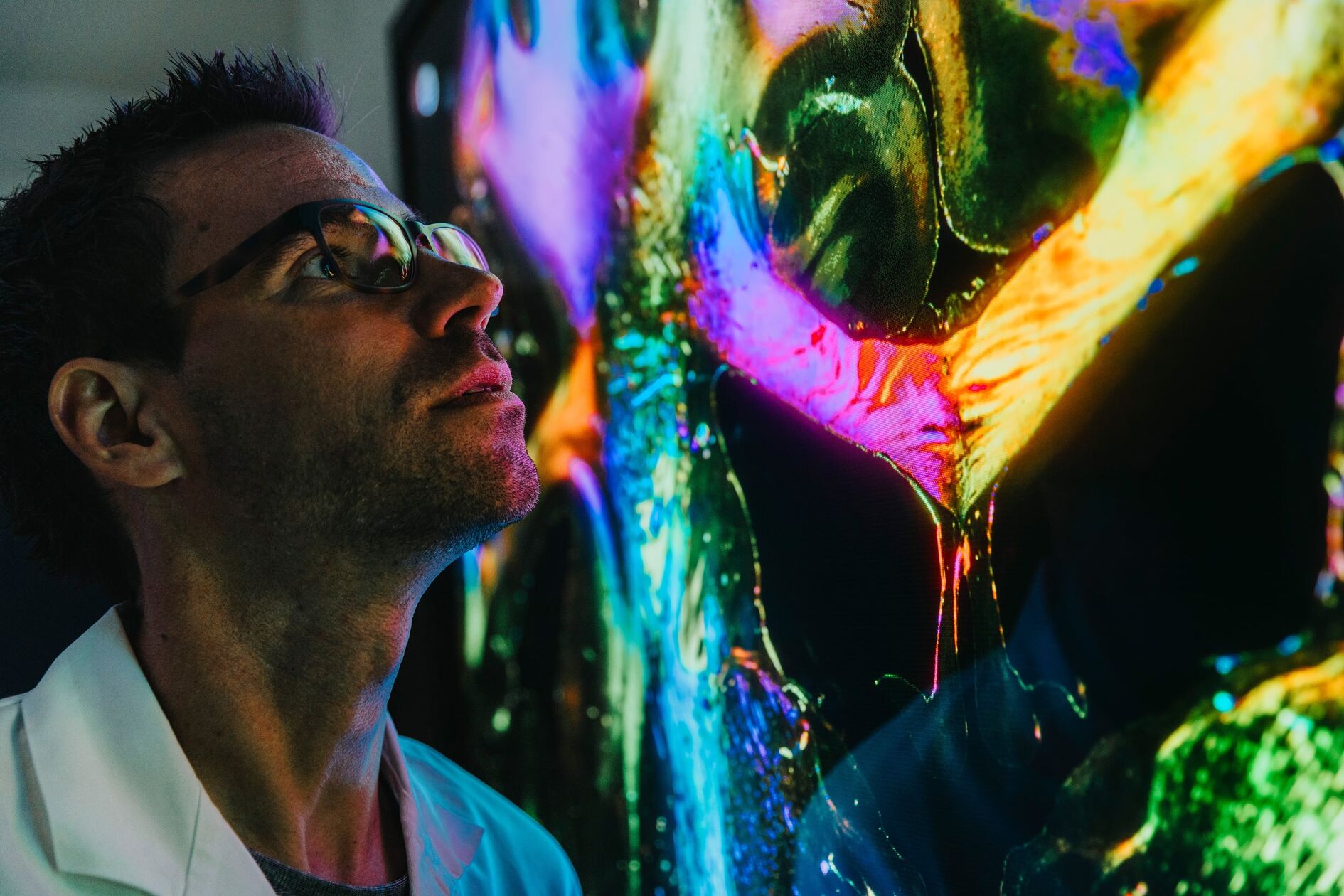
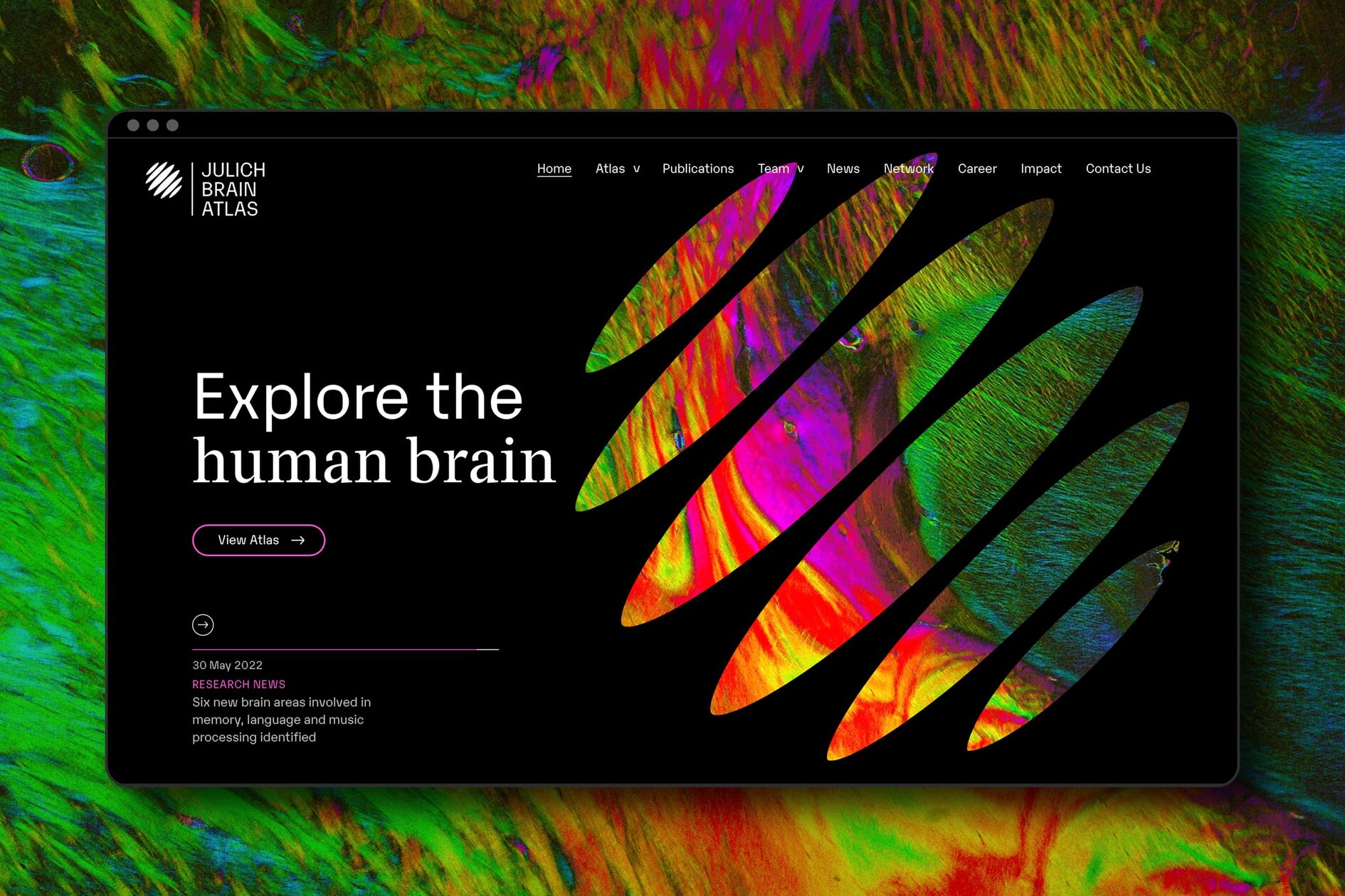
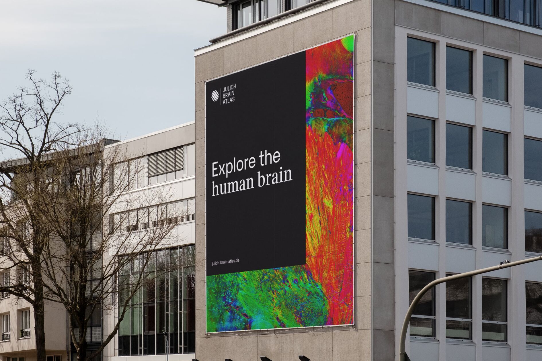
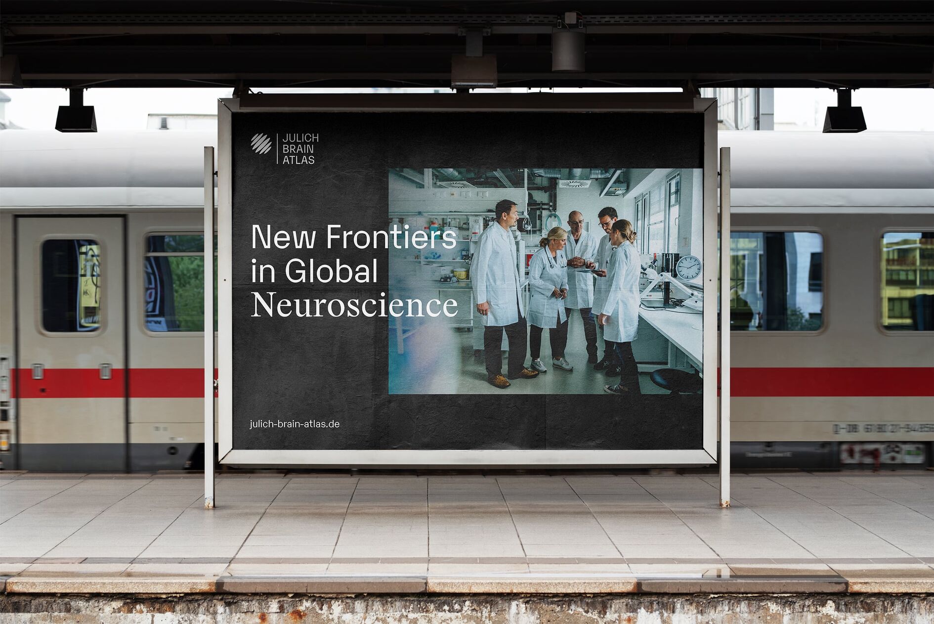
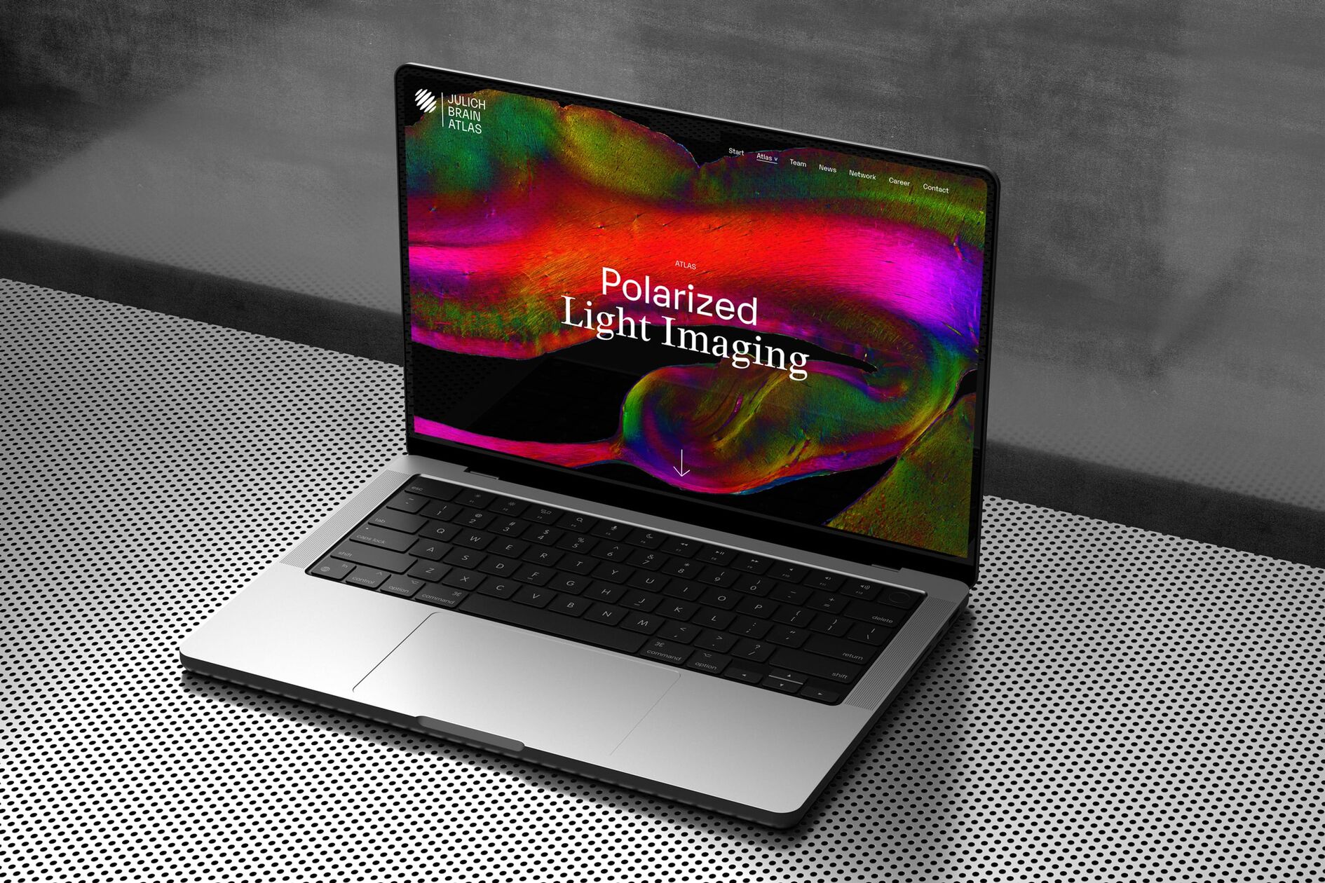
We modified high-resolution brain scans using different methods to create a versatile but consistent central visualization to serve as the core of the brand identity. The resulting images are unique works of art with an aesthetic quality that pays homage to the many different ways to understand the human brain. The rest of the brand appearance is kept simple to let the brain scans speak for themselves. We achieve this by using an elegant mixture of black and white backgrounds and typefaces. We also integrated portraits of the scientists to provide authentic insights to the people behind the project and contextualize their working environment to a general audience.
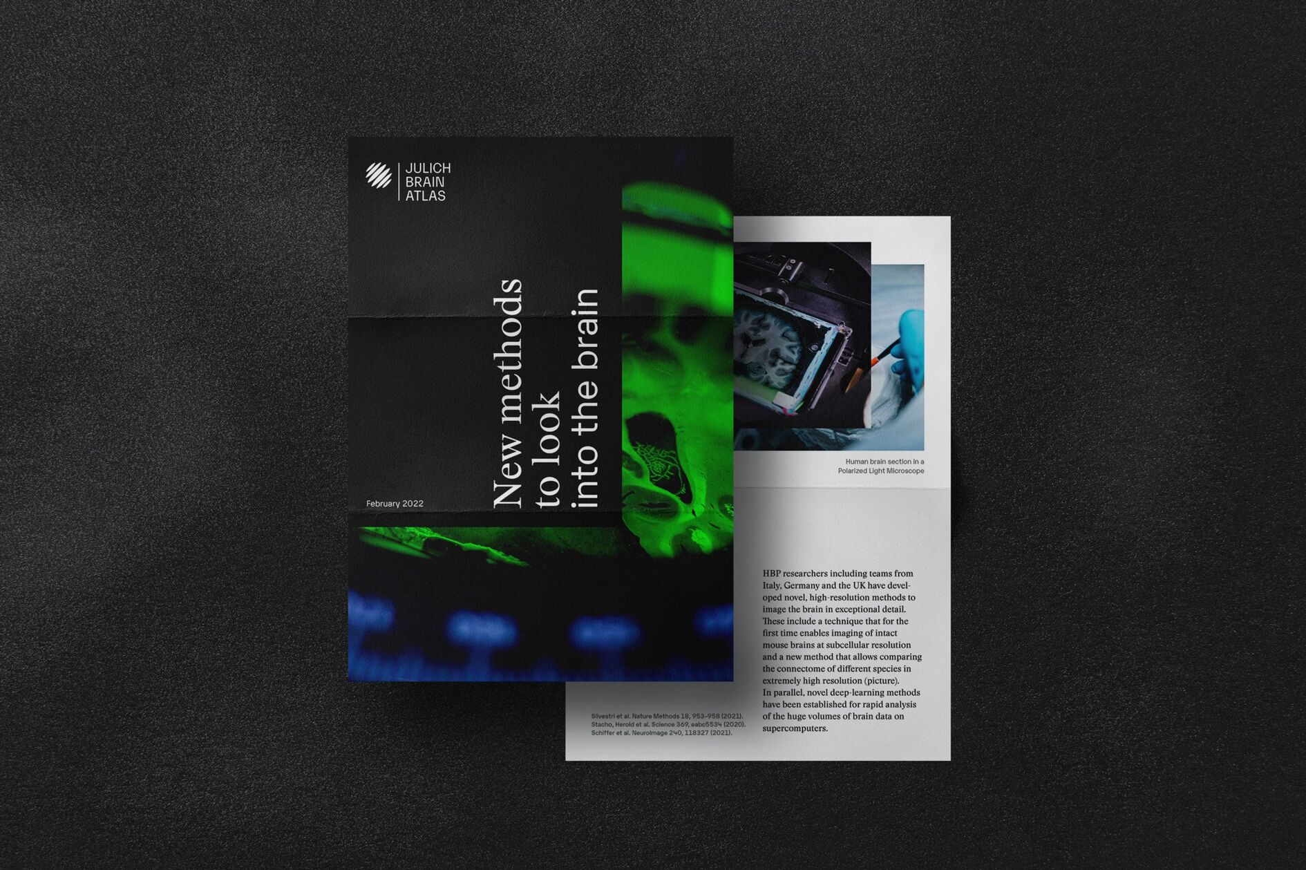
New website increases visibility and instills excitement for science
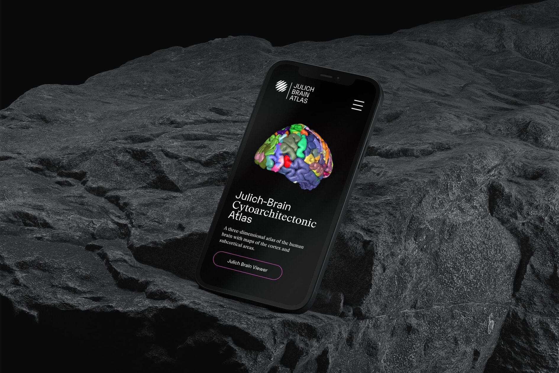
The Julich Brain Atlas website serves as a platform for an international scientific community driven by a holistic understanding of how the human brain works. Interactive storytelling elements and concise web design bring the fascination for the human brain to life digitally. Overall, the new brand identity raises public relations to a new level, opening previously difficult-to-access scientific content to new target groups and inspiring future generations of brain research.
