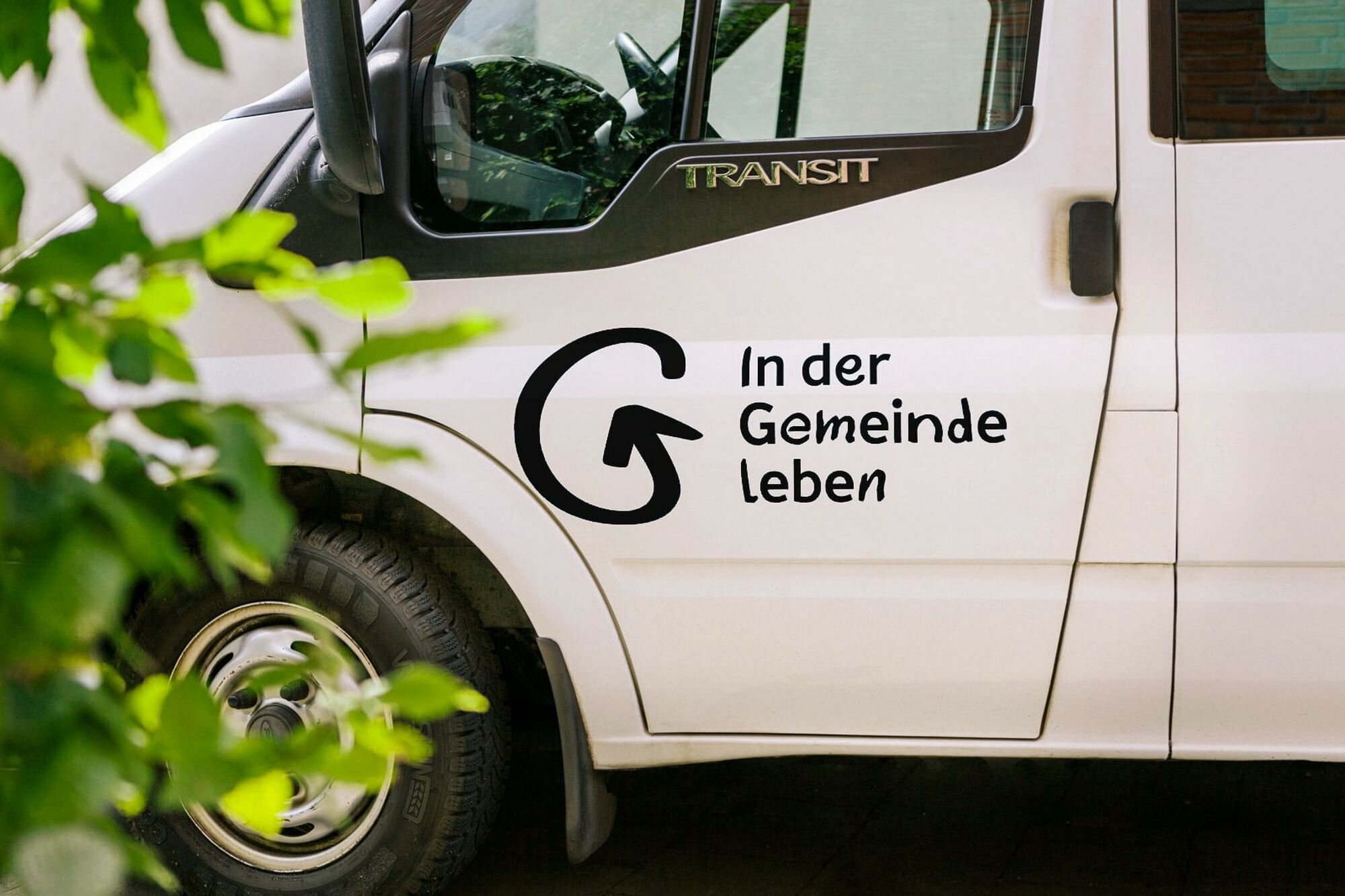
Branding and website design for a nonprofit organization that celebrates inclusion and diversity
Project description
IGL - Living in the community
Branding and Website
Services:
Corporate Design
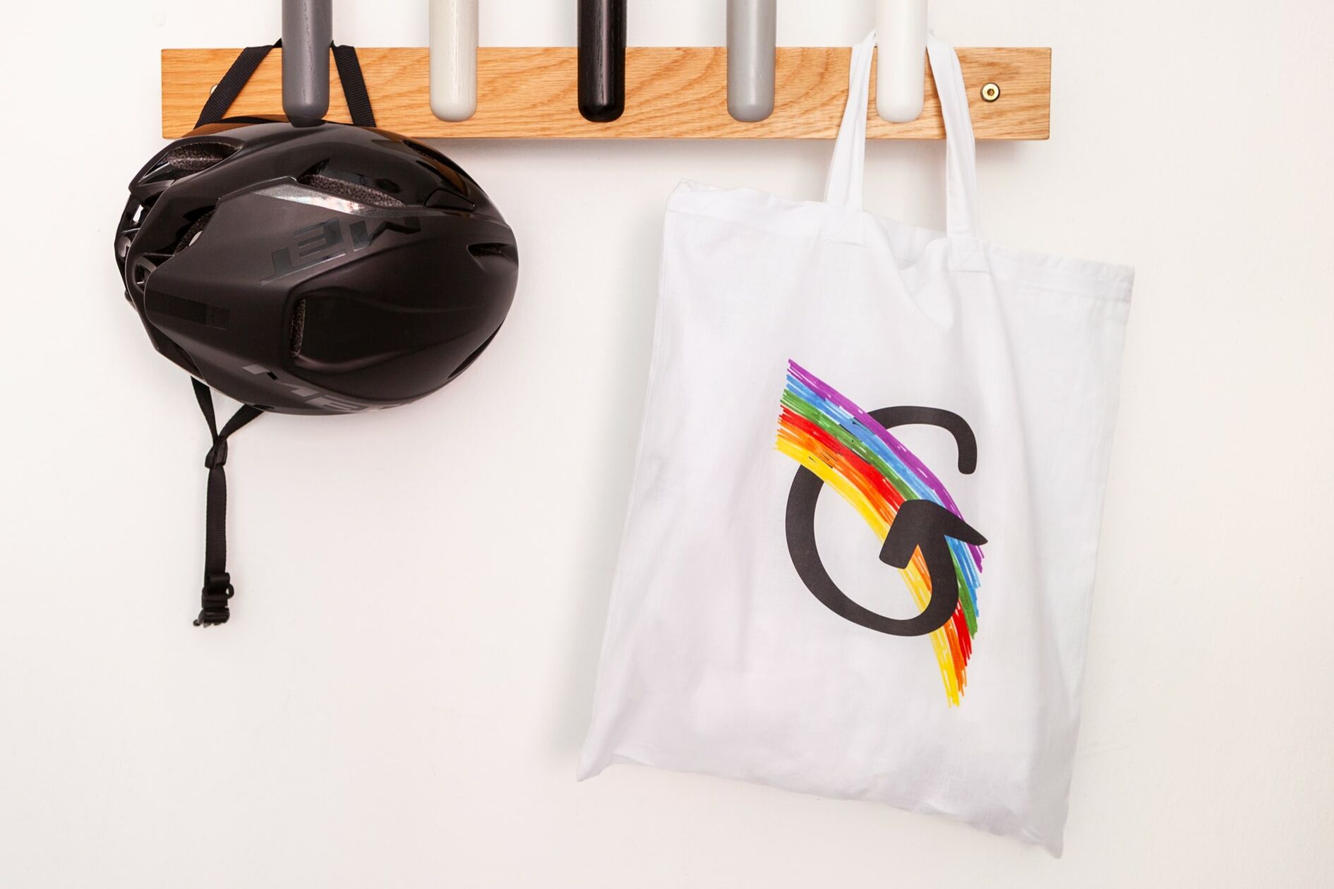
Visual Merchandise
Copywriting
Kick-Off Branding Workshop
Webdesign
Backend Development
Frontend Development
Type design
In collaboration with Tobias Textor, Gabriel Richter, Christoph Koeberlin, Thanh-Thao Tran, Morten Sassi, Kevin Runck and Kurt Heuvens
Innovative, social, and human: a new appearance for a special concept
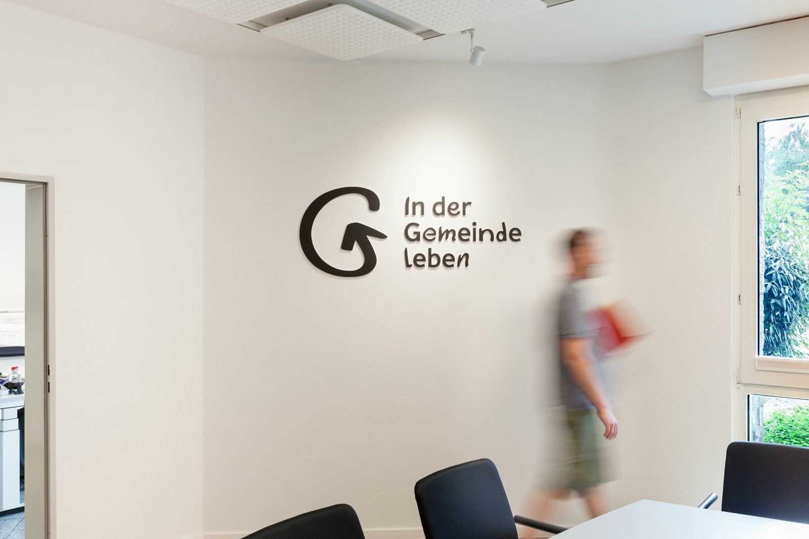
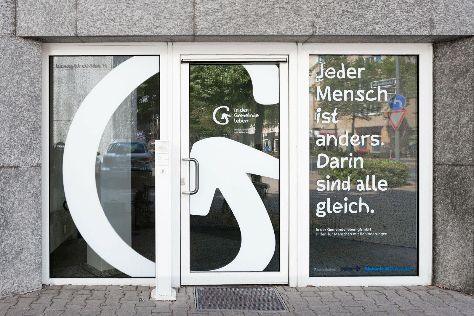
People with disabilities know best what they need to live their own lives. Sometimes, however, they need help getting the support they need to be their best selves. The “In der Gemeinde leben gGmbH (in English: living in the community LLC) also known as IGL, advises and supports people with disabilities wherever they live, and tailors their services to the needs and desires of their clients. Through long term, intensive cooperation with IGL, we have helped to develop a new brand image, a unique company typeface, and a universally accessible corporate website.
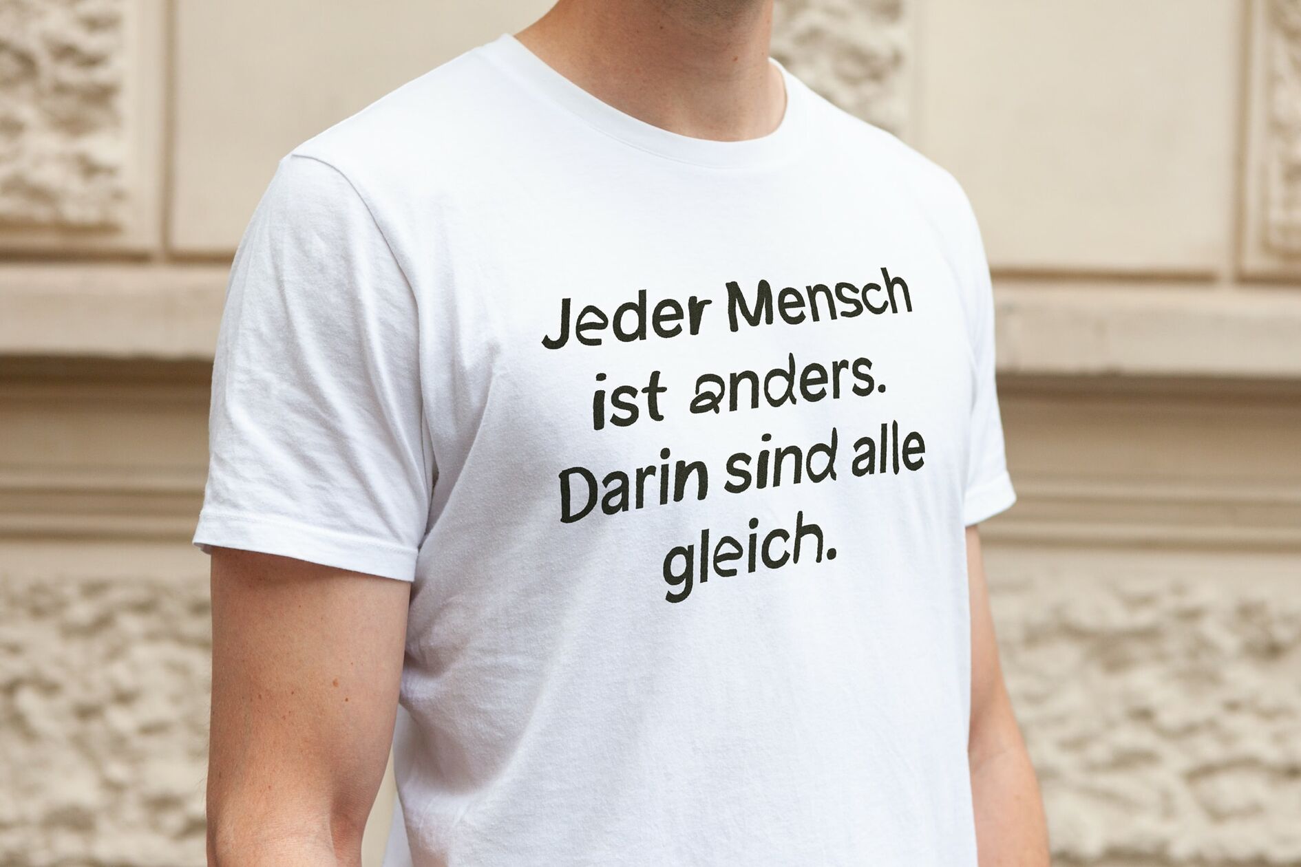
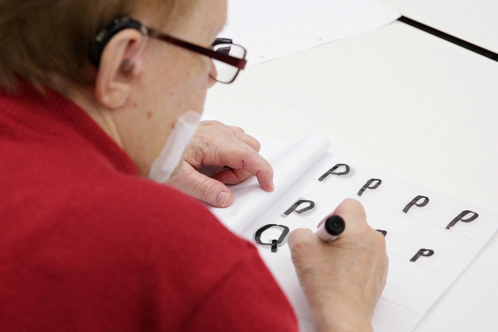
A graphic system that includes both clients and employees
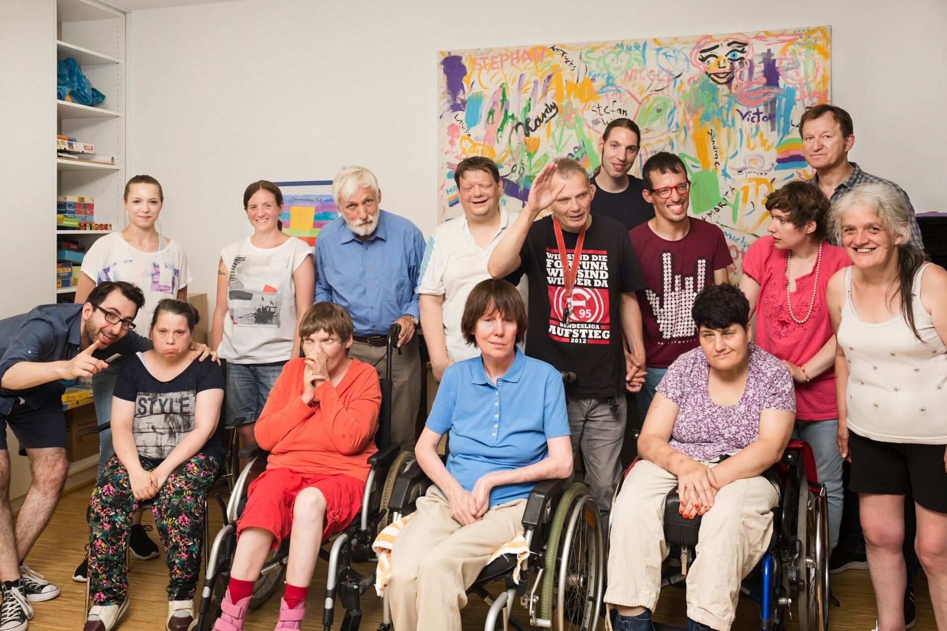
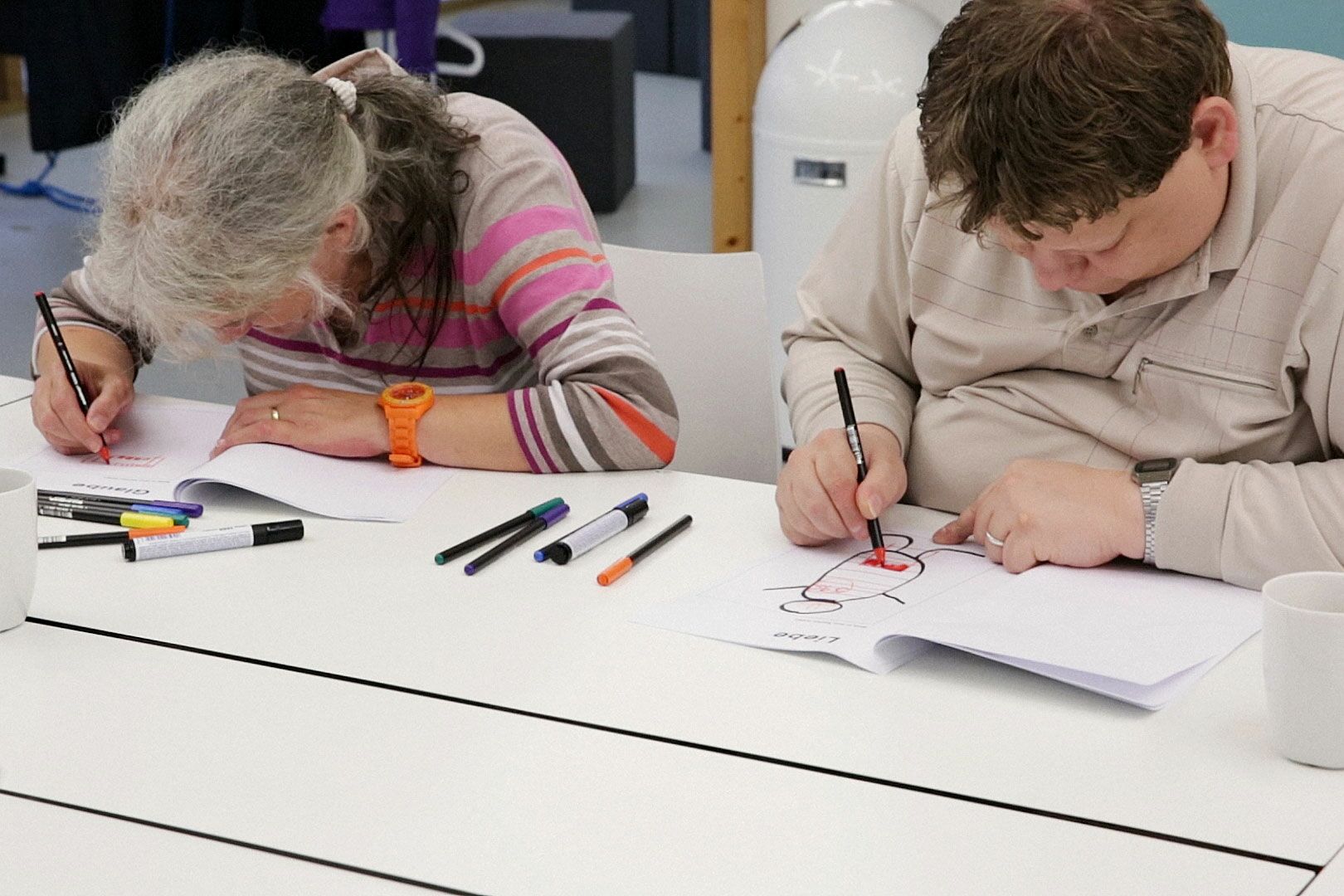
In the joint kick-off workshop, we worked out the core elements of the work IGL does: to see diversity as enrichment, and to live inclusively. People with disabilities should actively shape their own lives and not be patronized. In the spirit of their core beliefs, we wanted to include the input of both clients and employees in every step of the design process. The result is a collaboratively designed visual system, designed to help people with disabilities thrive at the center of our society.
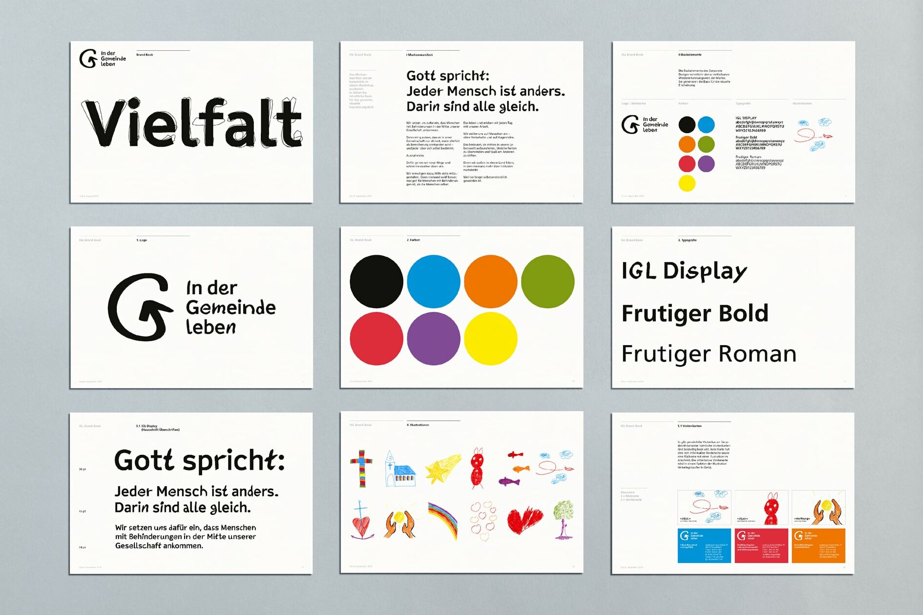
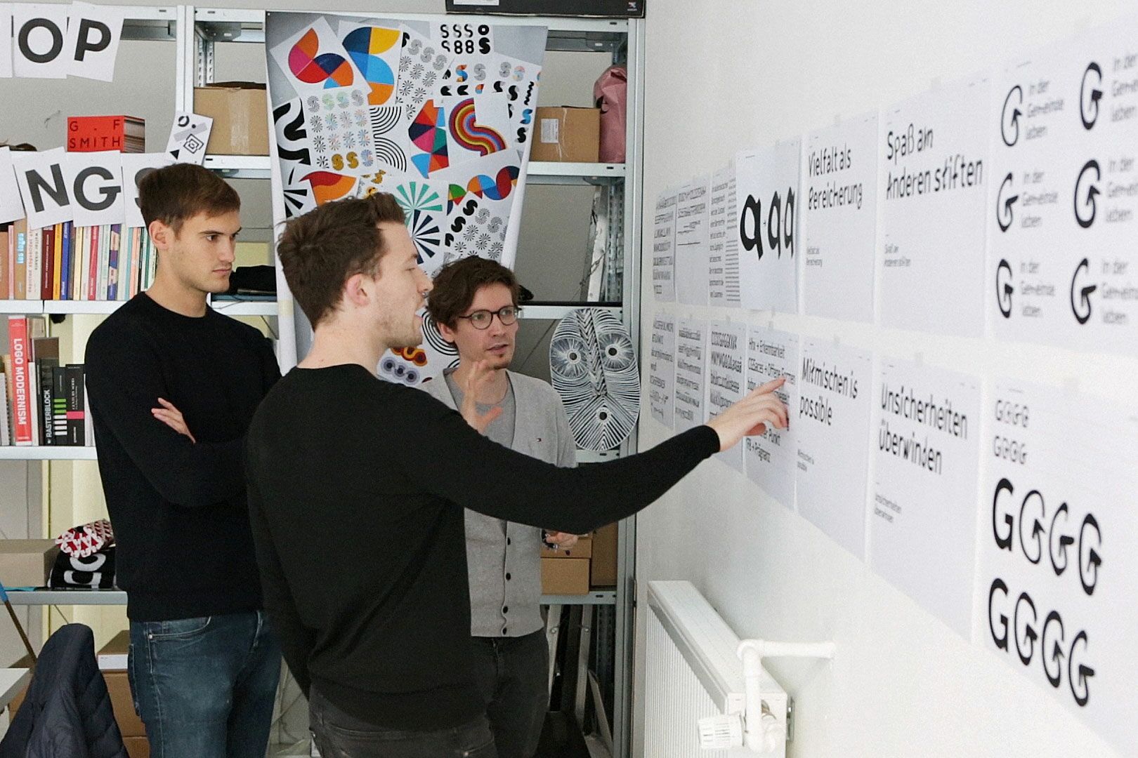
Expressing inclusion at the typographic level
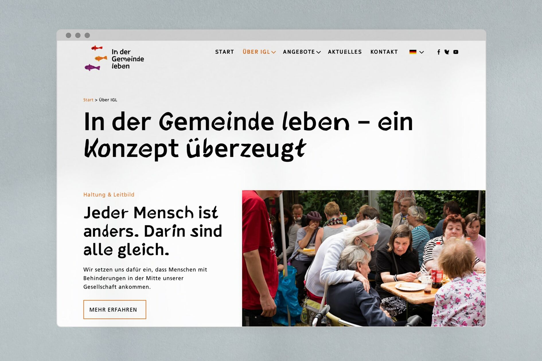
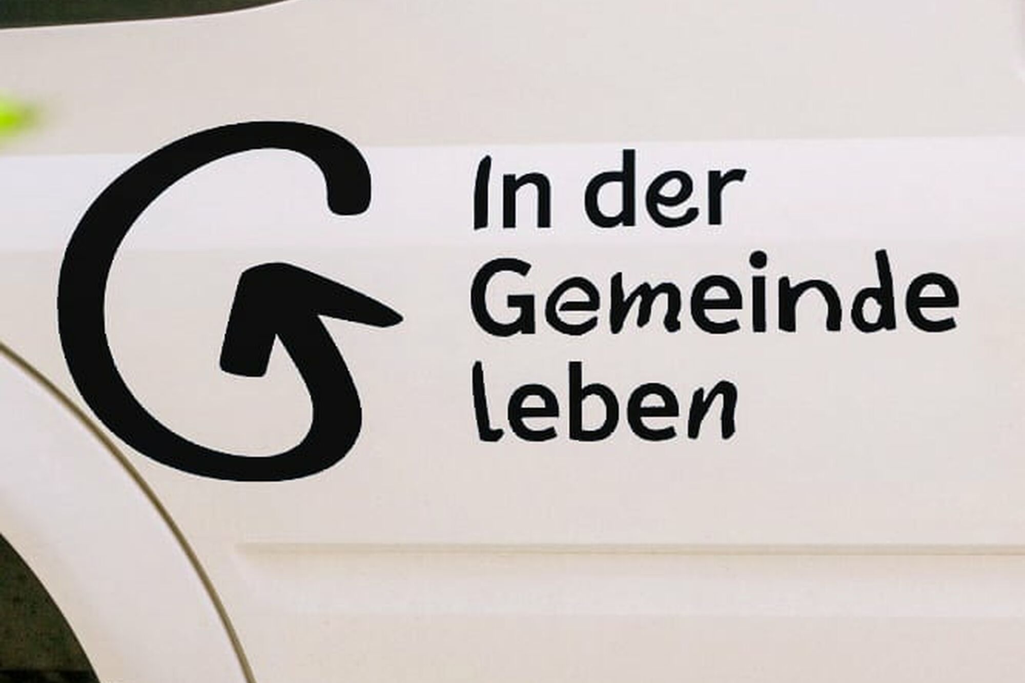
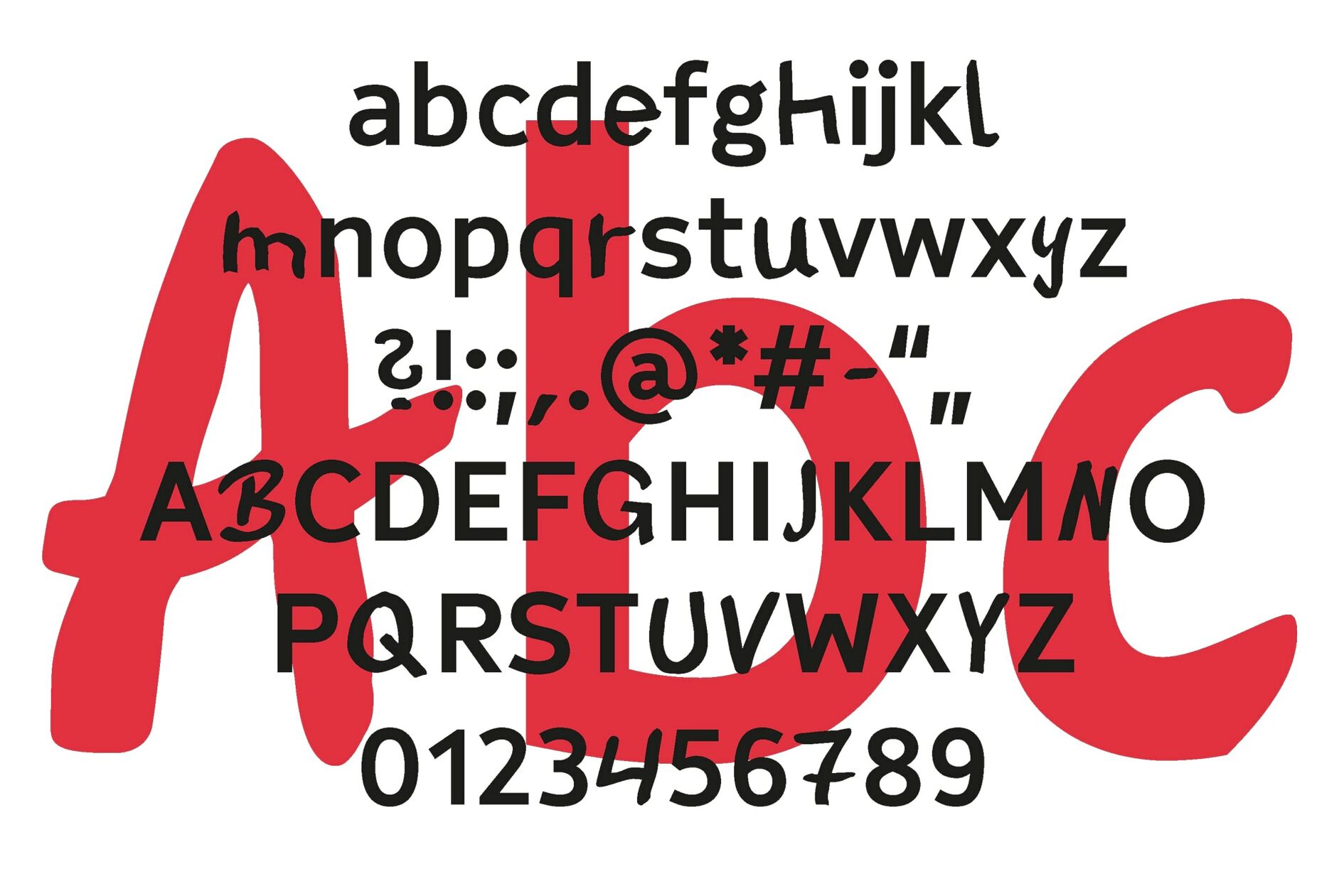
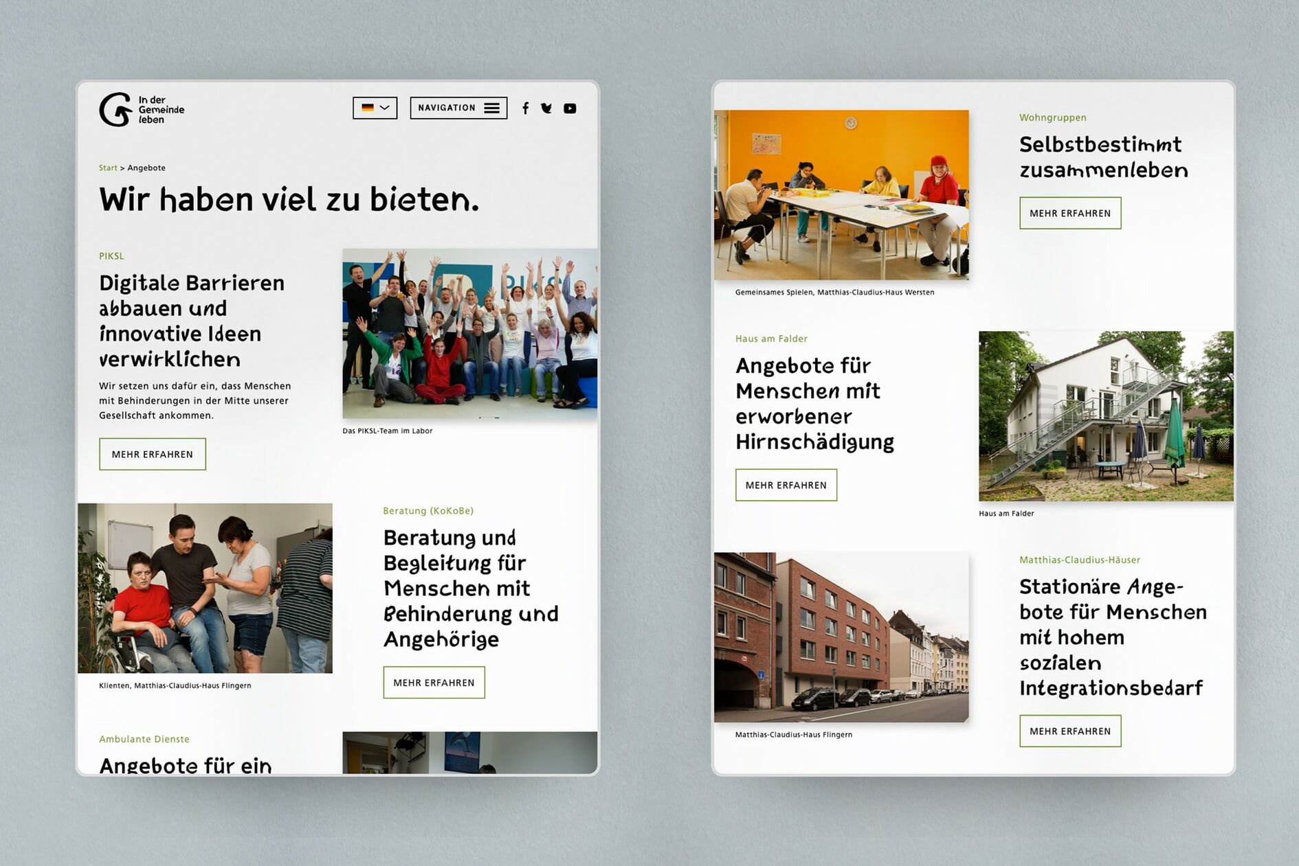
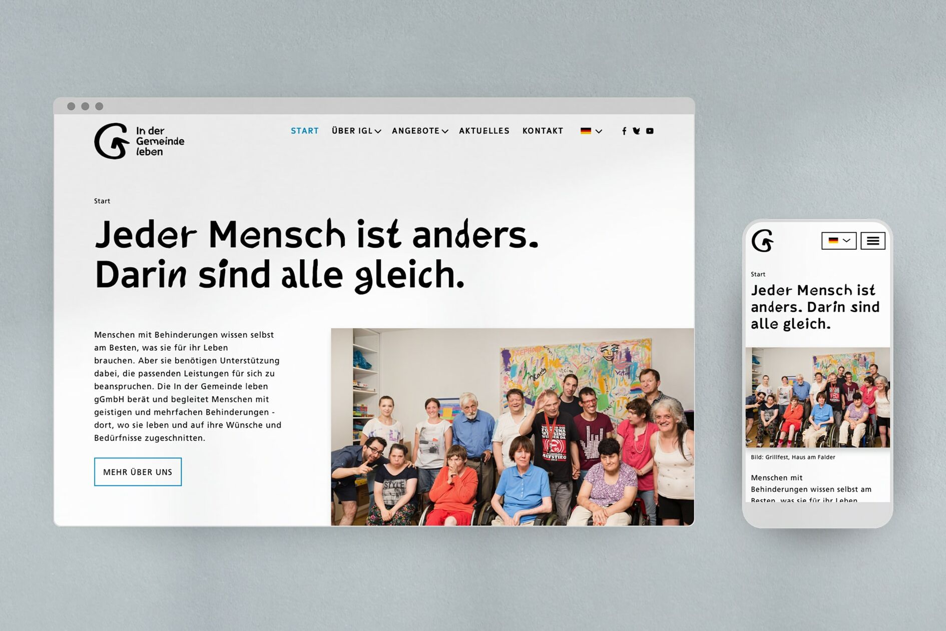
At the heart of the new brand identity is “IGL Display” – a headline typeface that we designed exclusively for IGL in collaboration with font designer Gabriel Richter. For this custom design, we collected handwritten alphabets from clients and employees and blended them with a typeface exclusively designed for this collaboration. In this way, we created a typeface that used diversity as enrichment – both through the collaborative creative process, as well as the overall design aesthetic.
Variety in expression meets easy readability
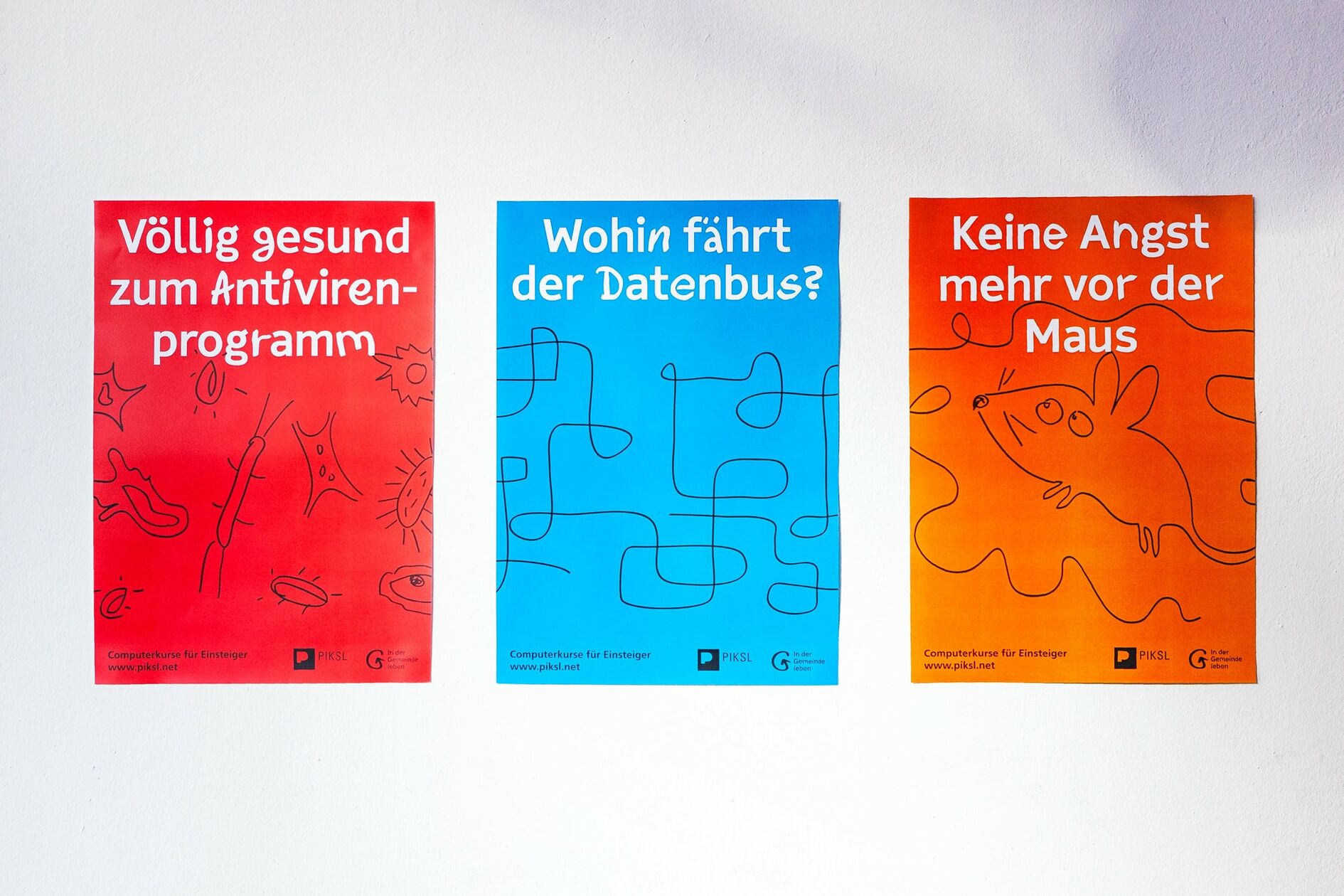
The handwritten letters alternate with the custom created typeface in a way that is fully automated and universally applicable. To ensure additional legibility and accessibility, we omitted everything that could adversely affect the readability of the font, and put great emphasis on the harmonization of the handwritten and regular custom typefaces so that they are balanced and easy to read when used together.
Universal Illustrations
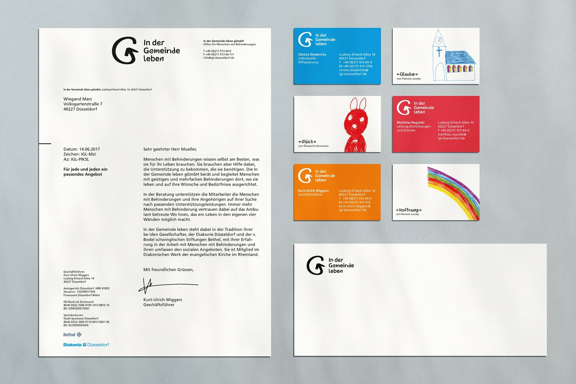
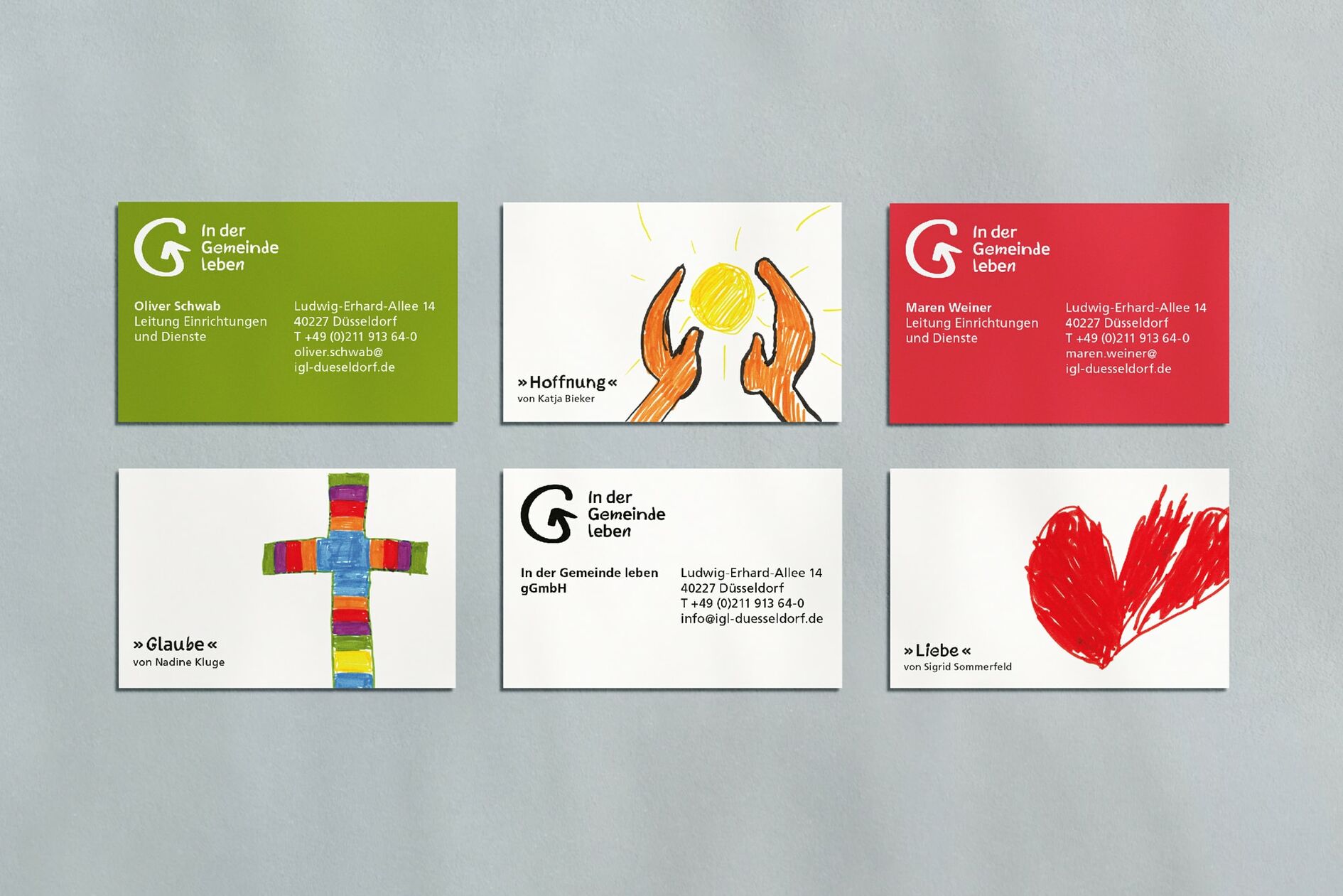
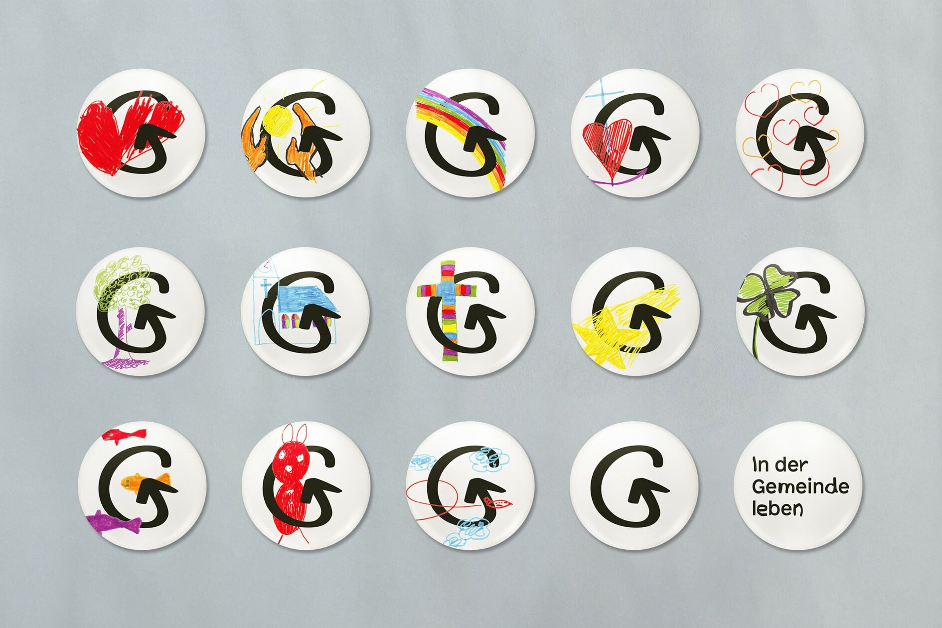
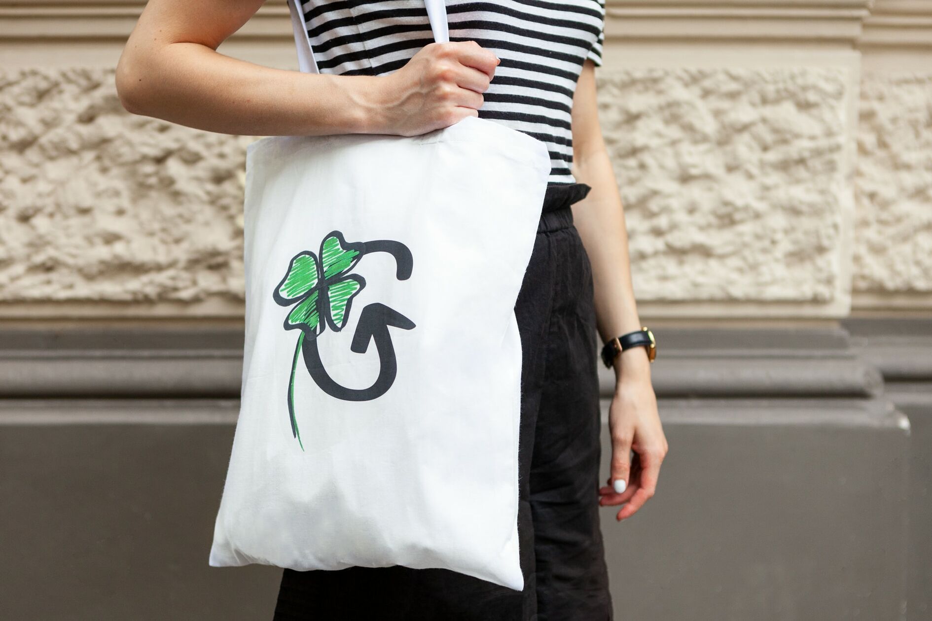
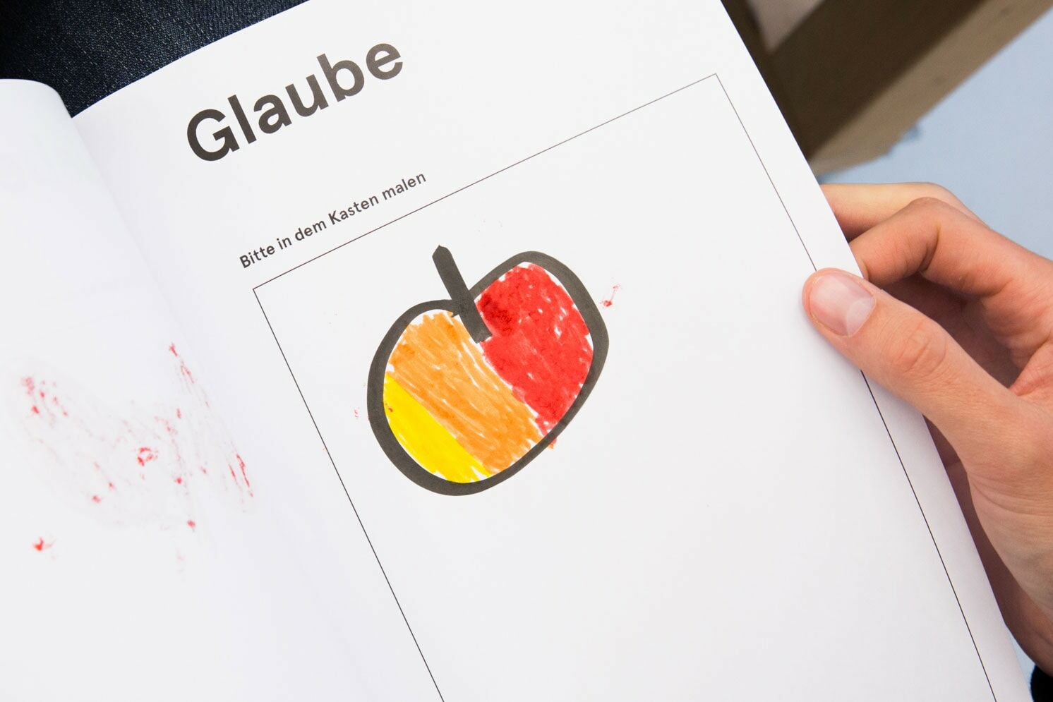
In addition to developing a custom font, we created illustrations in collaboration with employees and clients. Instead of focusing on what distinguishes people with disabilities from others, these illustrations help to emphasize what all people have in common. We asked everyone to put his or her idea of universal topics such as happiness, faith, love, and hope on paper. The resulting illustrations then became central elements of IGL’s overall corporate design.
A Universal Access website is for everyone
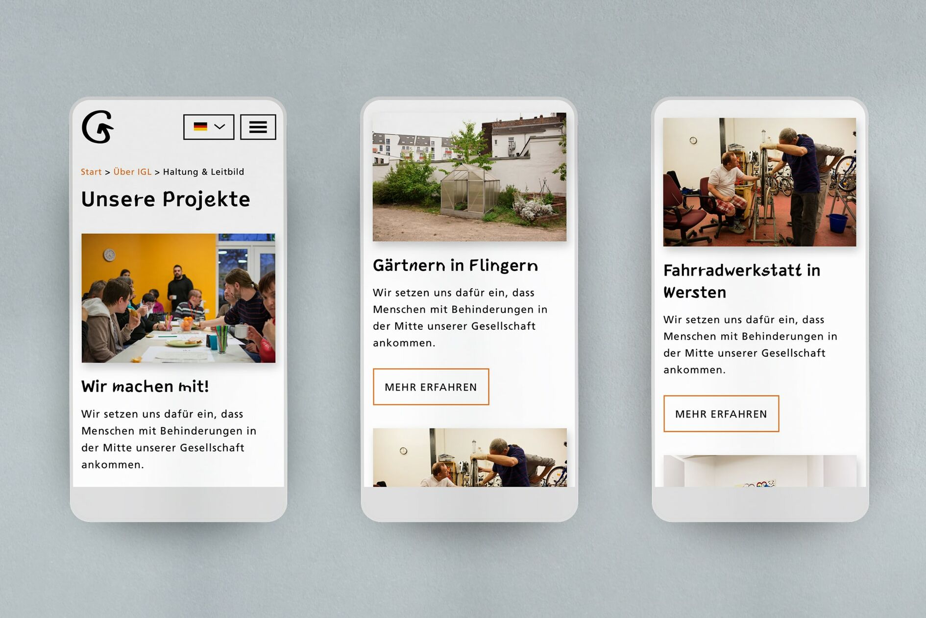
The central focus when developing the new company website was universal accessibility. Both the design and the technical implementation of the website strive to meet the highest requirements for universal access in digital media. Additionally, the user-friendliness of the website was user-tested, validated, and optimized together with clients and employees at every stage in the design process. The result is an innovative website that sets a new standard in terms of design, content, and accessibility for all.
