

Brand relaunch, spatial design and website for a group of family-run dental practices
Project description
Paeßens Family Dentistry
Branding, Spatial Design, Digital
Services:
Communication strategy
Corporate design
Icon set
Orientation system
Brand in space
Web design
Frontend programming
Backend programming
In collaboration with Anna Fitzon, Marie Volmar, Annika Kiefer, Thanh-Thao Tran, Gabriel Richter, Regina Pichler, awwwesome and Axel Mohr

A fresh brand relaunch for a new generation
For over 25 years, Paeßens family dentistry has been a local institution, offering high-quality dentistry across the German Lower Rhine region. In early 2020, the Paeßens family opened a third location – ushering a new era of family dentistry. This exciting new growth was also the perfect opportunity to relaunch a trusted and familiar brand – especially as the second Paeßens generation begin to take the reins.
Together, we introduced a simplified brand architecture that helps to provide clarity, consistency and orientation - both internally and externally. The design system helps to hone the practice’s profile, making it more tangible via various touchpoints – such as the new website or the spatial design at the new location.

Meeting the patient with a smile in the logo
The new word mark is at the centre of the brand presence and sets their surname in a typographic smile. After serving the community for more than 25 years, the name »Paeßens« is synonymous with dentistry across the region. Therefore, the logo focuses on the essence of the brand: a family practice where family togetherness goes beyond a shared surname.


Graphic concept: a tooth rarely comes alone
We digitally traced abstracted shapes based on impressions made from real teeth to create a catalogue of shapes that helped form a graphic construction kit. These were then seamlessly integrated across the entire rebranding, leaving no doubt about what Paeßens’ Family Dentistry’s main focus is: beautiful and healthy teeth that last a lifetime.


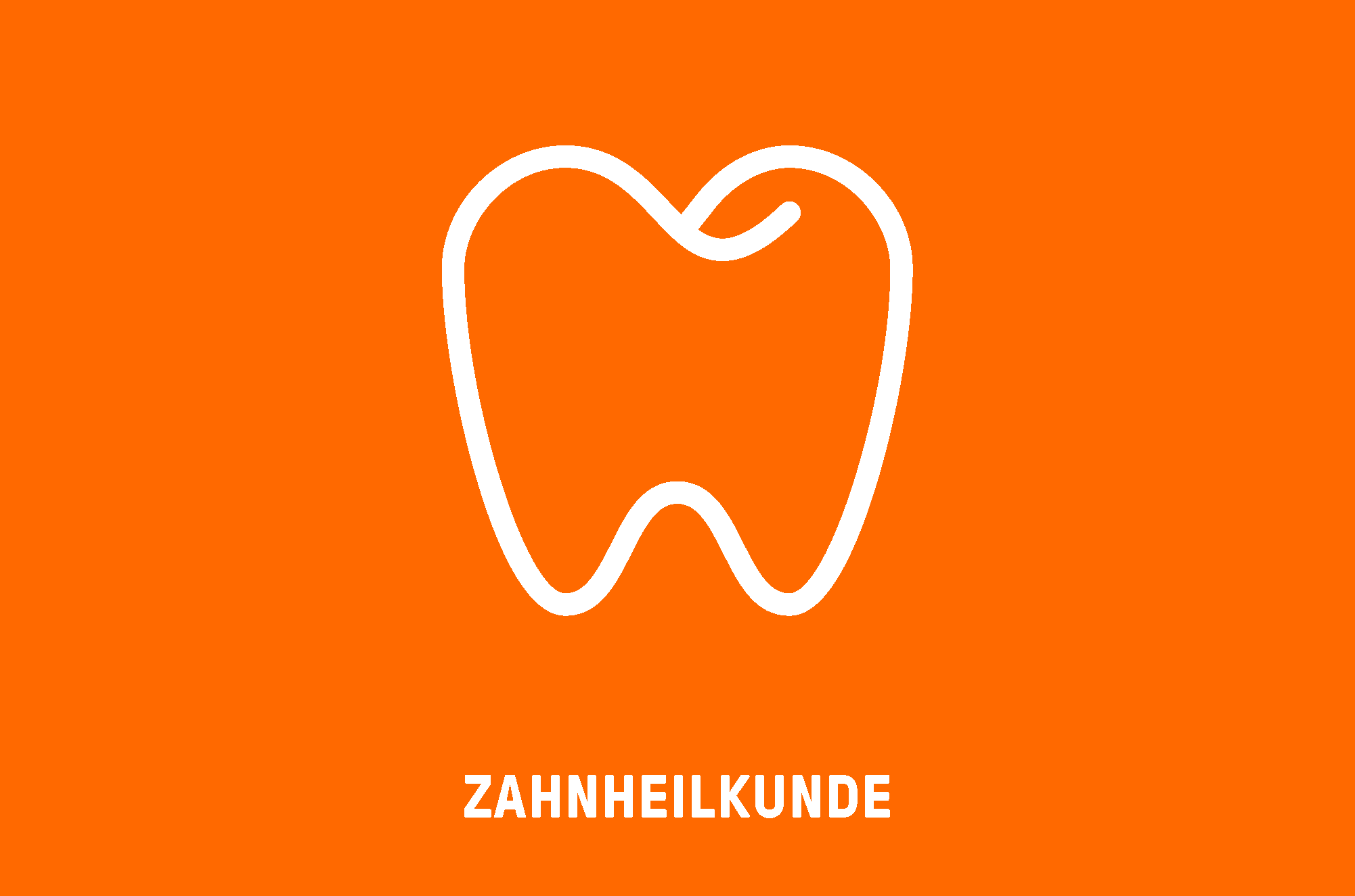
Colour coding and icons: a colourful family affair
In order to provide clarity and consistency within the complex spectrum of services the practice provides, we introduced a functional colour coding system using a colour palette that radiates positive energy and diversity. Each service is represented by its own icon, simply and charmingly visualizing the different types of dental treatment in an easy to understand and intuitive way.


A new typeface with polished corners and edges
Introducing a corporate typeface that projects strong character traits sharpens the typographic profile of the brand. On second thought, sharpening is probably the wrong word – the subtly rounded corners and edges of the individual letters across the typeface subtly allude to the pleasant feeling of freshly polished teeth after a successful visit to the dentist. In order to do the Paeßens family name justice typographically, the GrilliType typefoundry custom designed an uppercase „ß“ and integrated it into the corporate typeface.


Spatial design at the new Kevelaer location
We conceived and designed the entire interior and exterior spatial design system for the new dentist office in Kevelaer. In addition to a comprehensive orientation system based on the colour coding and icon language of the corporate design, generous wall graphics help to activate a brand relevant sense of space. The spatial staging of the brand presence interacts with the interior design to create an all-encompassing vision of the Paeßens family practice: to transform what is generally considered an unpleasant visit to the dentist, into a holistic wellness experience for your teeth.


Multifunctional practice website
Simple, clear and inviting: the new website caters to the needs of different users – from a quick overview of the 3 locations, or a detailed career page for potential new employees, to an authentic deep-dive into the philosophy of the Paeßens family practice. With its independent graphic appearance, the website goes far beyond industry standards, serving as a unique digital business card as well as a functional information portal for new or current patients.


The patient in focus
There is no better way to show the success of a dental practice than to see the radiant smiles of their patients. That’s why it made sense to use the largest stage possible to showcase the new brand identity, symbolizing what Paeßens strives for across all 3 of their locations: a satisfied, healthy smile after every visit.


