Brand re-launch for an iconic photo retailer with a 120-year-old history
Project description
Leistenschneider
Branding
Services:
Branding workshop
Communication strategy
Corporate Design
Messaging
In collaboration with Sarah Fyrguth, Marie Volmar, Anna Fitzon, Gabriel Richter, Regina Pichler, Patrick Mariathasan and Thanh-Thao Tran
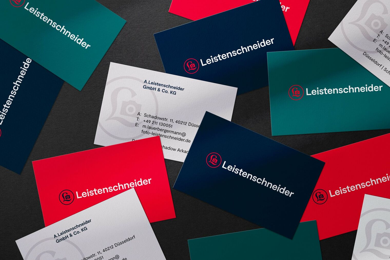
An institution in the photography industry
For over 120 years, Leistenschneider has been an industry leader for anybody wanting to capture their world in photos. This traditional company has operated for over four generations since first opening its first store in Düsseldorf in 1898, and has been growing in many major German cities ever since. Our task was to help the newest generation of the Leistenschneider team expand its digital business presence by updating and modernizing the brand’s image to face the challenges of an increasingly digital world.
An iconic brand that draws directly from its rich history
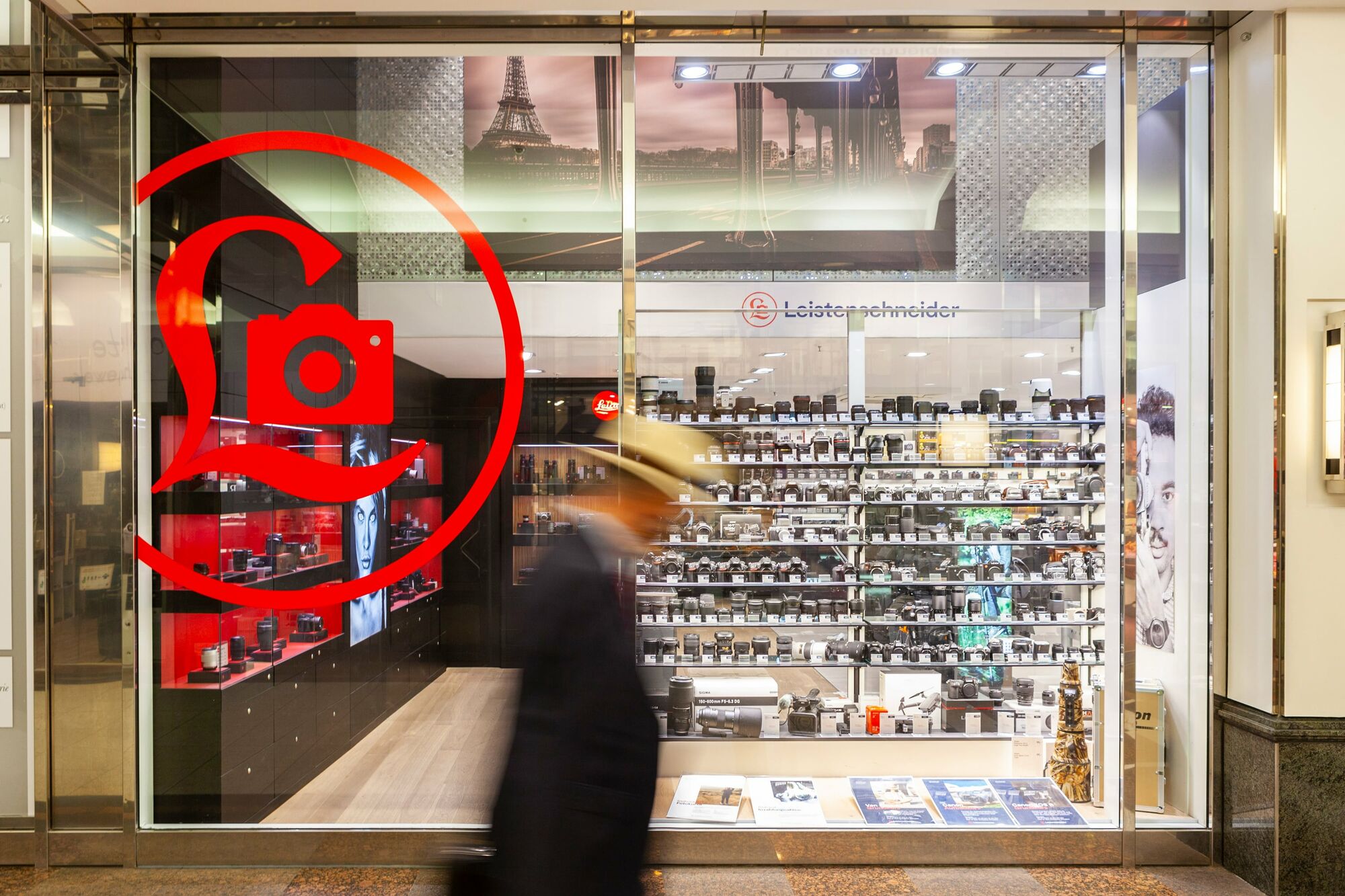
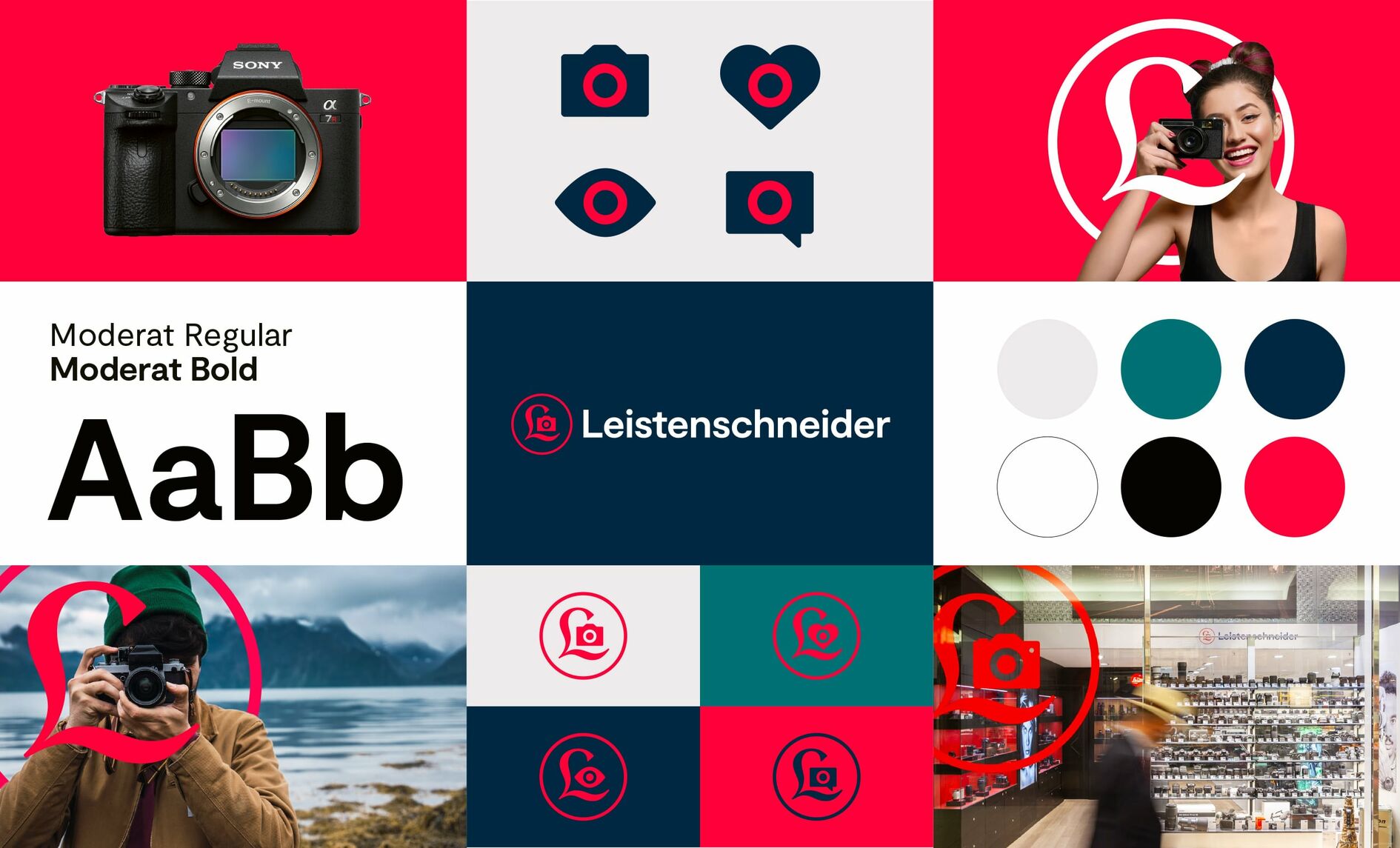
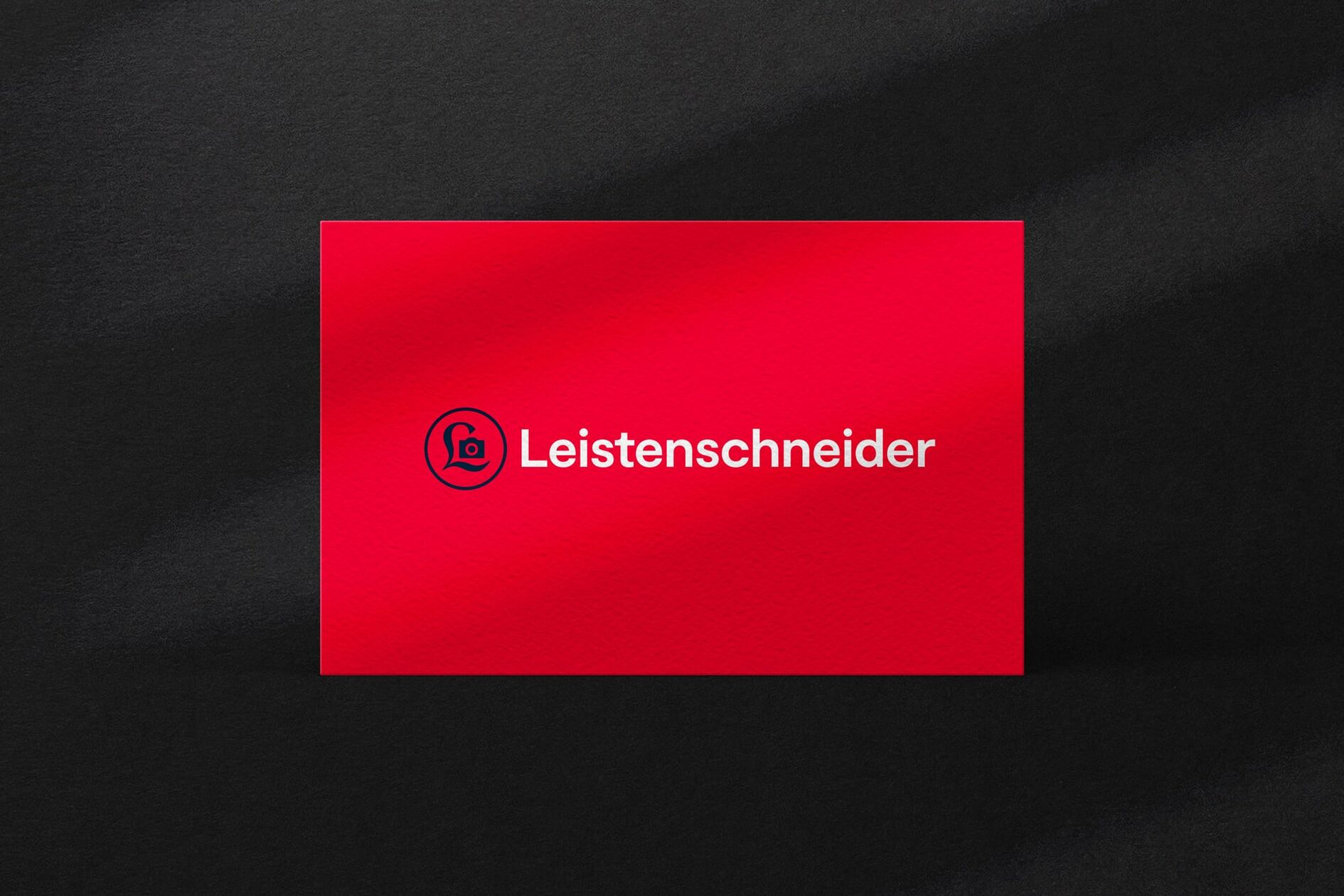
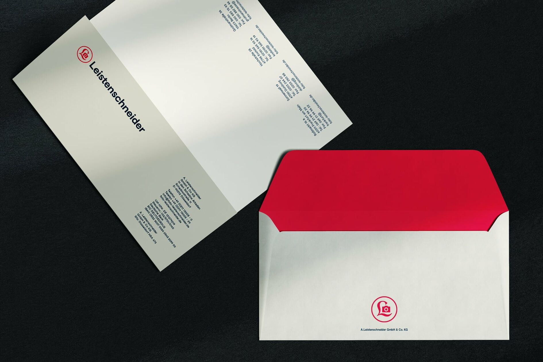
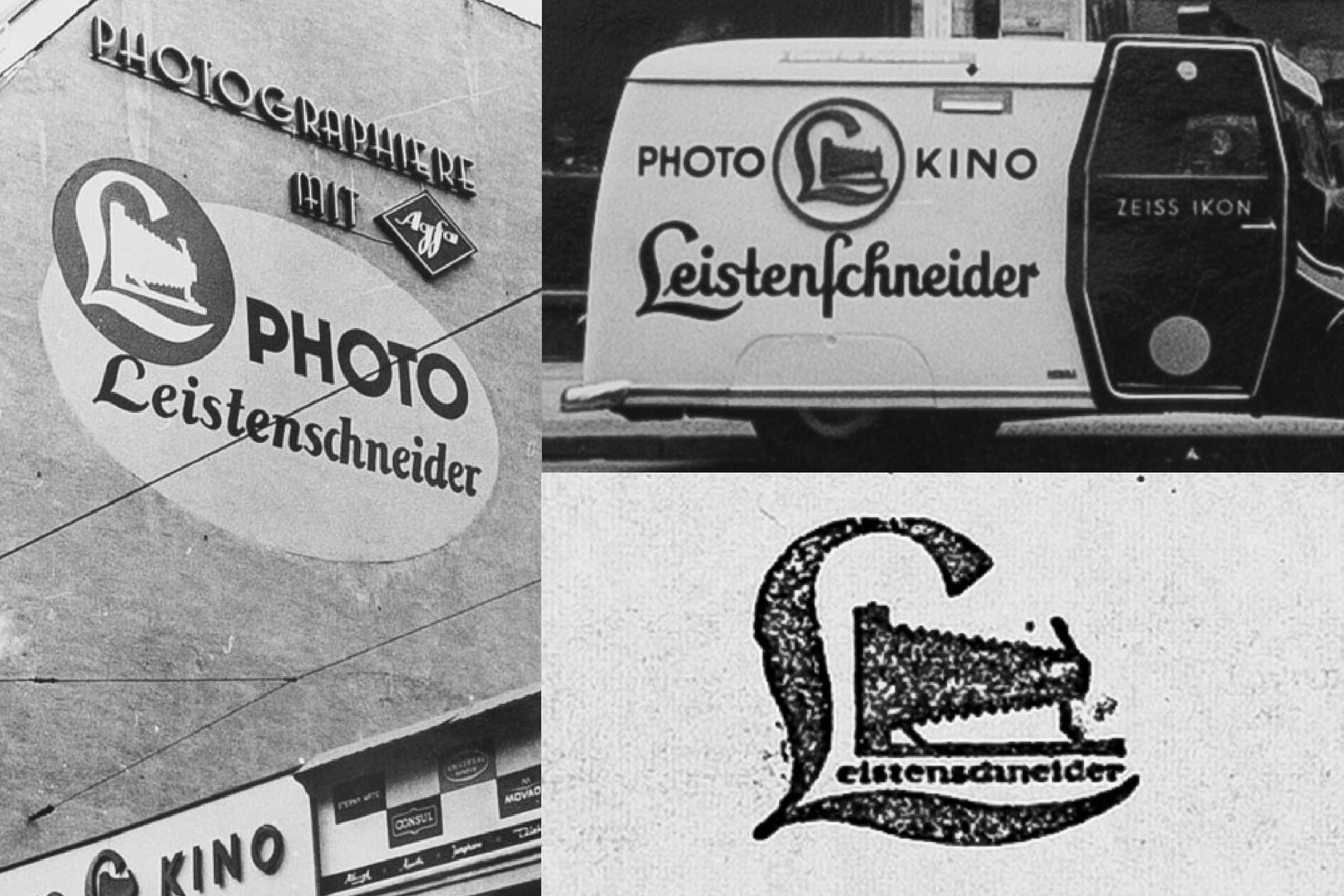
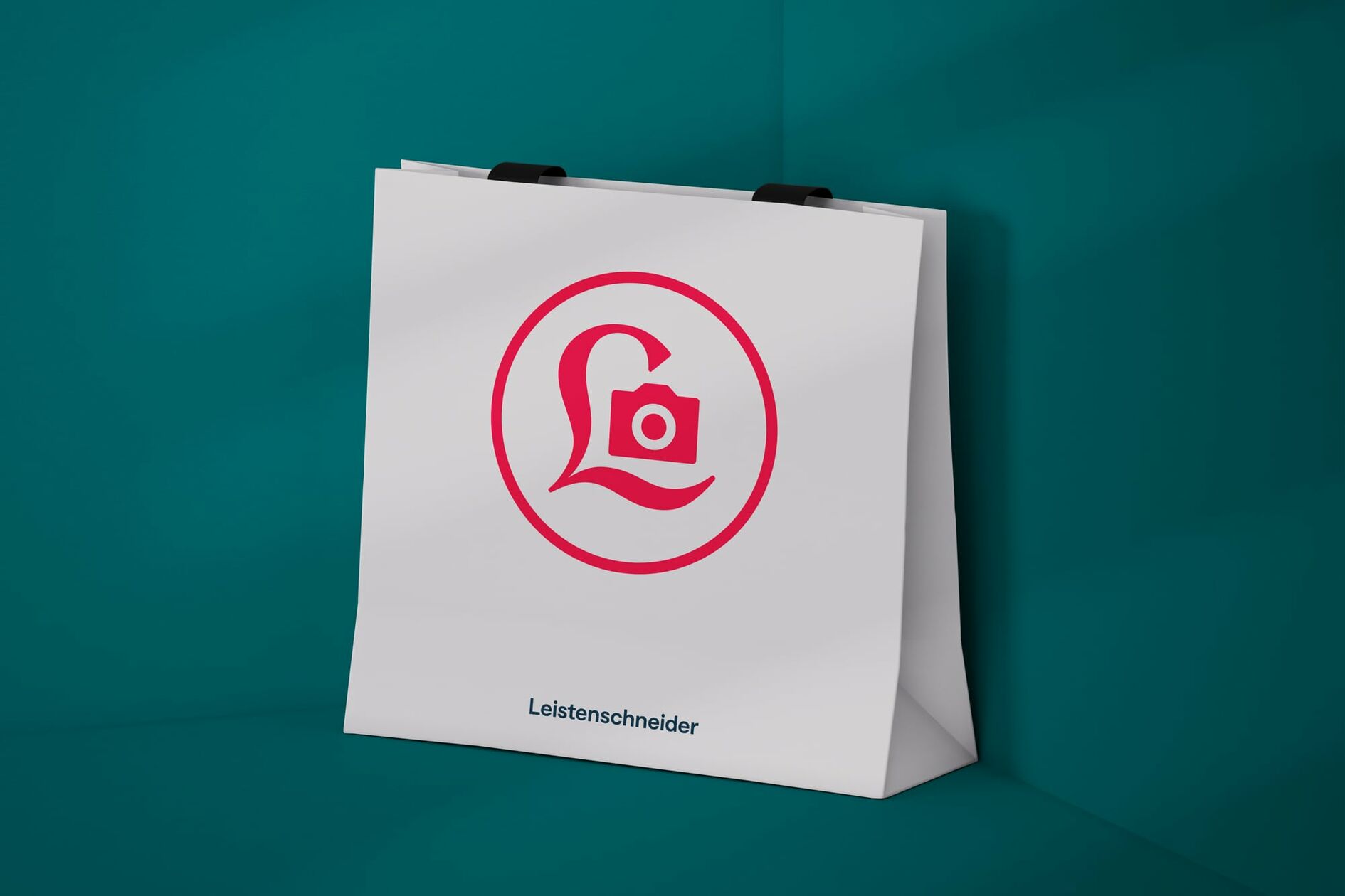
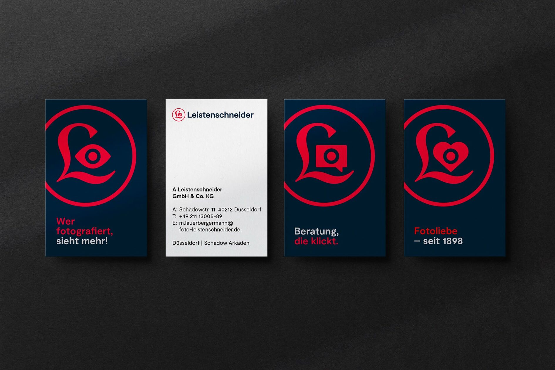
It was immediately clear to us that there is no better way to credibly convey and convincingly translate Leistenschneider’s unique history than with a logo that has been used in the photography industry for over 100 years. We took the old picture mark out of the archive, modernized it, and reintroduced it in a way that plays well to the requirements of the digital world.
The logo as a visual brace and narrative element
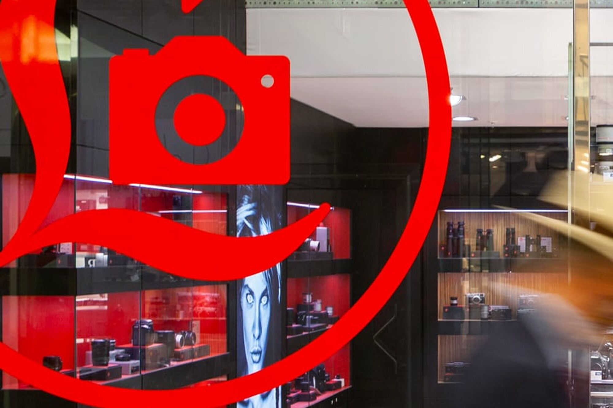
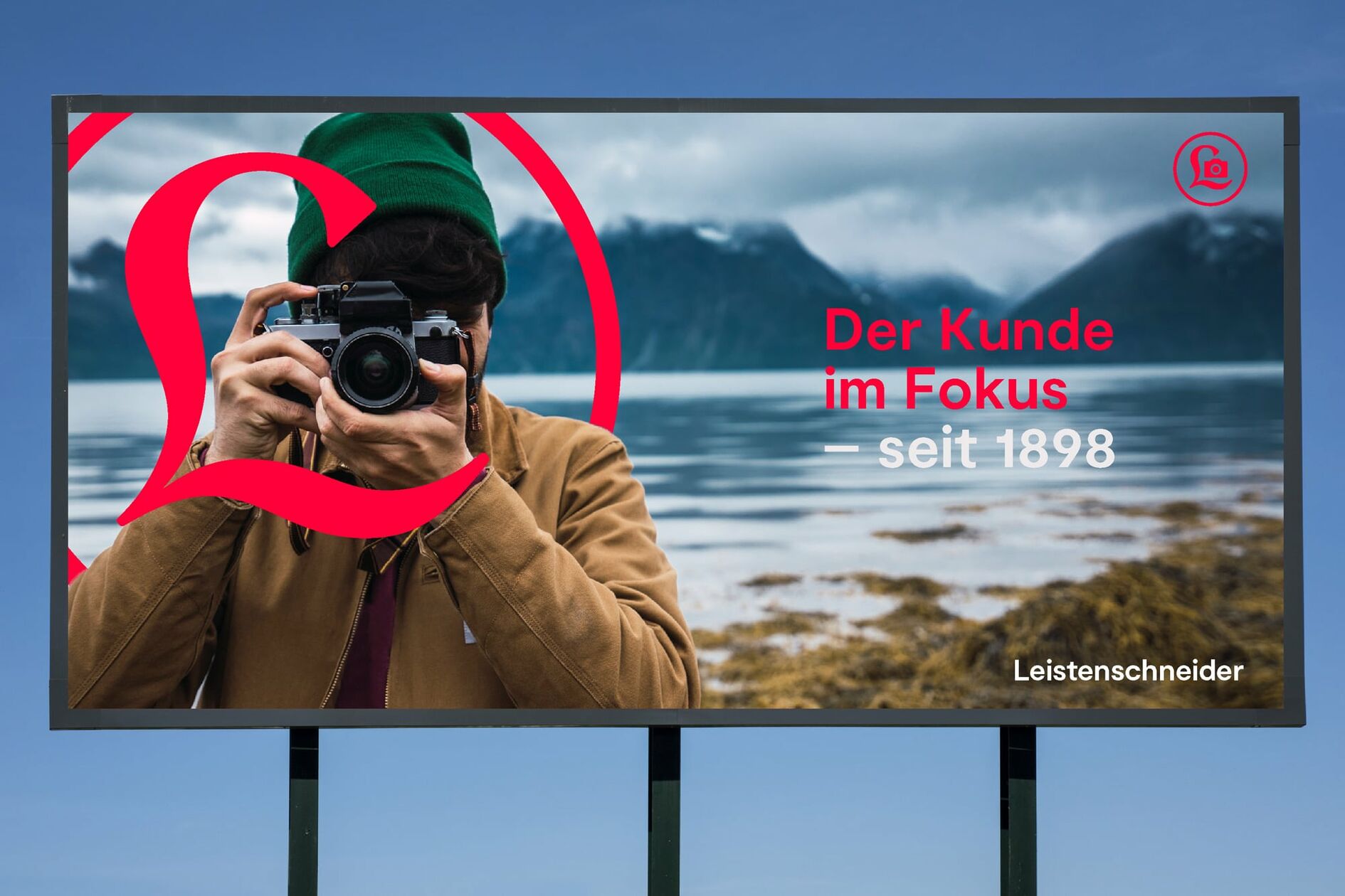
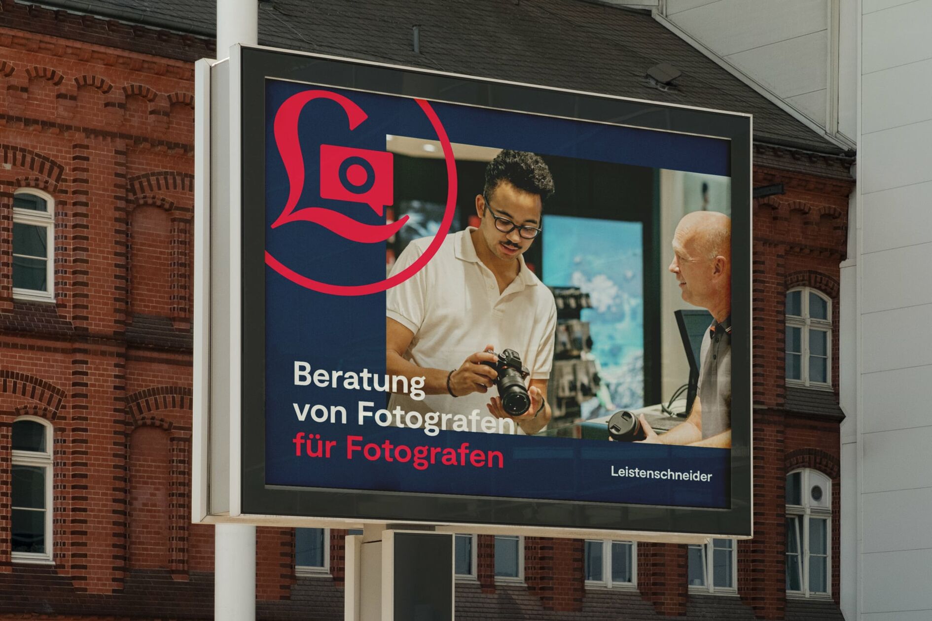
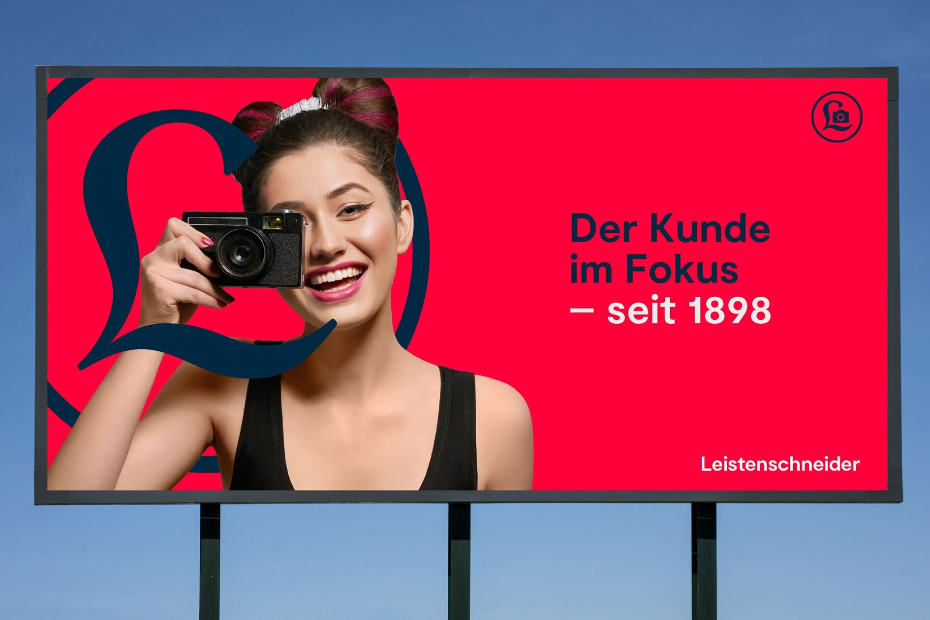
The new mark is at the center of the brand world. It is not only a concise statement; it serves as a key multifunctional visual that conveys the heritage of the brand. When used in with customer portraits, it symbolizes that the focus of the Leistenschneider brand goes beyond the technology being used in this era, and focuses on their customers needs instead. Variants of the picture mark with changing icons also help to create a narrative framework where different facets of the brand personality can be communicated depending on the context.

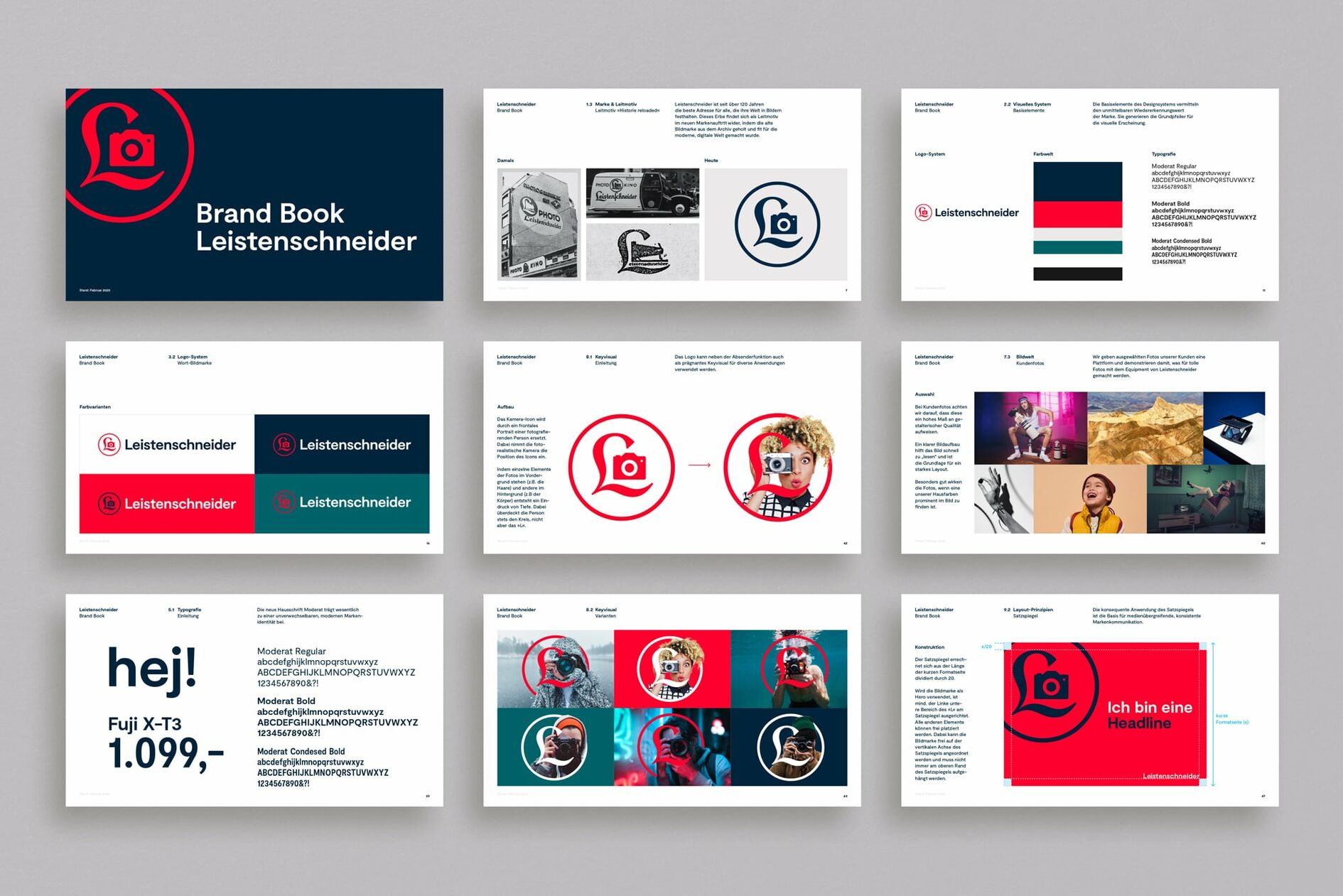
Progressive typography and bright colors
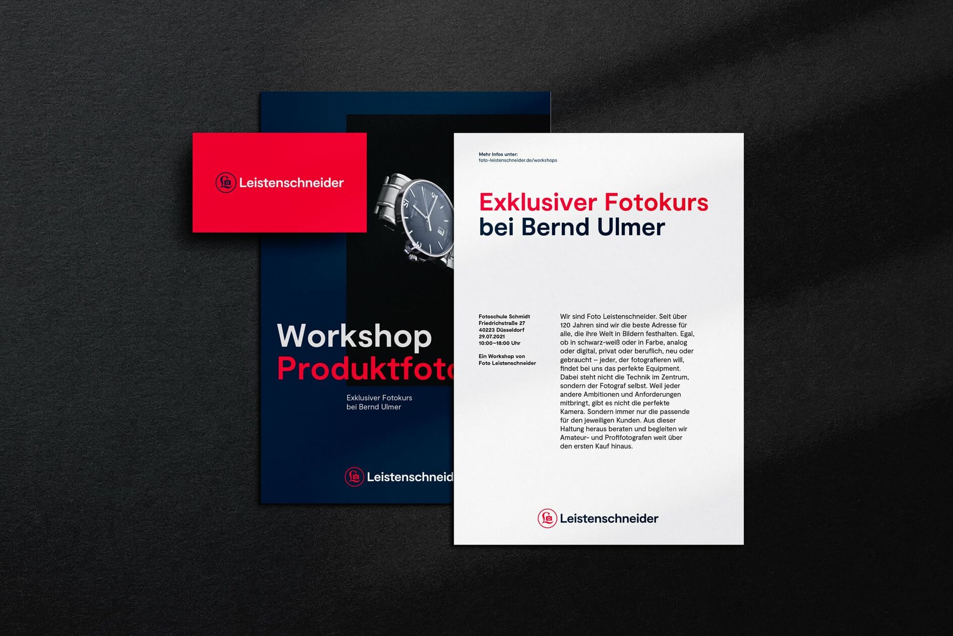
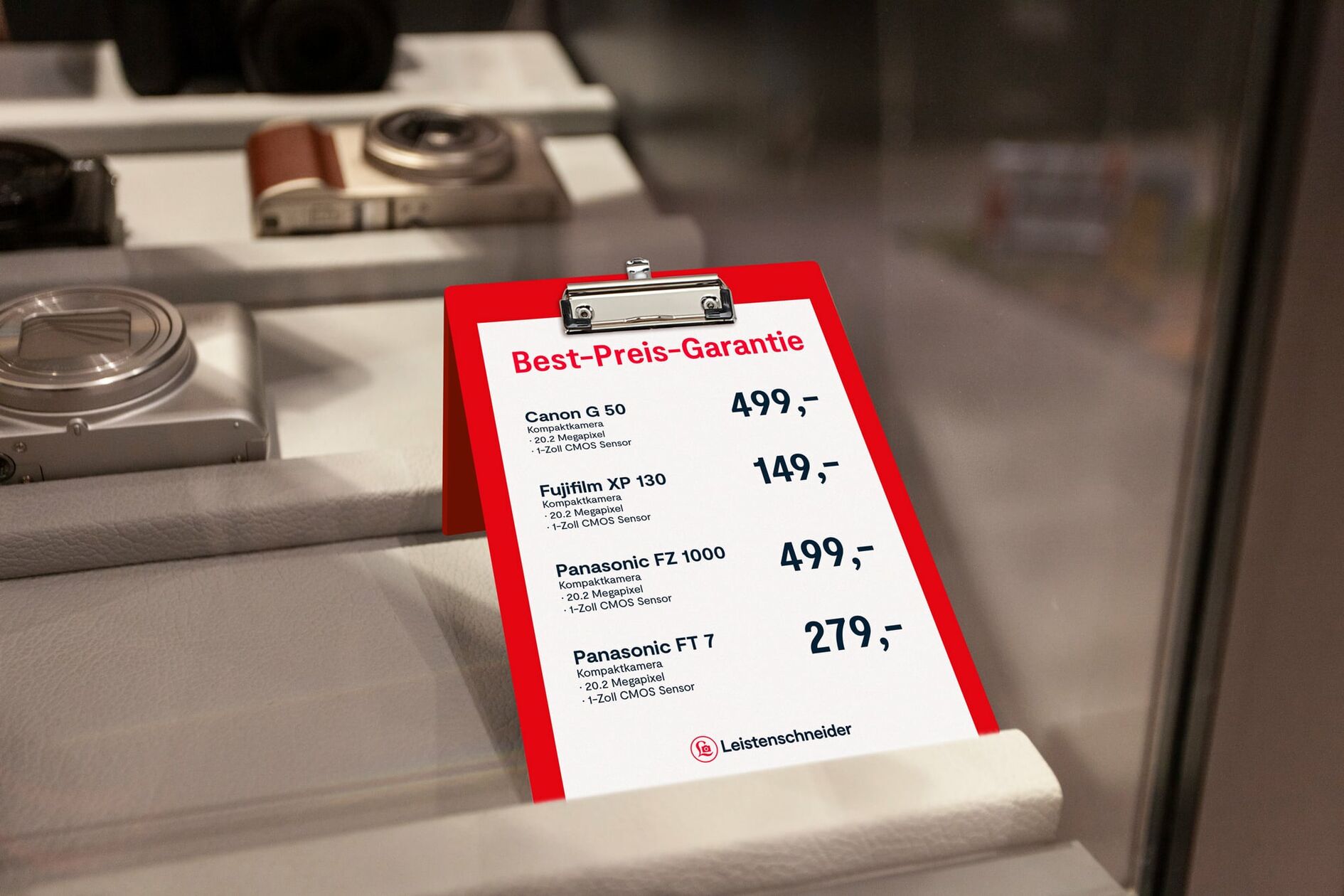
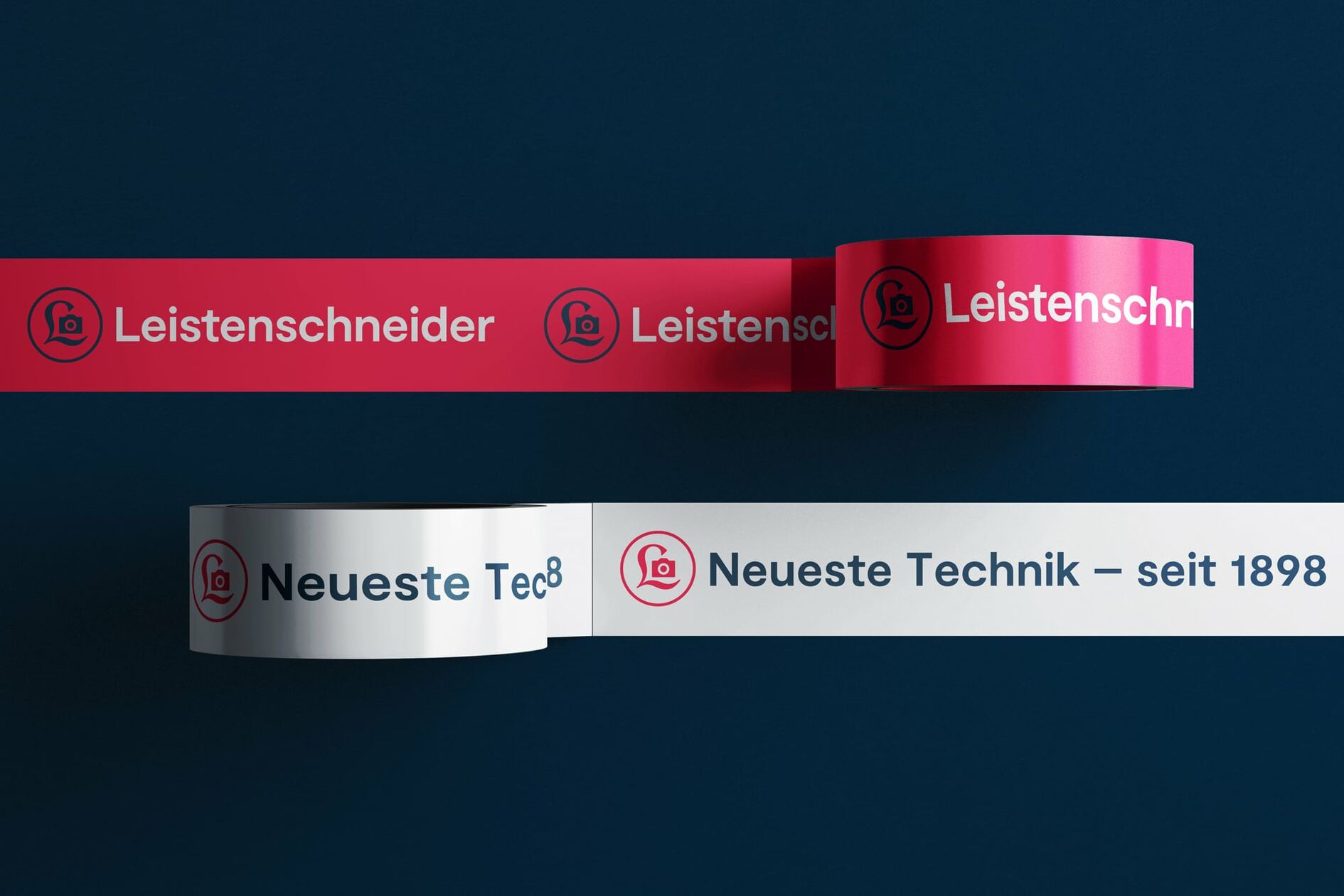
The new in-house typeface substantially contributes to creating a modern and inviting impression of the brand world. From a functional perspective, it also features useful all-rounder qualities that can be used on anything from price tags in the store to concise headlines in the new webshop. A targeted update of the color world complements the established bright red designs with elegant indigo and petrol tones to round off an updated look.
