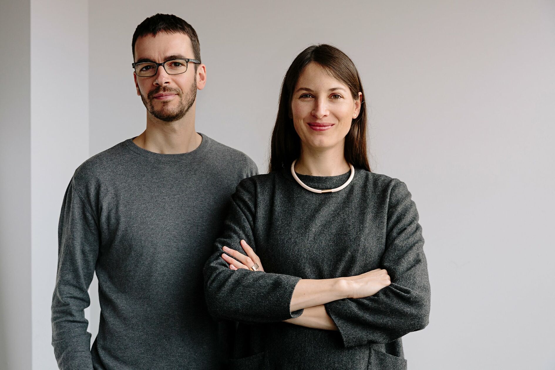
Introducing a sustainable jewelry brand that aims to redefine luxury
Project description
Quite Quiet
Branding
Services:
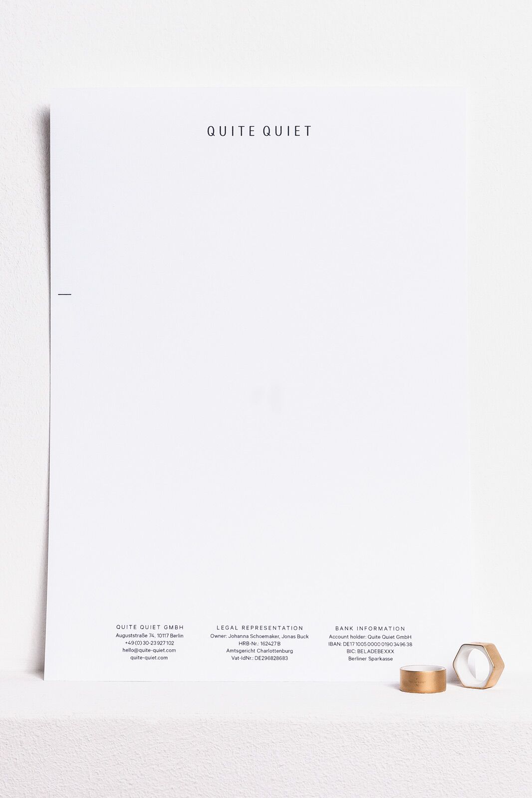
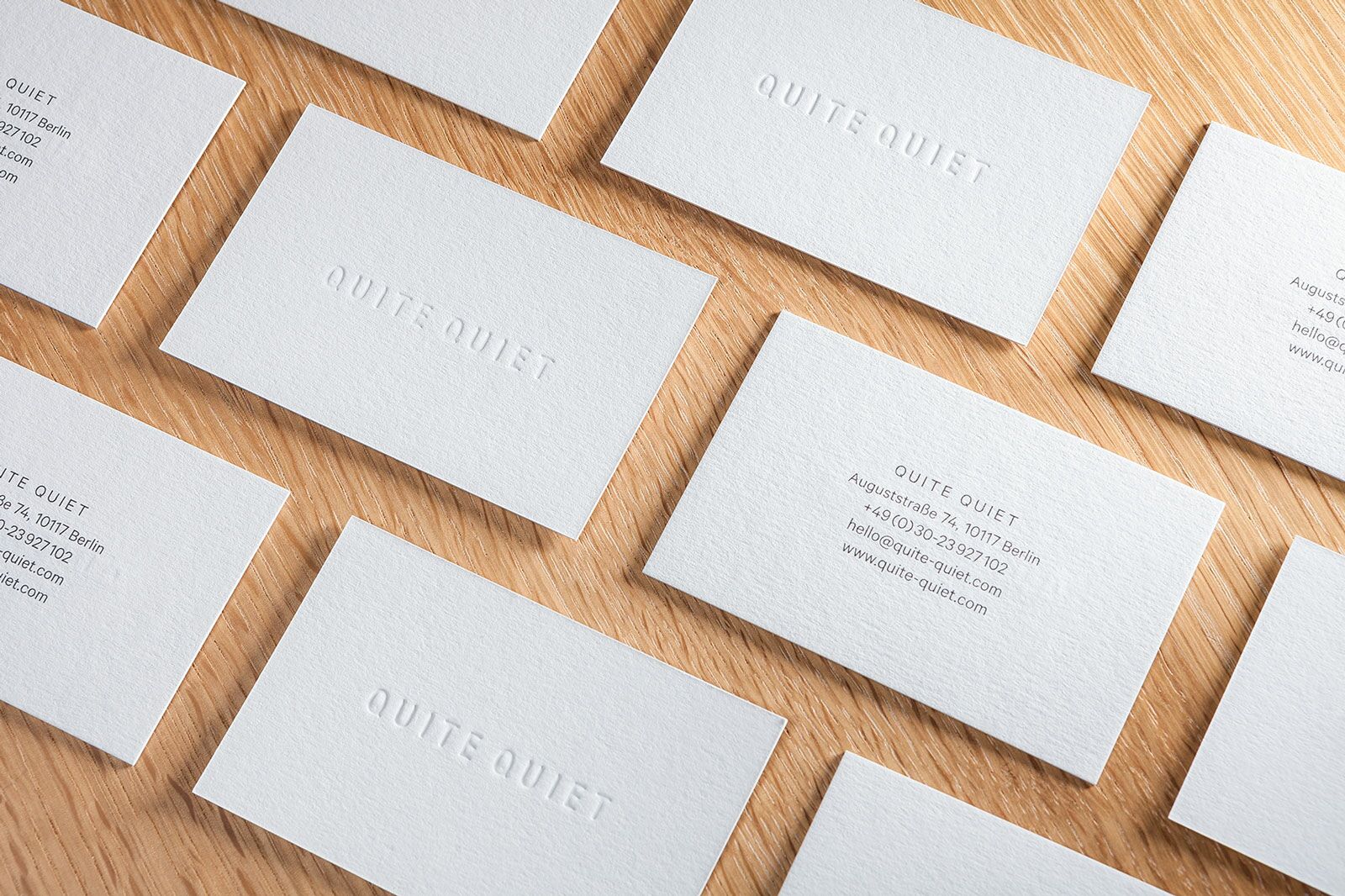
Corporate Design
Art Direction
Name Finding
Design Consulting
In collaboration with Anna Fitzon
Editorial photography: Lina Zangers
Product photography: Quite Quiet
Online-Shop: quite-quiet.com
Synchronous wordplay, attitude and branding
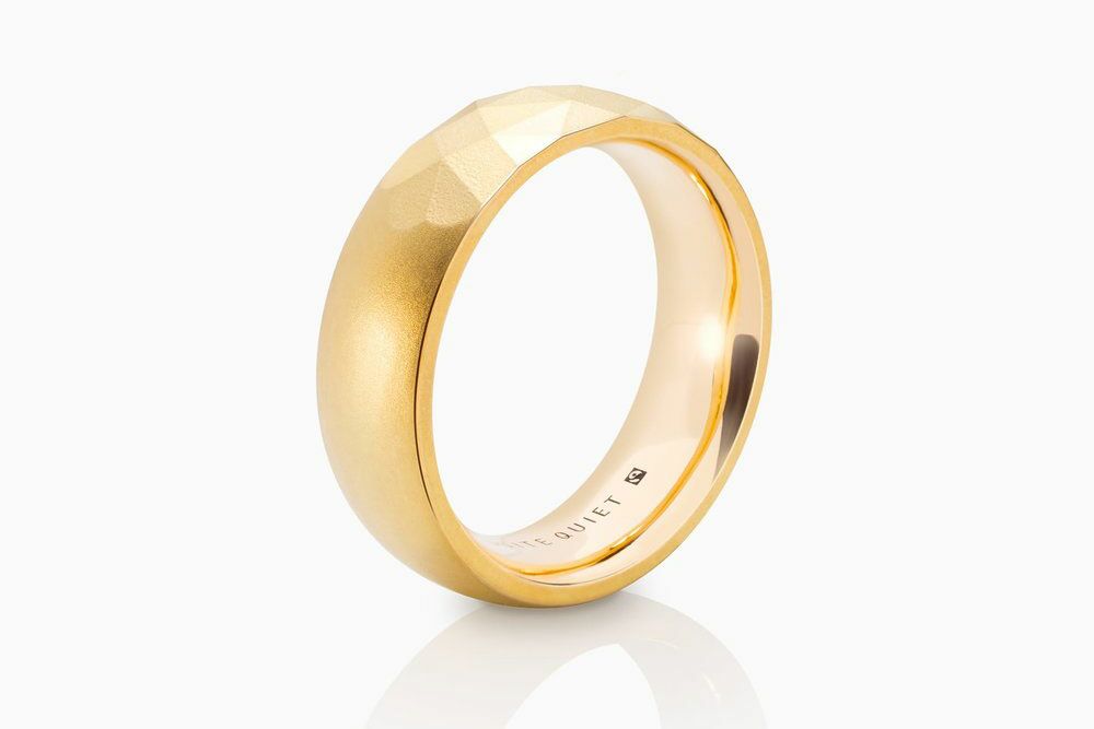
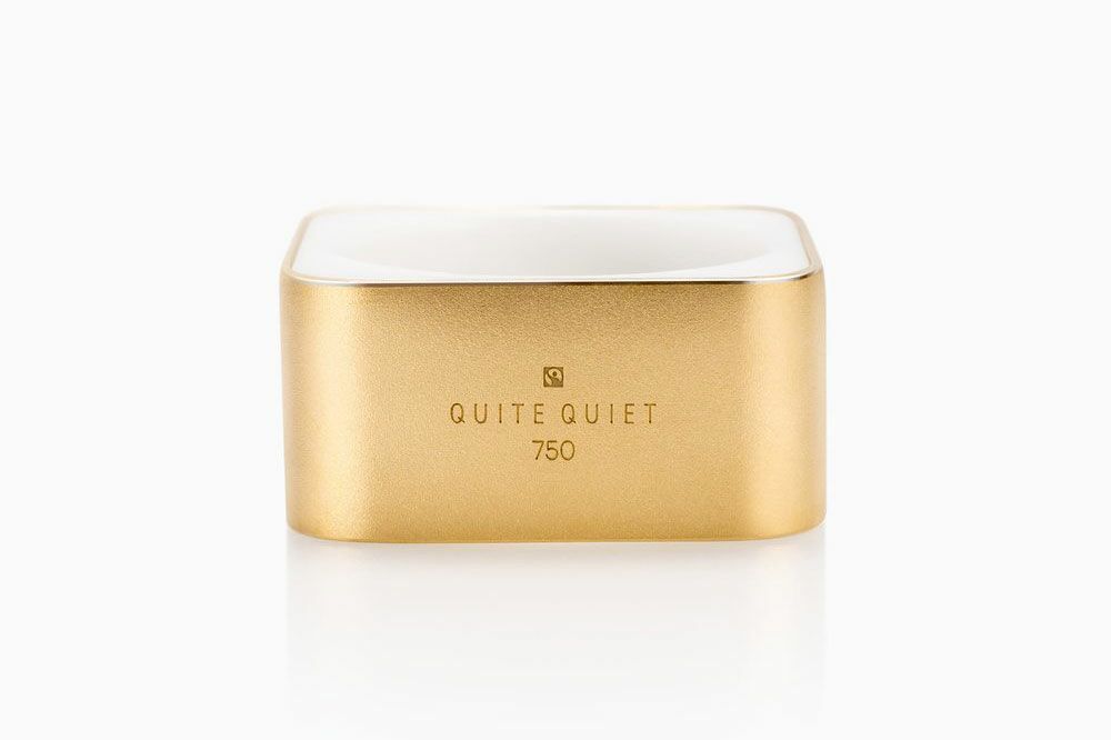
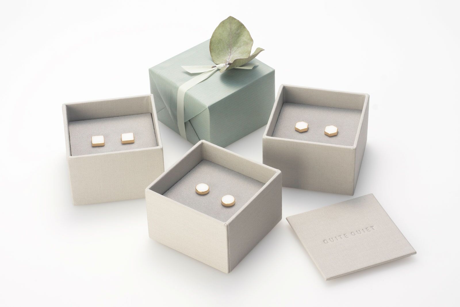
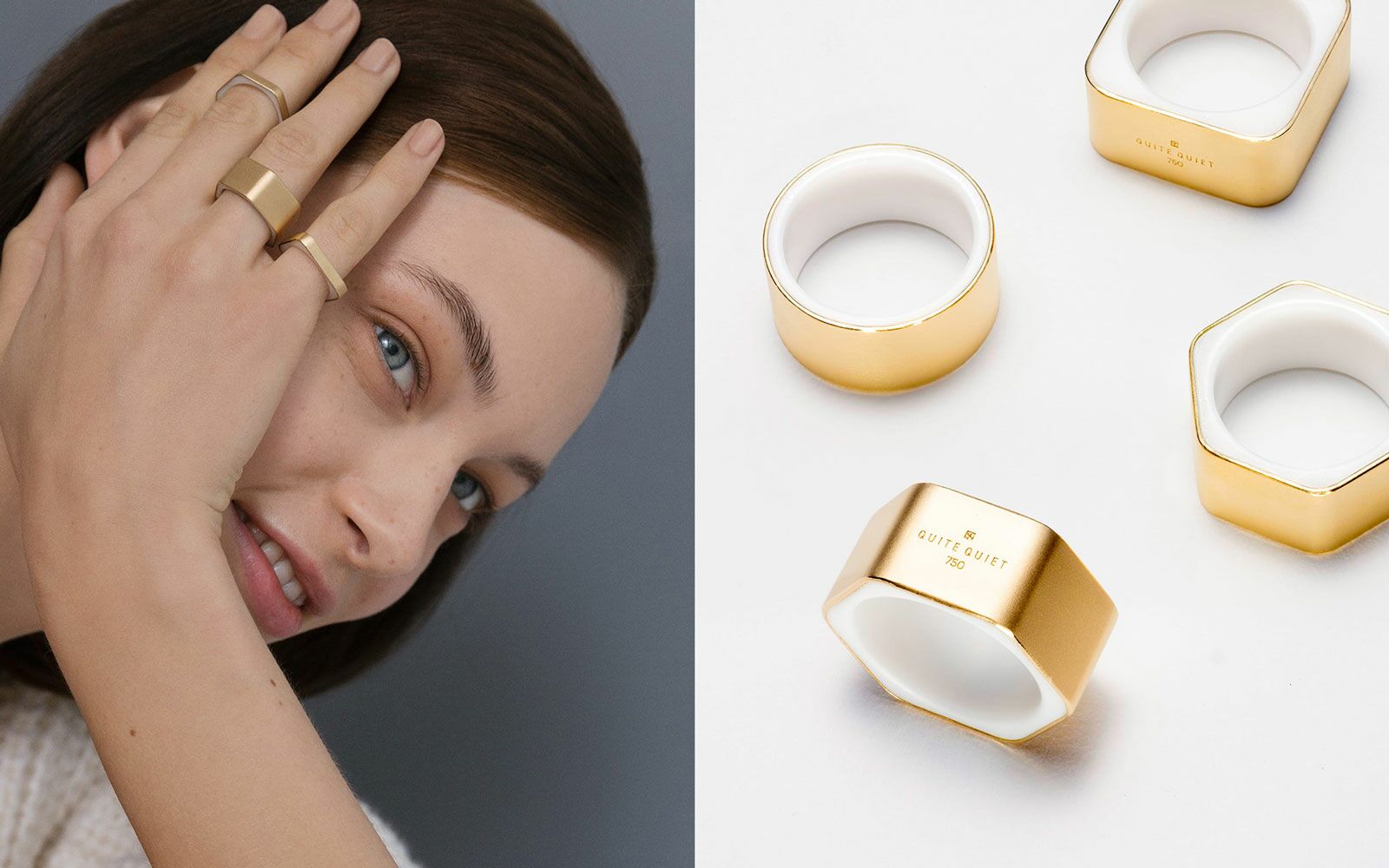
Quite Quiet combines innovative industrial aesthetics with emotional jewelry design. Their philosophy is that real luxury is created when all aspects of a product are applied with the utmost care – from clear design principles, to fair-traded materials and sustainable production. g31’s task was to transfer this philosophy into a brand world that graphically represents Quite Quiet’s minimalist design principles and sustainable practices.
A Deliberately Understated Visual Identity
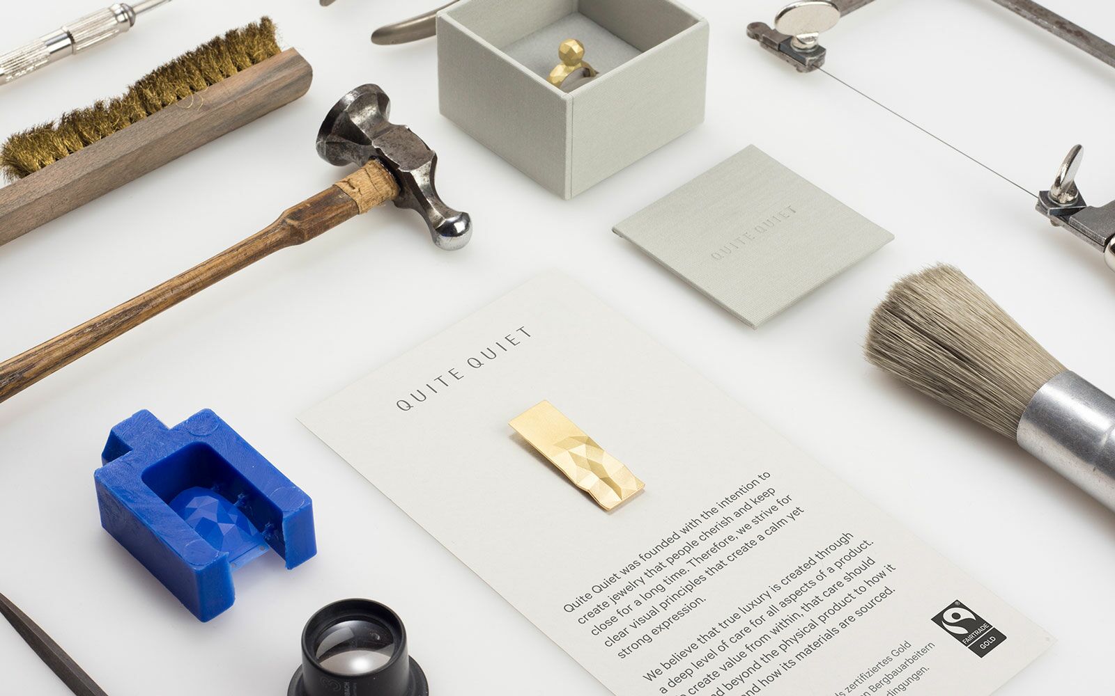
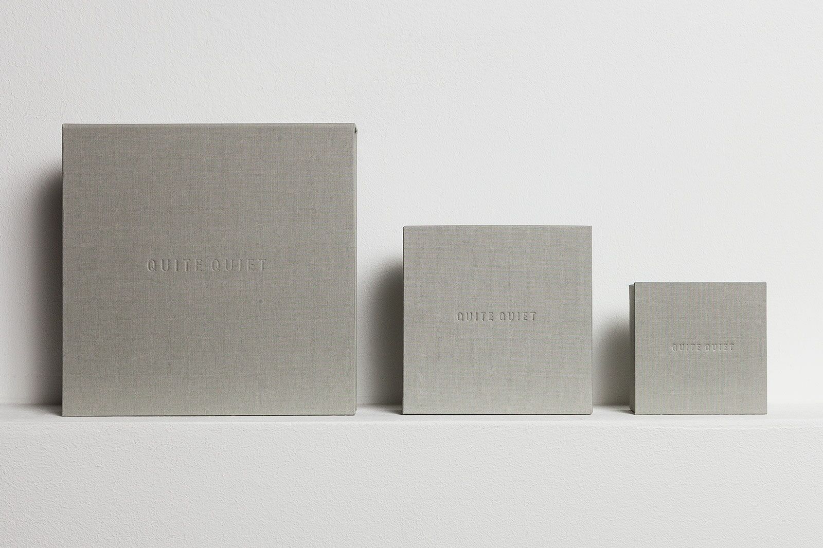
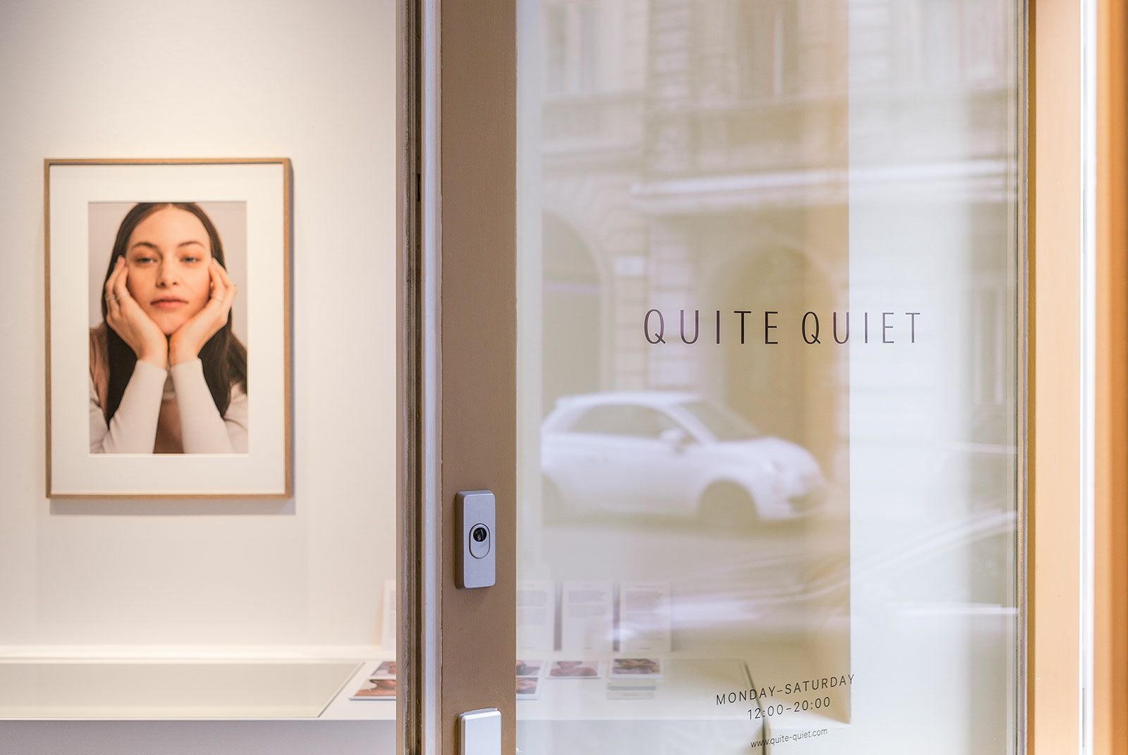
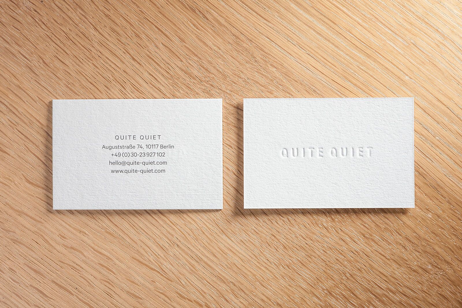
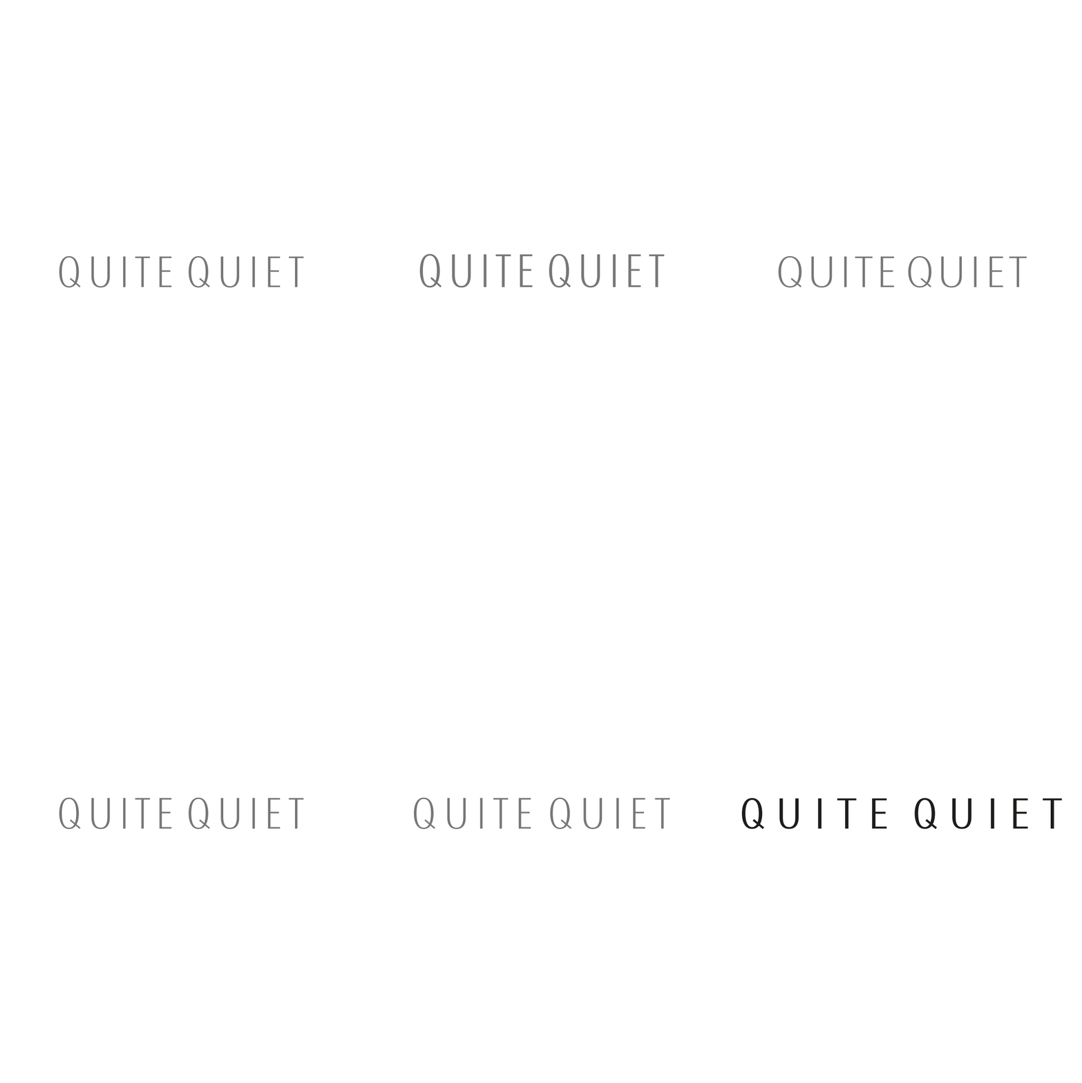
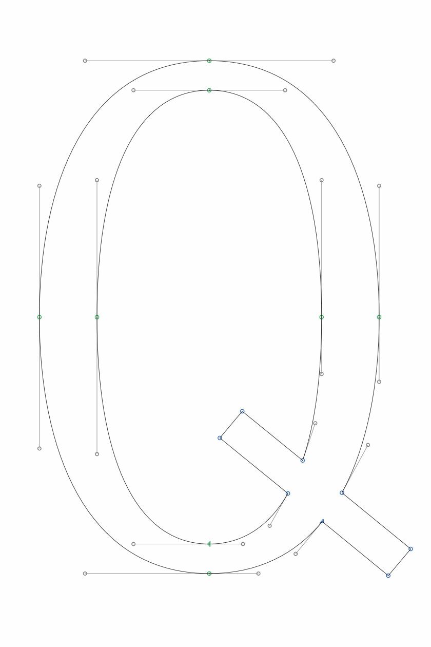
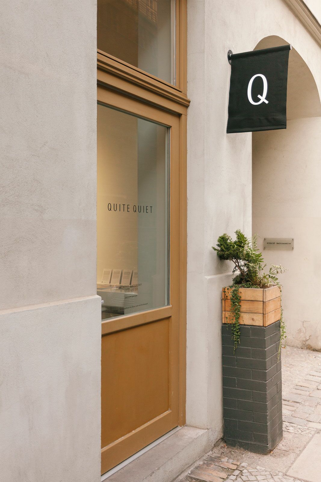
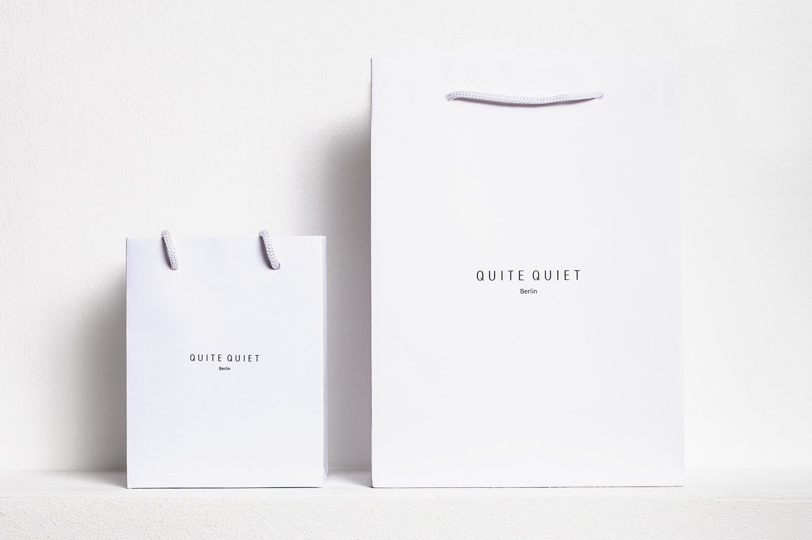
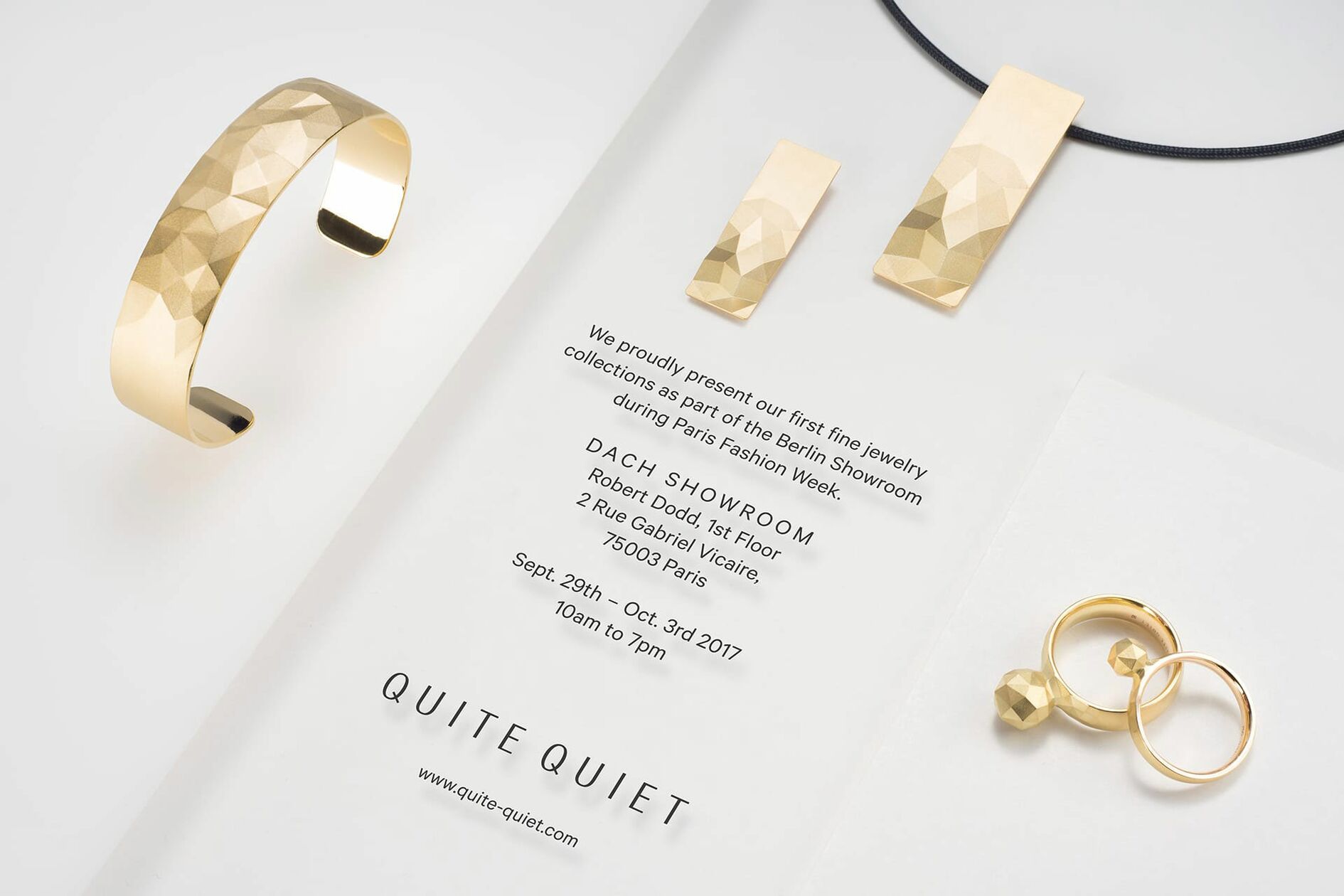
At the core of the brand world is the custom drawn word mark, translating »Quite Quiet« into a calm typographical image. To achieve this aesthetic, we combined the elegant contrast of a serif font with the modern look and feel of a grotesk font, while avoiding the use of superfluous graphic décor.
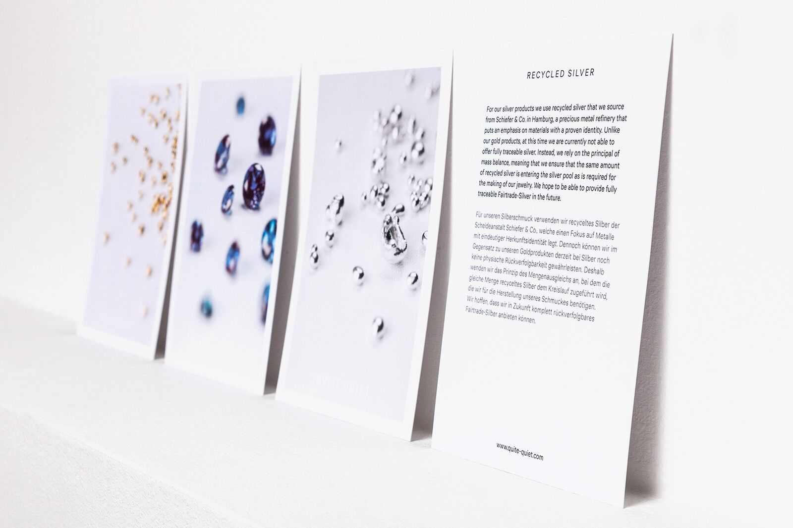
Fair trade materials, high end design
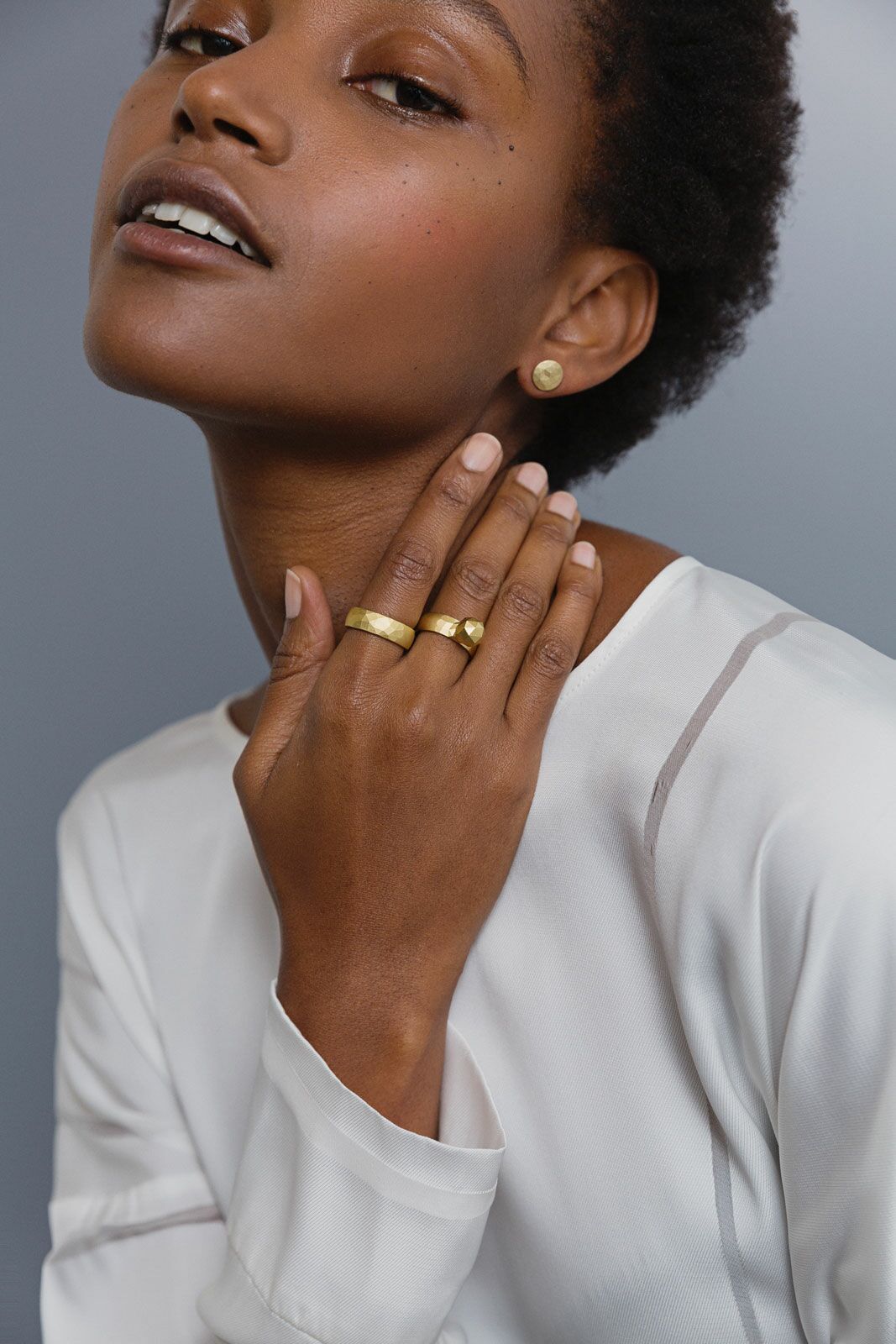
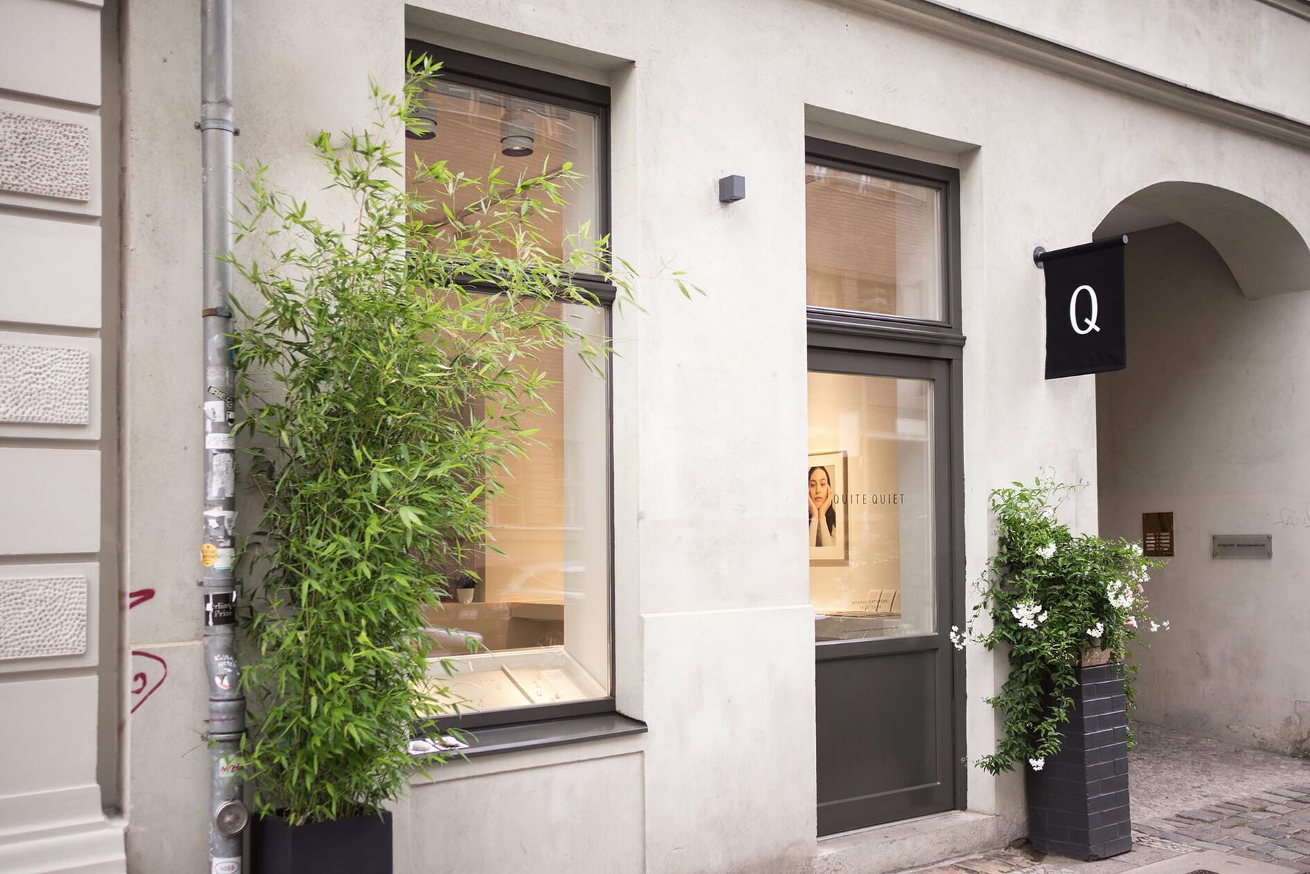
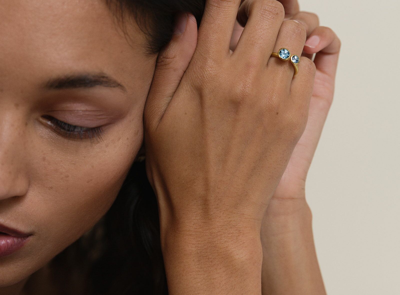
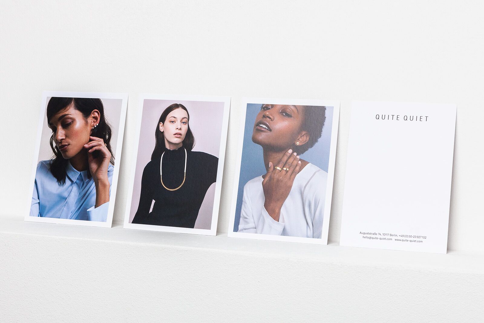
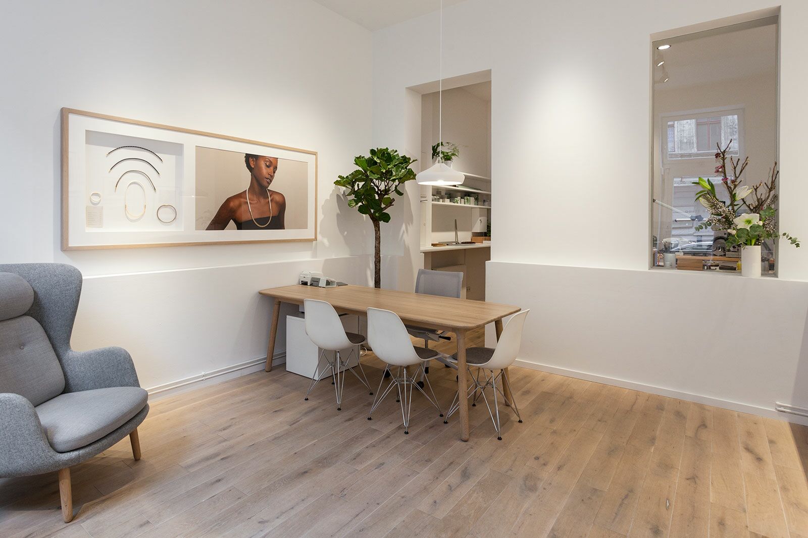
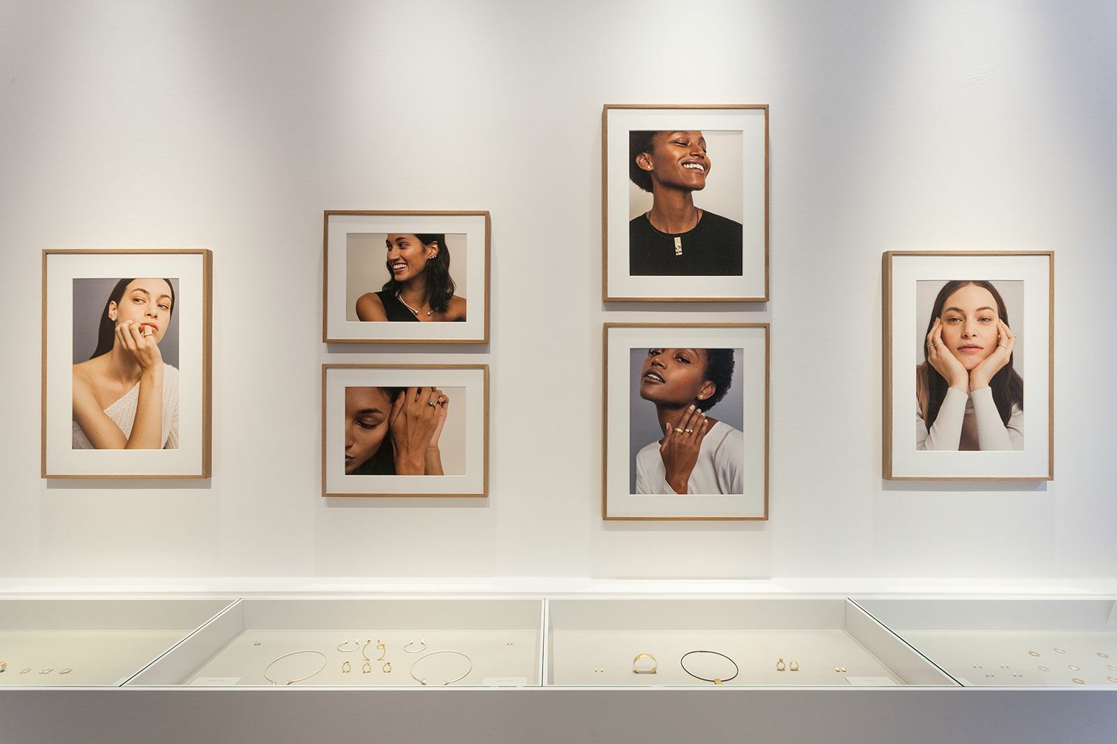
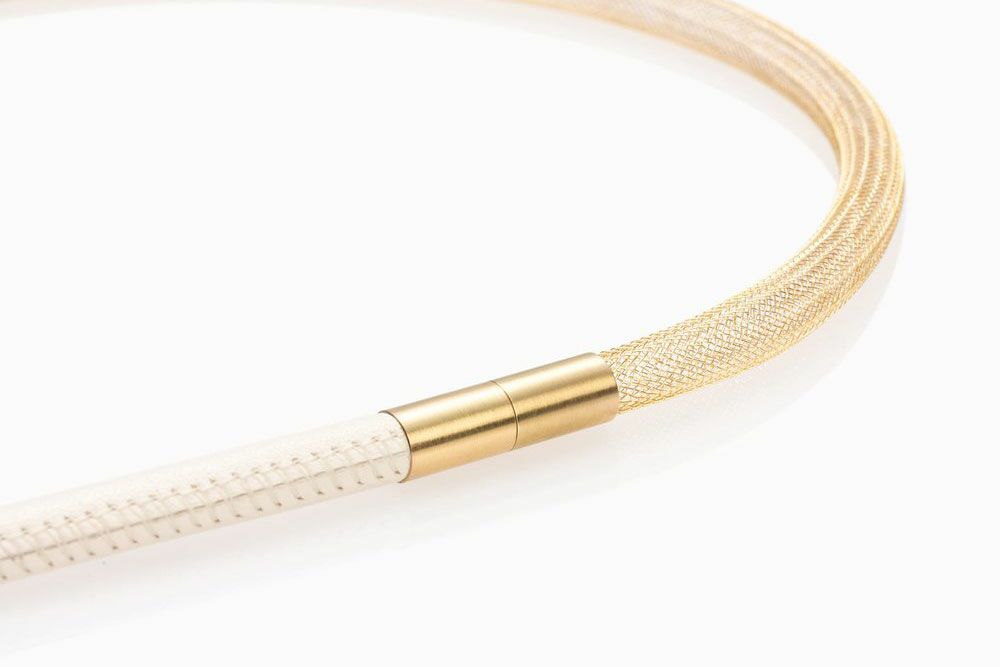
At Quite Quiet, traditional craftsmanship meets modern industrial manufacturing techniques using sustainable materials. By embracing this complex interaction of principles, a brand world emerges whose progressive, visual ethos is perceptible in every aspect of the brand – whether it’s the individual products, the emotional image language, or the design of the shop.
