A strong voice for the world’s oceans
Insights into the rebranding process for a marine conservation start-up
When it comes to environmental protection, many people probably think of Greenpeace, NABU, or the WWF panda. These are all, of course, great organizations that do important work. Naturally, they benefit from the high profile and charisma they have built over decades as solid brands. However, smaller organizations and NGO start-ups often have a hard time getting the attention they deserve alongside these giants. This is despite the fact that their environmental protection efforts might even be more efficient, innovative, and consequently more effective in the long term.
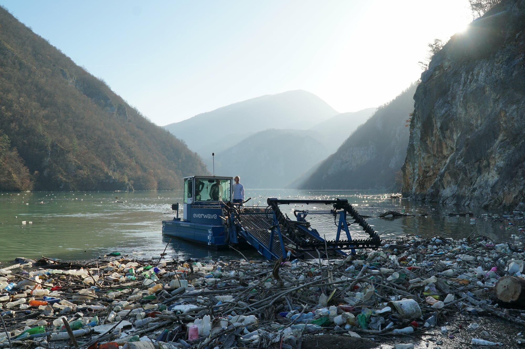
An excellent example of this phenomenon is the team at everwave, which first told us about their holistic approach to ocean rescue in late 2020. At the time, their organization was called „Pacific Garbage Screening,“ based on CEO Marcella Hansch’s master’s thesis at RWTH Aachen University, which filtered plastic from the ocean. As her research developed, however, it became increasingly clear that to succeed in the long term; it is necessary to filter plastic earlier in the waste stream. To avoid plastic pollution in our oceans we had to look at where it flows into the ocean: at the mouths of rivers.
Suddenly the old name stopped making sense
With this new focus, it was increasingly apparent that the name „Pacific Garbage Screening“ was at the very least inaccurate given their new mission. However, instead of simply replacing the word „Pacific“ with „River,“ we saw the strategic shift as a unique opportunity for deeper and more meaningful change. Together, we decided to renew the name and the entire appearance of their organization in terms of content, strategy, and visuals. The overriding goal was to create the ideal basis for long-term and sustainable brand development so that perhaps one day they would be able to have a seat at the table with large-scale organizations like Greenpeace and WWF. We started this approach by asking ourselves a fundamental question: how do we want to talk about saving the ocean? Of course, this is a loaded question. The goal wasn’t to understand peoples’ personal preferences; it was about finding a way to reach out to as many people as possible and encourage them to get actively involved with ocean conservation.
A spirit of optimism instead of disaster scenarios
Everyone is now familiar with the pictures of sea creatures wriggling between plastic bottles on littered beaches surrounded by dying coral reefs. If you look at the communication of many environmental organizations, it sometimes seems like a competition to see who can garner the most attention by using the most horrible pictures. Of course, this kind of communication is justified: the state of the world’s oceans is dire; we don’t want to sugarcoat that message. The problem, however, is that shocking people with grizzly images is not enough to inspire the creation of a positive movement. In using images of catastrophe, we risk desensitizing people instead of triggering a spirit of optimism.
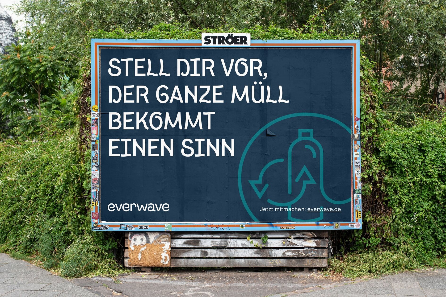
As necessary as it is to draw attention to justified problems, to truly effect lasting change, a clear vision of what a world with healthy oceans could look like is needed. From our first conversations with the team at everwave, we were inspired by how meticulously they work on this vision type. Their holistic approach targets the entire (vicious) circle of ocean pollution - from awareness-raising to researching the latest in ocean clean-up technologies. They believe that skimmed plastic waste shouldn’t be incinerated, but instead biotechnologically recycled and become the central component of a sustainable circular economy. In an introductory kick-off workshop, we then developed a joint idea of how to communicate this vision in the most memorable way possible. The principle of a natural cycle served us as a metaphor and content guideline for everything to follow: from finding a name to developing the design.
The name reflects their focus on the circular economy
We all know the result now: „everwave“. The new name is not only short, concise, and satisfying to say - it also subtly references the holistic approach to tackling ocean pollution. A wave is in an eternal cycle of ebb and flow - a beautiful, positive image that doesn’t try to say it all at once. We are convinced that a good brand name does not have to explain the product but should serve as a convincing story’s starting point. Therefore, as designers, the new name was also the main inspiration for the visual brand world we developed around it.
A new design system for everwave
As we mentioned at the beginning of this post, we redesigned the organization’s name and logo and the colors, fonts, and graphics they use. We refer to this package of goods as a „design system“ because all of the individual visual components dynamically interlock and relate to each other. We consider all conceptual dimensions of the brand’s orientation and how they fit together to do this well. Good design is not an end in itself but visually articulates the uniqueness of a product, company, or organization. This principle is just as true for a new toothpaste as it is for a marine conservation organization (even if saving the ocean is, of course, much more fun).
An independent, typographic voice for the oceans
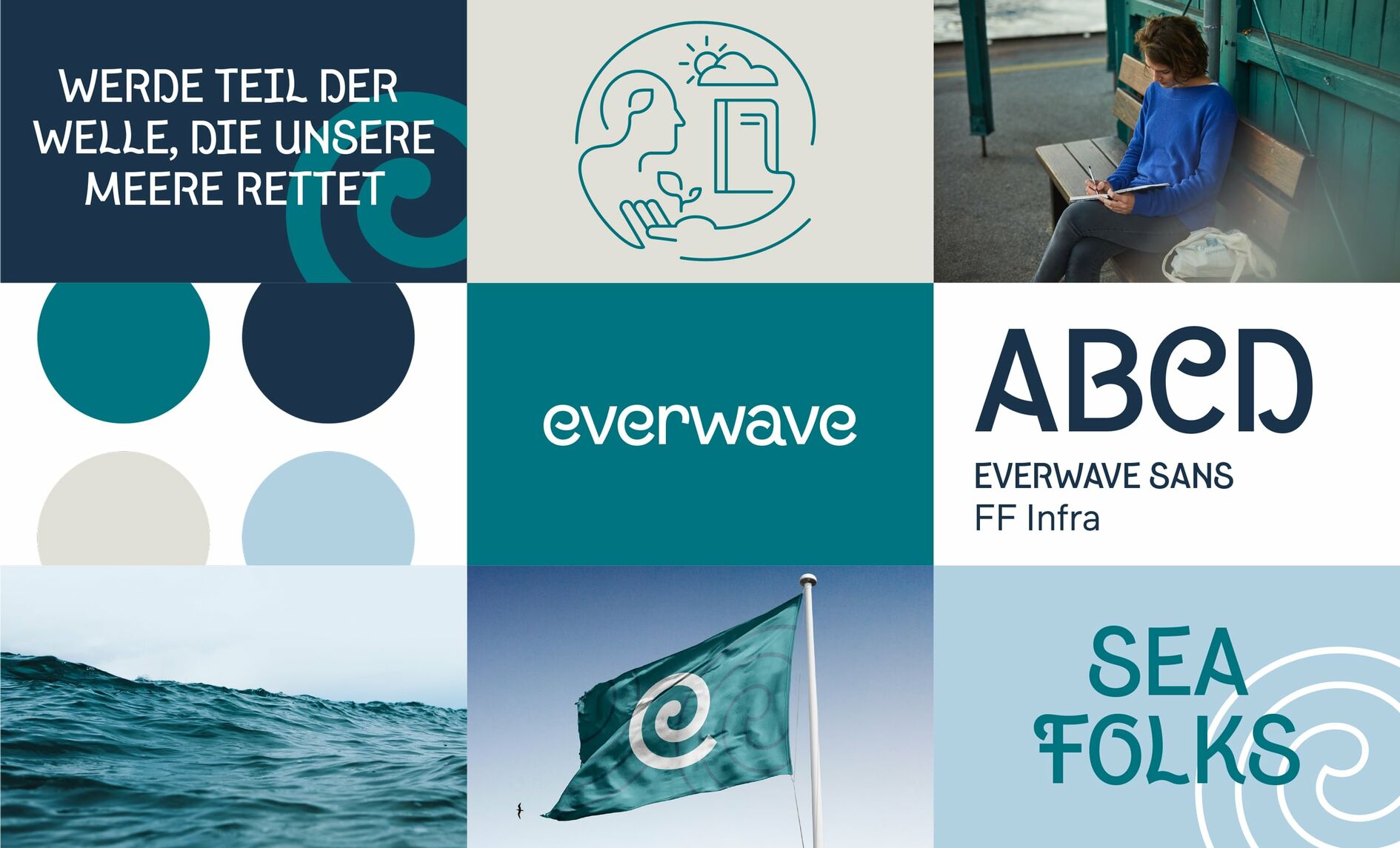
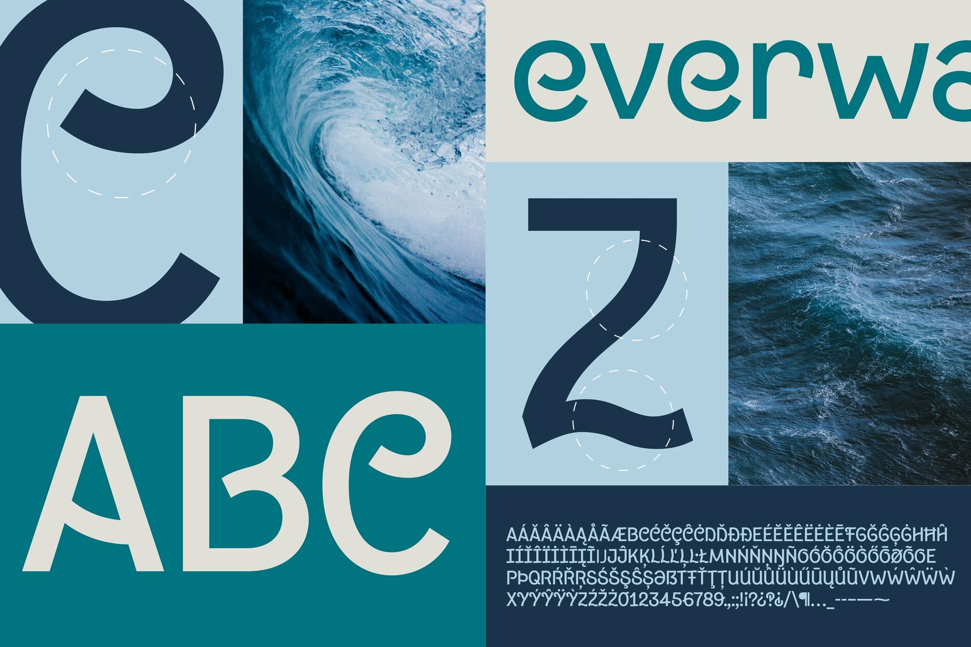
At the core of the new brand identity is a custom typeface designed exclusively for everwave in collaboration with type designer Gabriel Richter. Subtle typographic references to water and waves create a typeface with a strong appeal and evocative character. This typeface quite literally gives everwave’s messages and concerns their own, unmistakable voice. A functional grotesque typeface as a matter-of-fact visual counterpart rounds off the typographic system.
A strong sign that you can draw in the sand with your finger
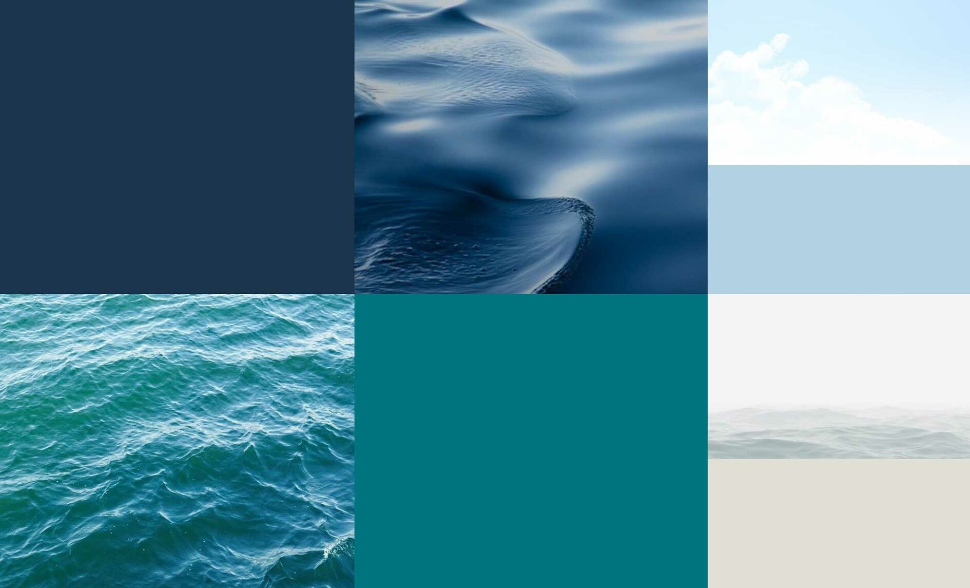
everwave’s new figurative mark is radically minimalist yet reflects the essential facets of the brand’s personality. Formally aligned with the new headline font, the „e“ reveals a stylized, breaking wave in negative space, referencing the ideal of a sustainable circular economy that the company strives for. The new wordmark is set in the new house font and thus fits perfectly into the overall image. The color scheme is derived from various colors of the sea. The overriding goal of everwave’s new brand identity is to make the value and beauty of the oceans tangible. In addition to oceanic references in the design system’s typography, we extracted the diverse shades and colors directly from the sea.
A color scheme derived from various colors of the sea
The overriding goal of everwave’s new brand identity is to make the value and beauty of the oceans tangible. In addition to oceanic references in the design system’s typography, we extracted the diverse shades and colors directly from the sea.
Icons visualize the facets of the holistic approach
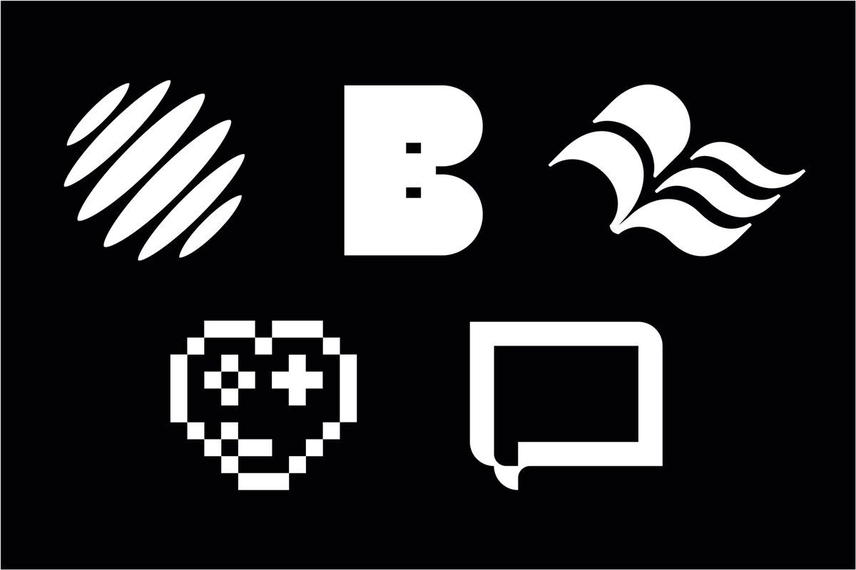
Through the cross-fertilizing combination of technological innovation with ecological inspiration, everwave makes a measurable contribution to a more sustainable future. We used two key visuals composed of individual icons to represent the start-up’s two central areas of activity.
Conclusion
everwave’s new brand identity inspires a spirit of optimism that equally speaks to scientific and political stakeholders, investors, and the general public. After all, we are all in the same boat - saving the ocean from pollution can only be done collectively.
We at g31 are proud to contribute to this initiative with our work.
More information and applications of everwave’s new design can be found here.
